Friday, May 31, 2013

Indicators of School Crime and Safety


Michael G. Planty, Ph.D., chief of victimization statistics at the Bureau of Justice Statistics (BJS), appeared on C-SPAN’s America by the Numbers on May 31, 2013. He described the latest trends in school crime and presented data on homicides and suicides at school, nonfatal violent and property crime, injuries from firearms and other weapons on school property, bullying, gangs, illegal drugs, and hate crimes at school. He also described trends in school discipline, safety, and security measures. 


Two of the more interesting trends appear to be that (a) violence and theft have been declining in school settings since about 1992; and (b) since the year 2000, school security measures have been on the rise in schools. A pdf covering all of the basics of the report can be found on the BJS website. A couple of the more interesting graphs appear below.
Click to Enlarge
Click to Enlarge


As noted, one of the topics covered was also school safety measures implemented in the last ten years or so. These include everything from student uniforms, staff ID cards, security cameras and armed security officers in schools.  This graph shows the increases from 2000 through 2010 in these (and other) safety measures.
Click to Enlarge
You can view more of the data in the preliminary tables from the forthcoming report Indicators of School Crime and Safety, 2012, located on the National Center for Education Statistics’ (NCES) website. The report is based on findings from several BJS and NCES data collections, including the School Crime Supplement to the National Crime Victimization Survey, the Youth Risk Behavior Survey, the School Survey on Crime and Safety, and the School and Staffing Survey. The link wasn’t ready when I first checked it earlier today but should be active soon !

Another source for national data can be found in the 2012 Statistical Abstract for the United States, in their School Crime and Safety section. Their data covers incident reporting, disciplinary behaviors, weapons at school, bullying, and selected safety measures at schools.

Locally, the Teen Assessment Project (TAP), conducted through the Herkimer and Oneida Counties Comprehensive Planning Program (HOCCPP), contains a variety of data from local teens about their experiences in school, home and the community, including bullying, violence, and many other topics. The latest Oneida County version of the TAP was done in 2011; the most recent Herkimer County TAP survey was conducted in 2013. However since that data hasn't been analyzed yet, your best bet for Herkimer County TAP data is the 2009 survey results. Once the 2013 Herkimer County TAP data is analyzed a report of its findings, along with all of the TAP survey reports, will be found on the Human Service Planning page of HOCCPP.

Origins and Destinations: People Moving Into, and Out of, Upstate NY

When people leave Upstate New York, where do they move to? And where do new migrants to the Upstate region come from? The New York Minute, an oline publication of Cornell University’s Community & Regional Development Institute (CaRDI), produced in collaboration with the Program on Applied Demographics, just released an interesting look at who moves into, and out of, upstate New York. Upstate New York for these purposes is defined as anything in New York north of Rockland and Westchester Counties.

Basically CaRDI looked at the County to County Migration flows in the 2010 American Communities Survey (ACS) Five Year Estimates and identified the top 5 origins and destinations for different age groups within the Upstate New York area. What they found was that “Upstate” receives a significant number of in-migrants from the downstate New York region, from Florida, and from countries in Asia. A significant number of movers out of “Upstate” head to Florida, to downstate New York, and to Pennsylvania, among other locations. And these origins and destinations do seem to vary by the age of mover.

The graphic below, taken from the New York Minute, shows these breakdowns by age groups nicely. 
Click to Enlarge

To see the full data, visit: Cornell's Program for Applied Dempgraphics.                

Daytime County Population Changes Revisited: Towns, Cities, and Villages

Yesterday I posted about changes in the daytime population due to worker flows into and out of counties. There is some limited additional data I wanted to share on a lower municipal level as well - namely for a few towns, cities and villages in the region. The availability of the data is based on the municipalities meeting a minimum threshold of workers either working within, or living within, their boundaries.

The table below provides data for those towns, cities and villages that met these thresholds. What is interesting, again, is to see which municipalities operate at deficits and which work with additional population during the daytime.

Town, City, and Village Daytime Commuter Population Changes

Click to Enlarge

From the Horse's Mouth: Accessing Historical Census Data

Often I get requests for data from older censuses. More recent data is readily available through a variety of online resources. But when it comes to, let's say, the 1930 Census, things get a little more difficult. Sometimes it's just best to go to the horse's mouth - namely the US Census Bureau website. While many of you undoubtedly are familiar with the American Fact Finder (AFF), there are other places on the Census Bureau website where historical data can be found. It may not be as easy or as searchable as using AFF.

One of the most direct places is their historical Census of Population and Housing webpage.  From this website you can access all of the population and housing data in every census that has been done since 1790. Please keep in mind that the census has not always provided the types of data you are presently used to, but if it was released as part of the population and housing information, it's there. For some of the data, you can access it online in a pdf; for others you must download LARGE files to view the information. So beware before you click the download button !

Regardless, this page can be a valuable resource when trying to track down some long forgotten census tidbit.

Thursday, May 30, 2013

Daytime County Populations: Adjusting for Commuting Workers

There are several surveys conducted by the Census Bureau that ask questions regarding commuting and place of work, such as the American Community Survey (ACS), Decennial Census (2000 and prior), American Housing Survey (AHS), and the Survey of Income and Program Participation (SIPP). Some of these questions include: mean travel time, means of transportation, time of departure, vehicles available, distance traveled, and expenses associated with the commute.

The ability to link information about commuting to socio-demographic characteristics and geography allows planners to forecast local peak travel demand, gauge the amount of pressure placed on transportation infrastructure, and address unmet transportation needs more accurately. Federal, state, and local planners and policymakers use the ACS and other Census Bureau surveys to guide decisions about how to allocate limited public resources devoted to transportation.

Daytime population refers to the number of people who are present in an area during normal business hours, including workers. This is in contrast to the “resident” population present during the evening and nighttime hours. Daytime population estimates are calculated using resident and workplace population estimates.
Information on the expansion and contraction experienced by different communities between nighttime and daytime populations is important for many planning purposes, including those dealing with transportation, land use, disaster, and relief planning and operations.

Here is a table compiled from the just released Commuter Adjusted Daytime Population Estimates. These are based on the 2010 ACS Five Year Estimates and are available for the entire country. Notice the far right column which basically indicated whether a county is a "giver" of workers, or a "taker". A value of less than 1.00 represents a community that supplies workers to other communities. A value of greater than 1.00 means a community provides more jobs than they have resident workforce.

Click to Enlarge


Thriving (And Not So Thriving) Businesses

The infographic below, put together by Masters-In-Human_Resources.com from data gathered by the U.S. Bureau of Labor Statistics provides some insight into businesses that appear to be thriving and those perhaps that are struggle in recent times. In the words of the people at Masters-In-Human_Resources, "Construction and healthcare-related fields are expected to see exponential growth in the next decade, while jobs at the Post Office and newspapers, well, may go the way of the dodo."

The infographic provides a nice visual of what businesses are "growing or dying" in their words. Further down the post are the actual national percentages of growth or decline within each industry. To see a full sized version of the graphic, see this web page .

Click to Enlarge

Largest Percentage of Growth and Decline by Industry


  • Home health care services: 6.1%
  • Individual and family services: 5.5 %
  • Management, scientific, and technical consulting services: 4.7%
  • Veneer, plywood, and engineered wood product manufacturing: 3.9 %
  • Computer systems design and related services: 3.9 %
  • Cement and concrete product manufacturing: 3.2 %
  • Outpatient, laboratory, and other ambulatory care services: 3.2 %
  • Offices of health practitioners: 3.2 %
  • Software publishers: 3.1 %
  • Construction: 2.9 %
  • Commercial and industrial machinery and equipment rental and leasing: 2.9 %
  • Other professional, scientific, and technical services: 2.9 %
  • Facilities support services: 2.9 %
  • Community and vocational rehabilitation services: 2.9 %
  • Lessors of nonfinancial intangible assets (except copyrighted works): 2.9 %
  • Other educational services: 2.7 %
  • Automotive repair and maintenance: 2.6 %
  • Grantmaking and giving services and social advocacy organizations: 2.6 %
  • Sawmills and wood preservation: 2.6 %
  • Child day care services: 2.6 %
  • Petroleum and coal products manufacturing: -1.3 %
  • Newspaper, periodical, book, and directory publishers: -1.3 %
  • Pulp, paper, and paperboard mills: -1.4 %
  • Fiber, yarn, and thread mills: -1.4 %
  • Iron and steel mills and ferroalloy manufacturing: -1.4 %
  • Electrical equipment manufacturing: -1.5 %
  • Metalworking machinery manufacturing: -1.6 %
  • Glass and glass product manufacturing: -1.6 %
  • Basic chemical manufacturing: -1.6 %
  • Other chemical product and preparation manufacturing: -1.9 %
  • Other miscellaneous manufacturing: -2.3 %
  • Federal enterprises except the Postal Service and electric utilities: -2.4 %
  • Metal ore mining: -2.5 %
  • Pesticide, fertilizer, and other agricultural chemical manufacturing: -2.5 %
  • Pipeline transportation: -2.6 %
  • Communications equipment manufacturing: -3.1 %
  • Computer and peripheral equipment manufacturing: -3.1 %
  • Postal Service: -3.2 %
  • Leather and hide tanning and finishing, and other leather and allied product manufacturing: -7.6 %
  • Apparel knitting mills: -8.3%


Welcome to the Real World: New Graduates and Unemployment Rates

A study just released by the Georgetown University Center on Education and the Workforce lays out the employment prospect for recent college graduates. The Georgetown report used the American Community Survey (ACS) data from 2010 and 2011 for its analysis. For recent graduates, it looked at 22- to 26-year-olds who had bachelor’s degrees, and for more experienced college graduates it looked at 30- to 54-year-olds with college degrees. The report offers a reminder that while lots of young people will spend an inordinate amount of time deciding where to go to college, it’s perhaps more important to figure out your major once you get there. That decision can have a life long impact of your ability to find a job once you graduate.

For example, in the graphic below which comes from the report you can see the recent majors with the lowest and highest overall unemployment rates. For example, Information System, Architecture and Anthropology degrees have the hardest time finding employment, while students getting a bachelors in Nursing, Elementary Education, and Parks and Recreation/Physical Fitness have the best chance of finding jobs right away.
Click to Enlarge
 Taking the analysis a step further, the report looks at employment prospects within majors by whether the graduate has any work experience as well as if they may have gotten a graduate degree. It's interesting to see how those with some sort of work experience in their chosen field fare so much better than those that don't.
Click to Enlarge
Of course this is all national level data. To provide a local perspective, below you will find two tables. The first provides a breakdown of the types of majors for people holding bachelors degrees in both Herkimer and Oneida Counties. The second shows the basic majors held by men versus women.

Click to Enlarge


Click to Enlarge

Wednesday, May 29, 2013

The Price of Communication: Historical Costs of First Class Stamps

According to the US Postal Service, the total number of pieces of mail has declined by more than 20% since 2007. While as many as 212 BILLION pieces of mail were handled by the USPS that year, by 2011 that number had dropped to "only" 168 billion pieces of mail processed. It is declines like this that have caused the Postal Service to re-evaluate its operational logistics.

One of the potential options, according to this article by CNN Money is to raise the price of stamps...again. they were recently raised this past January, so a first class letter now costs 46 cents to mail. In the three months ended March 30, the agency lost $1.9 billion -- which actually is less than the $3.2 billion it lost in the same period a year earlier.

According to Wikipedia, an Act of Congress provided for the issuance of stamps on March 3, 1847. The first stamp issue of the U.S. was offered for sale on July 1, 1847, in NYC, with Boston receiving stamps the following day and other cities thereafter.

Here is information from the US Postal Service that shows the increases in stamp costs from those early days until this past January.

Click to Enlarge

Previous 12 Month Earnings of Males and Females in Herkimer and Oneida Counties

Census data recently analyzed by the Pew Research Center show that a quarter of all moms now bring home more money than their male counterparts. According to an NBC News article  "Overall, women -- including those who are unmarried -- are now the leading or solo breadwinners in 40 percent of U.S. households, compared with just 11 percent in 1960.That’s both good news and bad news, depending on which end of the scale you examine. At the top level, educated women are catching up with men in the workforce. But at the bottom rungs, there are more single mothers than ever and most of them are living near the poverty line."

While Pew was able to get special runs done for them in analyzing the American Communities Survey (ACS) data from the Census Bureau, we unfortunately don't have that type of access. However there are some interesting data in the ACS that tells us about the earning power of local males and females.

The graph below shows the cumulative percentages of males and females in Herkimer and Oneida Counties who worked full time in the past 12 months by how much they earned. It is set up to show the percentage that earn less than several benchmark amounts
Click to Enlarge

So for example,  looking at the graph you can see that 84% of all Herkimer County females who worked full time in the past year earned less than $50,000 annually; in comparison, only 66.3% of Herkimer County males earned $50,000. What this shows, then, is that females in Herkimer County are more likely to earn lower salaries than males - or more specifically more of them are paid at a lower rate than their male counterparts. Another way to think of that same data is to say that only 16% of Herkimer County females make MORE than $50,000, versus 34% of Herkimer County males. So which group would you rather be a part of ?

Here's the data the above chart comes from.

Click to Enlarge
You can visit the Census Bureau's American Fact Finder to explore other income related data broken down by gender or race !

Tuesday, May 28, 2013

Second Bill Introduced in House To Effectively Eliminate American Communities Survey

Recently this blog contained a post about a bill to eliminate the American Communities Survey (ACS) altogether . Basically that bill would eliminate some funding within the Commerce Department, and would effectively repeal the Census of Agriculture, the Economic Census, the Census of Governments, and American Communities Survey. In additional it would largely limit the function of the Census Bureau to conducting the "short form" decennial census once every ten years, thereby eliminating data collected on poverty, education, income, and basically anything other than age and race.

A second bill has now been introduced that would make the ACS voluntary, instead of the current law which makes response mandatory. Effectively the data that would be collected would only come from those willing to share that information, making the data in essence worthless from an analytical standpoint. This would be especially true for small areas such as counties, cities, towns and villages.

This bill can be read at Library of Congress website .

Top Five Ancestries in Herkimer and Oneida Counties: 1980 to 2010

Ancestry is a relatively new question within the Census. The ancestry question was added to the census form in 1980, so the data concerning ancestry is about 30 years old at best. Ancestry can refer to a person’s ethnic origin or descent, their "roots" or heritage, or the place of birth of the person or the person’s parents or ancestors before their arrival in the United States. Some ethnic identities, such as "German" or "Jamaican," can be traced to geographic areas outside the United States, while other ethnicities such as "Pennsylvania Dutch" or "Cajun" evolved in the United States.Some obviously may refer to a specific country (Polish), while others may be more regional in concept (Arab).

The intent of the ancestry question is not to measure the degree of attachment a respondent has to a particular ethnicity. Rather it is intended to give people a chance to describe their self-identity with any particular heritage if they feel they have one. So, for example, a response of "Irish" might reflect total involvement in an "Irish" community. On the other hand it may reflect only a memory of ancestors several generations removed from the individual. A person’s ancestry is not necessarily the same as his or her place of birth; i.e., not all people of German ancestry were born in Germany (in fact, most were not).

And of course, some people prefer to identify their ancestry as American. This could be because their ancestors have been in United States for so long or they have such mixed backgrounds that they do not identify with any particular group. Some foreign born or children of the foreign born may report American to show that they are part of American society. There are many reasons people may report their ancestors as American, and the growth in this response has been substantial.

All that being said, so what do Herkimer and Oneida Counties ancestry data look like ? Well below you can see the Top Five Ancestries for each county since the question was introduced in 1980. Note how some ancestral  identities have declined while others have risen. And in Herkimer County, one ancestry dropped out of the Top 5 altogether.

Top Five Ancestries in Herkimer County

Herkimer County (Click to Enlarge)


Top Five Ancestries in Oneida County

Oneida County (Click to Enlarge)


Friday, May 24, 2013

Memorial Day By The Numbers: Veterans Among Us

Memorial Day, according to Wikipedia, is a day of remembering the men and women who died while serving in the United States Armed Forces. Formerly known as Decoration Day, it originated after the American Civil War to commemorate the Union and Confederate soldiers who died in that struggle. By the 20th century Memorial Day had been extended to honor all Americans who have died while in the military service.

The US Census has created the following infographic concerning Memorial Day and our veterans: Memorial Day infographic image

According to the American Communities Survey (ACS) we have some 26,000 veterans living in Herkimer and Oneida Counties. Here's a glance at the veterans among us.
Click to Enlarge

Thursday, May 23, 2013

Changes in Minority Population: Rome

Yesterday I posted some maps showing changes in minority population for the Greater Utica Area. Today I have maps focusing on the same thing for the City of Rome. All of these maps can be found on our MAPS page. Remember that "minority" is a term used by demographers that identifies any population that is not white and non-Hispanic.
City of Rome Minority Population 1990  (Click to Enlarge)
City of Rome Minority Population 2000  (Click to Enlarge)
City of Rome Minority Population 2010  (Click to Enlarge)

Wednesday, May 22, 2013

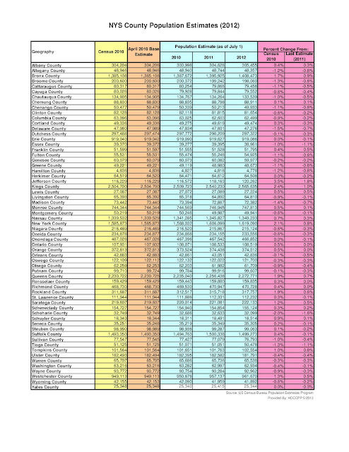
2012 Population Estimates for NYS Counties

The Census Bureau's Population Estimates Program (PEP) produces estimates of the population for the United States, its states, counties, cities, and towns, as well as for the Commonwealth of Puerto Rico and its municipios. Demographic components of population change (births, deaths, and migration) are produced at the national, state, and county levels for each of these geographies.in addition , housing unit estimates are produced for the nation, for states, and for counties.

The population estimates are used in federal funding allocations, as survey controls, as denominators for vital rates and per capita time series, and as indicators of recent demographic changes. One of those surveys that is "controlled" by the estimates is the American Communities Survey (ACS). What that means is that the population estimates provided below for Herkimer and Oneida Counties in the 2012 estimate release will be the base figure (in essence the figure all characteristics are "controlled" to) when the 2012 ACS data is released later this year. With each new release of annual estimates, the entire time series of estimates is revised for all years back to the last census. All previously published estimates are superseded and archived.

Click to enlarge this table of the most recent population estimates for NYS Counties.

Click to Enlarge

Measuring Changes in Racial Composition Over Time: Pre and Post Census 2000

Part of the American landscape is our changing racial composition. The Census Bureau collects race data in accordance with guidelines provided by the U.S. Office of Management and Budget. These data are based on self-identification. The racial categories included in the census questionnaire generally reflect a social definition of race recognized in this country, and not an attempt to define race biologically, anthropologically or genetically. In census questionnaires prior to the Census 2000, people were only allowed to select a single racial identification. As of the Census 2000, people could pick any number of racial identifiers, such as “American Indian” and “White.” People who identify their origin as Hispanic, Latino, or Spanish may also be of any race. Hence comparing pre-Census 2000 to post-Census 2000 race data is generally discouraged given the vastly different measurement processes being used.

The U.S. Census Bureau adheres to the Office of Management and Budget standards on race and ethnicity which guide the Census Bureau in classifying written responses to the race question as follows:
  • White – A person having origins in any of the original peoples of Europe, the Middle East, or North Africa.
  • Black or African American – A person having origins in any of the Black racial groups of Africa. 
  • American Indian or Alaska Native – A person having origins in any of the original peoples of North and South America (including Central America) and who maintains tribal affiliation or community attachment.
  • Asian – A person having origins in any of the original peoples of the Far East, Southeast Asia, or the Indian subcontinent including, for example, Cambodia, China, India, Japan, Korea, Malaysia, Pakistan, the Philippine Islands, Thailand, and Vietnam.
  • Native Hawaiian or Other Pacific Islander – A person having origins in any of the original peoples of Hawaii, Guam, Samoa, or other Pacific Islands.
So despite the drastic change in how race was self-defined in the pre- and post- Census 2000 world, I do offer the following glimpse into what this has shown us for changes in minority population composition, in this case for the Greater Utica area. Below are three maps that show block group level minority data for the 1990, 2000, and 2010 censuses. Minority is a term used by demographers that identifies any population that is not white and non-Hispanic. Note the changes you can see between the 1990 and 2000 censuses particularly, since that was the period when the self-definitional process changed. I will post similar maps for the Greater Rome area in the future, and these maps are available on our MAPS page as well.

1990 Minority Population Greater Utica Area (Click to Enlarge)
2000 Minority Population Greater Utica Area (Click to Enlarge)
2010 Minority Population Greater Utica Area (Click to Enlarge)


Tuesday, May 21, 2013

NYS DOL: Mohawk Valley Labor Market Profile (April 2013)

Information from the Department of Labor on the current employment, unemployment and market sectors for our region.


Monday, May 20, 2013

Small Business Week in Herkimer County: May 19th to May 25th

The Herkimer County Chamber of Commerce has declared this week Small Business Week in Herkimer County.According to an article in the Little Falls Times this is the second time the county has embraced this event. Most of what follows is from that article.

During a press conference at the Herkimer County Chamber of Commerce Office earlier this month, Legislature Chairman Vincent Bono read a proclamation that announced the county would participate in the May 19 to 25 observance of National Small Business Week. “Since 1968, the Herkimer County Chamber of Commerce has been assisting businesses to grow and has created a positive environment for businesses as they create jobs, support taxes and plan local events. We want to thank them for all they do,” said Bono. “Small businesses are the cornerstone of our community and we should support them every chance we get. What makes them such a commodity is they help add a better quality of life for Herkimer County.”

This year marks the second year for Small Business Week in Herkimer County. “Last year, Small Business Week wasn’t heavily promoted with as many events, but this year the county is making its first attempt at doing it properly,” said Herkimer County Chamber of Commerce Executive Director John Scarano. “Small business in our community is paramount. Ninety-nine percent of the businesses in Herkimer County are considered small businesses and small businesses make up this county. They give to us and we need to give back to them. At least one week out of the year we need to show our support,” he added. “It’s an obvious point in economic development that small business drives the train,” said Herkimer County Administrator James Wallace.

As a way for the county to show its support the Chamber is teaming up with title sponsor Herkimer County Community College and community sponsors Adirondack Bank, NBT Bank, the Herkimer Area Resource Center, Remington Arms and First Source Federal Credit Union to promote a week of events.

A full schedule of events appears on the Chambers facebook page, and a listing of various discounts available at small businesses in Herkimer County is also available.

Click to Enlarge

Friday, May 17, 2013

Community Indicators Projects Gets a Facelift !

In a previous post I talked about the Community Indicators Project which is sponsored by the Leadership Alliance for a Vital Community (LAVC). The project examines data and trends from a number of governmental and other sources to illuminate the state of the economy and educational system, explore the condition of families and youths, and identify the complex challenges facing our communities.

Just a few days ago the site got a facelift and updated data added to their data portals  Among the new things available for the data user are:

  • A Nonprofit Portal which allows organizations to share information about their projects that tie to specific indicators.  Other interested organizations can also comment on existing entries and share their similar work or ask for help;
  • The “What’s New” section links to news releases that feature specific data;
  • Grants Impact” (located in the second column) links to The Community Foundation’s new website where we feature grant stories and initiative area information;
  • You can now customize charts within each "indicator" by physically clicking on a limited number of city or county names you want to potentially use for data comparison.
To view a complete tutorial guide on the indicators and how the site works, please go to Using the Site webpage. In the meantime the Indicators Project seems like a great place for agencies in need of data to start their search!

Thursday, May 16, 2013

MAP: Cold War Travel Restricitions in Oneida County (1953)

According to a map posted on Slate.com, Soviet citizens visiting the US in the 1950s would have had lots of things to see in Oneida County, as long as they all were able to be seen in Utica ! Quoting largely from the Slate article, the restrictions were because a National Security Council directive, issued on Jan. 3, 1955, that allowed some “Soviet citizens in possession of valid Soviet passports” into the country, while extending controls previously placed only on visiting Soviet diplomats and official representatives to apply to their travel as well.

The map below shows where Soviet citizens, who were required to have a detailed itinerary approved before obtaining a visa, could and could not go during their time in the United States. As you can see, all of Oneida County appears to be in a restricted zone (the green colored areas in central NY State); this was undoubtedly the result of Griffiss Air Force Base being located in Rome. However one notable except was made for travel purposes. Soviet travel to the City of Utica was, in fact, allowed despite it being located in a otherwise "no-traveling" area.
Click to Enlarge
The restrictions established in 1953 mirrored Soviet constraints on American travel to the USSR. Both the United States and the Soviet Union had closely controlled the movement of all foreign visitors since World War II. A 1952 law in the U.S. barred the admission of all Communists, and therefore of Soviet citizens. (An exception was made for government officials.) As of early 1955, citizens of either nation could enter approximately 70 percent of the other’s territory, including 70 percent of cities with populations greater than 100,000. Travel restrictions on Soviet private citizens stayed in place, enforced by the Departments of State and Justice, until the Kennedy administration unilaterally lifted them in 1962 as a symbol of the openness of American society. 

Census 2010: Racial and Hispanic Breakdowns Within Regional Municipalities

One of the pieces of data generated by the decennial census done in 2010 was information on the racial and ethnic composition of our population. Below is a table showing the breakdowns for some of the race categories, as well as the Hispanic population counts, for each town or city in the region. Please note that race does NOT include the category of "Hispanic". Being Hispanic is considered an ethnicity within the census data, and thus is measured and reported independently of race.

Click to Enlarge

Wednesday, May 15, 2013

Deer Harvest Reports: Data from the NYS DEC

Deer harvest reports are useful because deer hunters use them to identify the densest deer populations. Some states, like New York, even break down their reports by county, game type and hunter type, or show them over time so that you can identify trends. The people at Guided Deer Hunts have put together a compendium of these reports on their website.

Most deer harvest reports are funded in part by the purchase of hunting licenses and tags. A previous post on this blog showed the number, the types, and the revenue generated by various hunting and fishing licenses purchased in Herkimer and Oneida Counties during the 2010-2011 season. Funding that comes from other government resources that help to generate these harvest reports has been cut drastically or eliminated altogether in many states. As a result some states have not updated their deer harvest statistics for a couple of years due to a lack of funds.

Hunters provide an important service to the rest of the community by controlling the state's deer herd and by reporting information. Most states collect the information from ear tags on harvested deer. Other states may also require harvest report cards from hunters. Most hunters follow through with their responsibility to report deer they harvest, and they believe reporting is important. The harvest reports are reviewed by the state and used to access the impact of last years harvest. This helps them determine possible changes to next year's license allocation, bag limits, season lengths and policy changes.

The New York State Department of Environmental Conservation has put out its Deer Harvest Summary and it contains some very interesting data. The information on harvests is available on a county basis, and in some cases by town.  Below are tow maps from the NYS Report, showing the total deer harvest and the "take versus take objectives" for 2011.
Click to Enlarge
Click to Enlarge

NYS Counties' Owner Occupied, Rental, Seasonal and Vacant Housing

A look at national housing occupancy data from the 2010 Census shows some interesting patterns for seasonal housing and vacancy rates. Of the fifty states, nine states had gross vacancy rates greater than 15 percent in 2010. Of these nine states, three were located in the Northeast (Maine, Vermont, New Hampshire), three in the South (Florida, South Carolina, Delaware), and three in the West (Arizona, Alaska, Montana). Though these states had the highest gross vacancy rates, it is of note that all but South Carolina had a higher-than-average proportion of vacant units classified as “Vacant—for seasonal, recreational, and occasional use” in 2010.

This class of units is more commonly referred to as “vacation” homes, but this category also includes units occupied on an occasional basis as corporate apartments and other temporary residences where all household members reported their residence was elsewhere. On a percentage basis, Maine (16.4 percent), Vermont (15.6 percent), and New Hampshire (10.4 percent), three northern New England states, topped the list of states with the most vacant units classified for seasonal, recreational, and occasional use. In terms of absolute numbers, Florida was the clear leader in the number of these homes (657,000), followed by California (303,000), New York (289,000), and Michigan (263,000).

Below is data for counties in New York State from the 2010 Census showing owner occupied housing unit information and vacancy data, particularly for seasonal and rental properties. 

 Census 2010: NYS Counties' Owner Occupied, Rental, Seasonal, and Vacant Housing

Click to Enlarge