Thursday, August 28, 2014

Regional Non-Profits and Tax Exempt Organizations

TaxExemptWorld.com is a website that serves as an information service. In their words, the website "is not affiliated or associated with any tax exempt/nonprofit organizations. The data on this website is public record information made available by the Federal Government and was most recently updated on 1/5/2014. There are over 2 million tax exempt/nonprofit organizations with Income of over $3 trillion dollars and Assets of almost $7 trillion dollars!"

While I have no way of knowing how accurate those figures are, the website does provide some interesting information on tax exempt organization by county. Data for both Herkimer County and Oneida County tax exempt and nonprofit organizations are on the website. The data includes the total number of organizations, their income, and the value of their assets within each county. There is also a full listing of what organizations are considered tax exempt or non-profit, but to be honest the list appears a bit out of date despite the claim that it was updated in January of this year.

Regardless, it is another resource when researching the impact of local non-profits. Within the ACS of the US Census Bureau, workers are classified such that those that workers within charitable, nonprofit, or tax exempt organizations can be pulled out and examined as a group. Below are just a few of the types of data that you can find allowing for a comparison of employees who work for nonprofit organizations and those that work in any other type of job.

For example, roughly 12,500 people work for nonprofits in the region. This is about 9% of the workforce, or one out of every eleven jobs.

Click to Enlarge

The non-profit workforce is overwhelmingly female - far more so than the rest of the workforce. Two out of every three workers in the nonprofit sector are female. Among all other workers, less than half of the rest of their workforce is female.


Both nonprofit workers and the rest of the workforce have similar experiences with marriage. Roughly two out of three have ever been married, and around half are presently married.


In terms of a variety of social and cultural factors, more of the nonprofit workforce is black, and more of it is disabled, than compared to the rest of the workforce. They are less likely, however, to be Hispanic, or to be foreign born.

Click to Enlarge
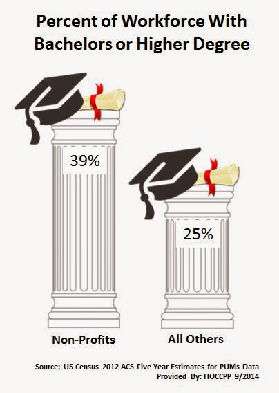
One of the areas where nonprofit employees (as a group) clearly out perform other workers is in terms of educational attainment. Compared to for-profits employees, governmental employees and self employed workers, employees of nonprofits are considerably more likely to have a bachelors degree or higher. Nearly 40% of nonprofit workers have a bachelors or higher, whereas only about a quarter of the rest of the workforce has a similar level of education.

Wednesday, August 27, 2014

The Relative Value of $100: A Countrywide, and Statewide, Comparative Look

The Tax Foundation recently recently released a map showing the relative value of $100 in each state of the US. Because average prices for similar goods are much higher in California or New York than in Mississippi or South Dakota, the same amount of dollars will buy you comparatively less in the high-price states, or comparatively more in low-price states. Using data from the Bureau of Economic Analysis they adjusted the value of $100 to reflect how prices are different in each state.

Click to Enlarge
 As you can see, $100 nationally is only worth about $86 worth of purchasing power in New York State.

They also did a similar map for the MSAs (think urban areas) in the country. Herkimer and Oneida Counties combined compose the Utica Rome MSA. The Utica Rome MSA actually has a purchasing power of $107.53 for that same $100 mentioned above. This would suggest that the cost of living is much lower here than for the rest of NY State.


Monday, August 25, 2014

Working 9•2•5 : Differences Between Full Time Workers Based on Their Hours of Work

Regionally there are some 145,000 people in the workforce of the combined counties. Of those people, slightly more than 60,000 work full time - meaning roughly 8 hours a day or 40 hours per week. The traditional view of the average worker is that they have a "9 to 5" type job - getting to work by 9 AM and leaving around 5 PM. The rest of the full time workforce typically might begin anywhere from noon, to maybe as late as 6 PM. The former group I am referring to as "9•2•5ers"; the latter as nontraditional work hours employees.

To begin with the idea that people work typically 9 to 5 is not really true - the majority of full time workers regionally begin their work day between quarter to 7 and quarter after 8 in the morning. They then work 7 to 8 hours and head home. These "9•2•5ers" are actually quite a bit different from the full timers working nontraditional hours. The infographic below provides a look at the 9•2•5ers and their nontraditional brethren.


Part 1

Click to Enlarge


Part 2

Click to Enlarge


Wednesday, August 20, 2014

Interactive Graphic on Where We "New Yorkers" Come From

A little while back the New York Times posted an article on where people in each state came from - how many were native born and how many came from other places. The link above will bring you hopefully to the interactive New York State graphic which allows you to point to a time line within each category and see what percent of New York's population came, for example, from southern states at that time.

Visit this interactive graphic and note the changes we have seen over the last 100 or so years!

Click to Enlarge

Tuesday, August 19, 2014

Multigenerational Families: A Local Look


Both the New York Times and the PEW Research Center recently have looked at multi-generational families and thier role in the local social fabric. According to PEW, a record 57 million Americans, or 18.1% of the population of the United States, lived in multi-generational family households in 2012, double the number who lived in such households in 1980.


For their report, multi-generational households included households with:
  • Two generations: parents (or in-laws) and adult children ages 25 and older (or children-in-law); either generation can “head” the household
  • Three generations: parents (or in-laws), adult children (or children-in-law), grandchildren
  • “Skipped” generations: grandparents and grandchildren, without parents
  • More than three generations
This is a more expansive definition than used by the Census Bureau, which basically only calls a household "multigenerational" if it has three or more generations of a family living together.

Below is an infographic using the more expanded definition for our region. The data comes from the 2012 ACS Five Year Estimates based on the PUMs data for our region. The PUMS data covers about 80% of the region's population, excluding basically the southern most portions of Oneida and Herkimer Counties.

Click to Enlarge

Wednesday, August 13, 2014

A Regional Look at Recent Love and Marriage: Births and Marriages in the Past 12 Months

The infographic below is based on the 2012 Five Year Estimates of the American Communities Survey. Geographically it is based on the two primary PUMAs covering most of our two county region. It provides some insight into recent marriages and births over the past twelve months prior to the survey response.

Click to Enlarge

Tuesday, August 12, 2014

New Maps: 2012 Poverty Maps by Block Group

New maps have been added to the Maps Page ! Just click on the Maps Page link above and look under the 2012 American Communities Survey Maps to find two new maps on poverty by block group for both Herkimer and Oneida Counties.


The LEAST and MOST Expensive States in Which to Own a Car

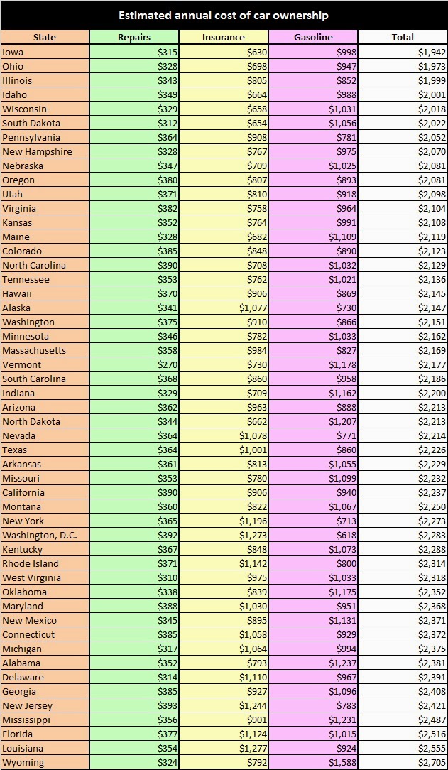
Bankrate analyzed the cost of gasoline, repairs and insurance in all 50 states and the District of Columbia. Three components were added together to get the total annual cost of owning a car - repairs costs, insurance costs, and totally annual gasoline expenditures. Labor and parts data were provided by CarMD.com, while gas spending was calculated with statistics from GasBuddy.com and the Bureau of Transportation Statistics. Insurance costs were compiled from National Association of Insurance Commissioners statistics.

Here's a state-by-state breakdown.


Monday, August 11, 2014

New York Times Article on Utica as a Refugee Haven

This article from the New York Times is very insightful into the life of refugees that have made their way to Utica and begun anew. It's well worth the read ! The article focuses on Sadia Ambure, a junior in high school.

"Sadia’s family belongs to the Mudey clan and over 100 extended family members live within blocks of one another. Family ties are everything, yet Sadia and her sisters have stitched together American and Somali Bantu identities. She keeps Steve Madden boots in her school locker to wear under skirts that were ordered from Somali Bantu catalogs. She covets Subway sandwiches — and occasionally hides one in the refrigerator — but is devoted to her mother’s goat stew. She wants to try her hand at modeling, but so far her mother, who has the final word on everything — even a trip to the movies — has said no."


Friday, August 8, 2014

A Quick Regional Look at Disabilities

One of the more difficult pieces of data to get access to over the years has been data on disabilities. To begin with, disability information is typically self-reported, as opposed to agency or service identified. Second, there just hasn't been a good source for this information down to the local level - until recently with the advent of the American Communities Survey.

Below are three graphs. The first is a simply pie chart showing how around one out of every eight citizens (13%)  regionally claim to have a disability.

Click to Enlarge
Next, the bar chart below shows the number of disabilities claimed within six classifications. Some of the almost 32,000 people regionally that indicated that they have a disability may, in fact, have claimed several different disabilities, so the total number of disabilities shown below is naturally higher than the total number of people claiming to be disabled.

Click to Enlarge
And the last bar chart is similar to the one above, but in  his case it focuses on the elderly, those age 65 or older. I offer it as an example of how the data might be looked at further. Hopefully such a look will come with input from those that find the data particularly useful!

Click to Enlarge

Schedule of American Communities Survey Releases

From the Census Bureau:

We are pleased to announce that the 2013 ACS 1-year estimates will be released on Thursday, September 18, 2014. The 2013 ACS 1-year estimates will be available for the nation, all states, the District of Columbia, Puerto Rico, every congressional district, every metropolitan area, and all counties and places with populations of 65,000 or more.

The 2011-2013 ACS 3-year estimates are scheduled for release on October 23, 2014. The statistics are derived from three years of data collection cover all geographic areas with populations of 20,000 or more.

The 2009-2013 ACS 5-year estimates are scheduled for release on December 4, 2014. The statistics are derived from five years of data collection cover all geographic areas regardless of size, down to the block group level.

The Public Use Microdata Sample (PUMS) files for each ACS release will be posted one to two months after each public release.

Thursday, August 7, 2014

The Long and Short of Owning and Renting Regionally

One of the things I have been trying to take a look at are the longer terms trends in our area by using older data sets (i.e. old census files) and comparing them to newer ACS data. There are, of course, limitations - changing definitions confound these efforts as much as the lack of data sometimes does !

That aside, I was able to assemble some information on housing tenure I thought was interesting, allowing for some comparisons between short versus long term home owners (those that have owned their homes for 10 years or less versus those that have owned them for more than 20 years), as well as short versus long term renters (those that have been in the same apartment five or less years versus those that have lived in the same apartment 10 or more years).

Looking at the patterns since the 1970 Census, you can see how there has been a decline in both Herkimer and Oneida Counties in "new" owners. In both counties we find that the percent of home owners that have been in their current home for 10 or less years has dropped - from about 42% to 36% in Herkimer County between 1970 and 2010, and from 45% to 39% in Oneida County over the same time period.

Herkimer County Home Owners 1970 to 2010

Click to Enlarge

Oneida County Home Owners 1970 to 2010

Click to Enlarge

At the same time, there has been an increase in the percentage of home owners that have stayed in their homes for the long haul - namely those that have lived at the same address in excess of the past 20 years. In Herkimer County the percentage rose from around 34% to 39% and in Oneida County it went from 29% to 39% over the last 40 years.

We find a somewhat opposite trend (albeit a small one) when looking at apartment dwellers in both counties. In both Herkimer and Oneida Counties we find slightly more people renting in the short run (in this case the shortest period I could measure in all 5 censuses was the prior 10 years so keep that in mind!), and slightly fewer people in life long rentals of, say more than 20 years.

Herkimer County Apartment Dwellers 1970 to 2010

Click to Enlarge
 

Oneida County Apartment Dwellers 1970 to 2010

Click to Enlarge

Since there are limitations in getting  at the older data, I wanted to try to learn a little more about those people that own and rent right now, as opposed to the past. To do this I delved into the ACS 2012 Five Year Estimates for the two PUMAs that make up the majority of the two county region.

First, looking at home owners, there was some interesting comparisons to be found among the family types and their participation in the workforce. Regionally the data suggest that newer home owners are more reliant on having two working people in the home than those that have been established in their homes for a couple decades. And single working parents make up about 18% of new home owners, versus only 8% of established owners. The large 40% slice of the pie labeled "others" for people that have owned their home more than 20 years is mostly people not in the workforce. This is likely retirees and older economically established citizens.

Click to Enlarge

This is somewhat confirmed when we examine households with children present among new versus established home owners.

Click to Enlarge

As can be readily seen, people who have owned their homes for more than 20 years are far less likely to have any children, let alone young children under the age of 6, present. These long term home owners are generally free from the types of family obligations that younger home owners find themselves dealing with. In addition, they are often free of their mortgages as well. As seen below, only four out of every ten longer term home owners still are paying a mortgage, versus eight out of ten among owners who have been in their house for less than 10 years.

Click to Enlarge

When we look at employment data with renters, one piece that seems to leap out its the increased demand that single working parents place on rental properties versus those owning homes. More than 40% of short term renters (those who have only been renting for 5 or less years) are single working parents. Among long term renters more than a quarter (26%) are single parents with jobs. This is two to three times as large a percent as in the case of home owners.

Click to Enlarge

Just as was the case with home owners, short term renters are more likely to have children, and especially younger children under the age of 6, present in the household. Nearly one out of five people (19%) who have been renting for less than five years have children under the age of 6 present in the household - this is identical to their compatriots who are "new" home owners. And similarly, longer term renters are far less likely to have young children in the home.

Click to Enlarge

Affordable housing is something that impacts renters especially hard. HUD defines affordable rental housing on the basis that a household should spend no more than 30% of its income on rent. In our region, nearly HALF of all renters, long and short term, spend more than 30% of their income on rent. And more than one in five spend as much as 50% of their income to pay rent for their apartment.

Click to Enlarge

To get some sense of what that income is, the chart below shows the median household and family incomes for long and short term renters, as well as long and short term home owners.

Click to Enlarge

Tuesday, August 5, 2014

Aggregate Nonprofit Data for NYS Counties

I have gotten several requests lately for data on nonprofits in our region - how many there are, what their economic impact is, etc. I contacted the National Center for Charitable Statistics who provided me with some data that is available by county. It is based on the filing of a Form 990 with the IRS - a Return of Organization Exempt from Income Tax.

Based on that operational definition, here are data for each county in New York for their nonprofit organizations including the of registered nonprofits, the number filing the Form 990, as well as their total revenue and assets. Be sure to note this is only revenue and assets for the organizations that have filed with the IRS for 2014. Often this is less than half the organizations registered as nonprofits - I can't explain that, so I am just noting it !

Click to Enlarge

Monday, August 4, 2014

Regional College Enrolled Foreign Born Population (2012)

The Utica Observer Dispatch had an article today about the challenges facing foreign born refugees when enrolling in college. They cite several difficulties including language hurdles. In an effort to look more comprehensively at the issues brought up in the article. I've put together several graphics based on our regional foreign-born college-enrolled population.

The data comes from the 2012 Five Year ACS Estimates for our regional PUMAs. Click on any of the graphics below to enlarge them and take a closer look at this intriguing population.

Click to Enlarge


Click to Enlarge


Click to Enlarge


Click to Enlarge


Click to Enlarge


Click to Enlarge

Eating on a Food Stamp Budget is a SNAP

When Leanne Brown moved to New York from Canada to earn a master's in food studies at New York University, she couldn't help noticing that Americans on a tight budget were eating a lot of processed foods heavy in carbs.

"It really bothered me," she says. "The 47 million people on food stamps — and that's a big chunk of the population — don't have the same choices everyone else does."

Brown guessed that she could help people in SNAP, the federal government's Supplemental Nutrition Assistance Program, find ways to cook filling, nourishing and flavorful meals. So she set out to write a cookbook full of recipes anyone could make on a budget of just $4 a day.

What she came up with is now online, for free.  Take a look at The SNAP Cookbook. It contains simple, sensible, and delicious things that you could whip up on a SNAP food budget. Here's one I wouldn't mind trying !

Click to Enlarge

In the meantime, here is a comparison of families in Herkimer and in Oneida Counties that depend on food stamps to make ends meet.

Click to Enlarge