
Friday, February 26, 2016
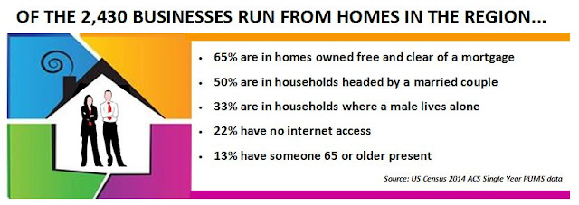
Regional Businesses Located in Households
Based on Census data from the 2014 ACS, here's a look at businesses that are operated out of residential homes in the two county region. Click on the graphic to enlarge it.
Wednesday, February 24, 2016
Children of Foreign Born Parents (2014)
Recently the Urban Institute released an article on the numbers of children with at least one foreign born parent. Below I've provided similar numbers for the state, as well as Herkimer and Oneida Counties.


Tuesday, February 23, 2016
Regional Changes in Group Quarter Populations: 1970 to 2010

For our region, the group quarters population has ebbed and flowed, and in the end, over the last 40 years, it has not actually changed a lot in terms of the total numbers of people living in these facilities. Slightly less than 14,776 people lived in GQs in the Herkimer-Oneida County region in 1970; that's almost the same number as live in GQs today. Click on the chart below to enlarge it.
 |
| CLICK TO ENLARGE |
- Institutionalized GQs include facilities for people under formally authorized, supervised care or custody at the time of interview, such as correctional facilities, nursing facilities/skilled nursing facilities, in-patient hospice facilities, mental (psychiatric) hospitals, group homes for juveniles, and residential treatment centers for juveniles.
- Non-institutionalized GQs are facilities that are not classified as institutional group quarters, such as college/university housing, group homes intended for adult, residential treatment facilities for adults, workers’ group living quarters and Job Corps centers, and religious group quarters.
The chart below shows how each of these components of GQs has changed over time. Click to enlarge it.
 |
| CLICK TO ENLARGE |
What might the differences in these changes be attributed to? Further analysis of the GQs populations suggest several things have impacted both components.
In terms of the Institutionalized GQ population, changes in mental health laws in the 1970s resulted in the release of large numbers of mental health patients from institutional care, thus driving down the numbers for Institutional GQs between 1970 and 1980. Subsequent to that there was a large growth in incarcerated persons, and hence the growth between 1980 and 2000 can partly be attributed to rising prison and jail populations. By around 2000, there was also the impact of the "baby boom" generation as people in that generation began to entire a phase of life where institutional care became needed in some cases. Interestingly, by 2010 baby boomers indeed are beginning to be felt in terms of long term care facilities such as nursing homes. At the same time however, New York State has begun reducing its prison population and as a result the region experienced the closure of correctional facilities. This conflicting push-pull (the growth of baby boomer need for facility access, and the reduction of correctional facilities) seems to have resulted in a temporary lull in institutional demand overall in the last decade.
In contrast, the growth of Non-Institutional GQ populations is quite straight forward. Based on census data, college dormitory populations have more than doubled in the last 40 years clearly driving the steady growth of this component. Between 1970 and 2010, college dormitory populations grew by more than 130%.
Below you can see how nursing home populations have risen (impacting Institutionalized GQ numbers) and how dormitory populations have grown (impacting Non-Institutionalized GQ numbers).
 |
| CLICK TO ENLARGE |
Monday, February 22, 2016
Women Owned Businesses in the Region
Last week I posted about the region's minority owned businesses. Just like those data, data on women owned businesses can also be found in the 2012 Census of Business Owner, and specifically Table SB1200CSA01: Statistics for Firms by Industry, Gender, Ethnicity and Race. Below are just a few tidbits about female owned businesses in the Herkimer Oneida Counties region.


Friday, February 19, 2016
Regional Minority Owned Businesses from the 2012 Survey of Business Owners
The 2012 Census of Business Owners includes data on minority owned businesses. Table SB1200CSA01: Statistics for Firms by Industry, Gender, Ethnicity and Race, provide a plethora of data about these firms, some of which I have tried to capture below. Visit American Fact Finder at the Census Bureau and see what other data exists for these businesses !
The graphics below are based on regional data - meaning the two counties combined.


The graphics below are based on regional data - meaning the two counties combined.


Thursday, February 18, 2016
Projected Openings in Occupations Within the Mohawk Valley: 2012 to 2022
 A while ago I posted on job openings in the Mohawk Valley by occupation through 2020. Note that the "Mohawk Valley" includes Fulton, Herkimer, Montgomery, Oneida, Otsego, and Schoharie Counties combined. The information has been updated an is now available for the period 2012 to 2022.
There are several ways to look at this data. First, and similar to what I did the last time, you might take a look at the actual numbers of jobs being created. Job creation takes into account brand new jobs, as well as hirees selected to replace workers that have left or retired. The chart below shows the top 10 jobs with projected growth from 2012 to 2022 for the Mohawk Valley Region.
 |
| CLICK TO ENLARGE |
Another way to look at these job openings is by the percentage growth they are projected to have. It's one thing to see a projected increase of 900 jobs, but another if those 900 jobs represent only a small percentage of that particular market sector. So as an alternative way to view these projections, here are the top ten projected openings by their percentages of job sector.
 |
| CLICK TO ENLARGE |
Lastly, here is a summation of all of the sectors, their job creation projections, and current salary data.
 |
| CLICK TO ENLARGE |
Wednesday, February 17, 2016
Occupational Attractions: Who Marries Whom By Occupation
When it comes to falling in love, it’s not just
fate that brings people together—sometimes it’s their jobs. Bloomberg.com
scanned data from the U.S. Census Bureau’s 2014 American Community Survey—which
covers 3.5 million households—to find out how people are
pairing up by occupation.
Interestingly, here's how Urban Planners seem to
match up. Click to Enlarge the graphic. Type your occupation into the space on the page to see how you might
match up to your mate, job-wise.
 |
| CLICK TO ENLARGE |
Tuesday, February 16, 2016
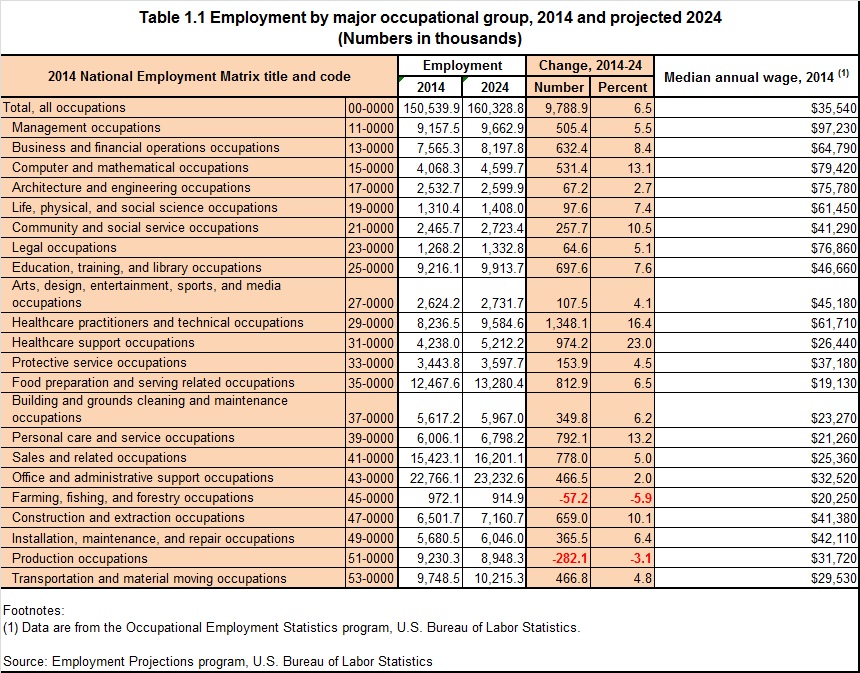
Projected National Job Growth By Occupation (2024)
From the Bureau of Labor Statistics comes projected job growth within various occupations through 2024. The data provides a comparison of 2014 occupational data with the projected changes by the year 2024.
Here are three basic tables found in the Excel spreadsheet download: overall employment by major occupational group; the fastest growing occupations; and the fastest declining occupations. Click each to see them enlarged.
Here are three basic tables found in the Excel spreadsheet download: overall employment by major occupational group; the fastest growing occupations; and the fastest declining occupations. Click each to see them enlarged.
 |
| CLICK TO ENLARGE |
 |
| CLICK TO ENLARGE |
 |
| CLICK TO ENLARGE |
Thursday, February 11, 2016
Trulia Maps Cover Everything from Demographics to Crime to Home Values
Trulia is basically a real estate website but it also has an incredible amount of tools available that would be useful perhaps for grant writing and even program development.These tools can be found for any place/zip code you insert into their search engine. Here's a screen shot below on age demographics for the a census tract in south Utica. Click on it to enlarge it.
You can basically check out any tract by clicking it. Note that the bar at the top of the map allows you to bring up data on any number of topics and subtopics.
So click on this link to the trulia mapping page and see how your neighborhood or town stacks up !
 |
| CLICK TO ENLARGE |
You can basically check out any tract by clicking it. Note that the bar at the top of the map allows you to bring up data on any number of topics and subtopics.
 |
| CLICK TO ENLARGE |
Wednesday, February 10, 2016
How We Travel to Work: An Interactive Map
A couple days ago I posted about an interactive map from Flowingdata.com that showed the times we left for work. They also have one on the mode of transportation we used to get to work. Below is a screen shot of Herkimer County's data. Click on it to enlarge it.
Note that the colored boxes near the top of the map break out this modes into vehicle based modes and non-vehicle based modes. By clicking the boxes (on the actual interactive map) you can toggle each mode on or off...or turn them ALL off but one to see how a county compares to the rest of the state.
So visit this mode of transportation to work interactive map and check out the info for your area !
 |
| CLICK TO ENLARGE |
Tuesday, February 9, 2016
Popular Running and Biking Routes Based on App Tracking

Below is a map of the Valley area (Ilion-Mohawk-Herkimer) showing the running routes popular in the area. Visit the Strava website and see what the biking routes entail, or go to your area to see popular routes!
 |
| CLICK TO ENLARGE |
Monday, February 8, 2016
Interactive Map on Time Leaving for Work
The website Flowingdata.com offers the an interactive version of the map below which shows when people leave home for work. The rates are for
people who have jobs and are 16 years or older. The data does not
include people who work from home. Take a look at how the flow changes by varying the time bar at the top of the map!
Here's what Oneida County looks like between 7:30 and 7:59 on any given workday ! Click on the map to enlarge it.
Here's what Oneida County looks like between 7:30 and 7:59 on any given workday ! Click on the map to enlarge it.
 |
| CLICK TO ENLARGE |
Thursday, February 4, 2016
County Level Health Metrics
The Institute for Health Metrics and Evaluation has provided US County Profiles for every county in the United States. These profiles analyze the performance of all
3,143 US counties or county-equivalents in terms of alcohol use, life expectancy
at birth, smoking prevalence, obesity, physical activity, and poverty using
novel small area estimation techniques and the most up-to-date county-level
information.
Below are summaries of the Herkimer and Oneida Counties data as well as links to their full profiles:
To see the full profiles, click on the county name below:
Overviews of both counties...
Below are summaries of the Herkimer and Oneida Counties data as well as links to their full profiles:
To see the full profiles, click on the county name below:
HERKIMER COUNTY
ONEIDA COUNTY
Overviews of both counties...
 |
| CLICK TO ENLARGE |
 |
| CLICK TO ENLARGE |
Tuesday, February 2, 2016
The Regional Foreign-Born Self-Employed Workforce: 2014
Of the nearly 13,000 employed foreign-born workers in the Herkimer-Oneida Counties region, about 7%, or roughly 900, are self-employed. Below is a breakdown of the top 10 occupations for these foreign-born self-employed workers. You can click the graph to enlarge it.
 |
| CLICK TO ENLARGE |
Because several people have asked
about the "Lab Technicians" category, the actual title of the NAICS
category is “Medical, Dental, and Ophthalmic Laboratory Technicians”. The
definition includes:
- Dental Laboratory Technicians: Construct and repair full or partial dentures or dental appliances. Excludes "Dental Assistants";
- Medical Appliance Technicians: Construct, fit, maintain, or repair medical supportive devices, such as braces, orthotics and prosthetic devices, joints, arch supports, and other surgical and medical appliances;
- Ophthalmic Laboratory Technicians: Cut, grind, and polish eyeglasses, contact lenses, or other precision optical elements. Assemble and mount lenses into frames or process other optical elements. Includes precision lens polishers or grinders, centerer-edgers, and lens mounters. Excludes "Opticians, Dispensing".
Subscribe to:
Posts (Atom)