Thursday, December 31, 2015

A Look at the NYS 22nd Congressional District Census Profiles

Here is a look at the American Communities Survey's profiles for the New York State 22nd Congressional District. the link below takes you to the Census Bureau's American Fact Finder and the four community profiles it offers for the district. It provides comparative numbers for the nation, as well as the state, with the district. Click on the profile you'd like to view below.


Demographic Profile

Social Profile 

Economic Profile 

Housing Profile 


Wednesday, December 30, 2015

Profiles for Every Municipality in Herkimer County Based on the 2014 Five Year Estimates

In a previous post I tried to link to the four ACS profiles for each village, town and city in Herkimer County through the American Fact Finder. As it turned out, I was only able to link to the primary Demographic Profile.

Below, however is a corrected version which now allows you to see each profile, by municipality, by clicking on a link for the type of profile you'd like to view: Demographic, Social, Economic, or Housing. In addition to the municipality's data, each profile also includes the county and state data for comparative purposes, as well as the margins of error. So here are the 2014 Five Year Estimates for Villages, Towns and Cities in Herkimer County.


HERKIMER COUNTY VILLAGE, TOWN AND CITY PROFILES

City Profile Type Profile Type Profile Type Profile Type
Little Falls Demographic Social Economic Housing


Towns Profile Type Profile Type Profile Type Profile Type
Columbia Demographic Social Economic Housing
Danube Demographic Social Economic Housing
Fairfield Demographic Social Economic Housing
Frankfort Demographic Social Economic Housing
German Flatts Demographic Social Economic Housing
Herkimer Demographic Social Economic Housing
Litchfield Demographic Social Economic Housing
Little Falls Demographic Social Economic Housing
Manheim Demographic Social Economic Housing
Newport Demographic Social Economic Housing
Norway Demographic Social Economic Housing
Ohio Demographic Social Economic Housing
Russia Demographic Social Economic Housing
Salisbury Demographic Social Economic Housing
Schuyler Demographic Social Economic Housing
Stark Demographic Social Economic Housing
Warren Demographic Social Economic Housing
Webb Demographic Social Economic Housing


Villages Profile Type Profile Type Profile Type Profile Type
Cold Brook Demographic Social Economic Housing
Dolgeville Demographic Social Economic Housing
Frankfort Demographic Social Economic Housing
Herkimer Demographic Social Economic Housing
Ilion Demographic Social Economic Housing
Middleville Demographic Social Economic Housing
Mohawk Demographic Social Economic Housing
Newport Demographic Social Economic Housing
Old Forge (CDP) Demographic Social Economic Housing
Poland Demographic Social Economic Housing
West Winfield Demographic Social Economic Housing

Profiles for Every Town and City in Herkimer County Based on the 2014 Five Year Estimates

This post has been improved and updated. Please click the link and go to this blog post which has all of the towns and the City of Little Falls data readily available !!


Tuesday, December 29, 2015

Increases in Health Insurance Coverage: By The Numbers

Regionally we have seen increases in the number of people with health insurance coverage, especially since the launching of the Affordable Care Act. More than 15,000 additional people living in Herkimer and Oneida Counties now have health insurance than did five years ago.

The graphic below provides some sense of the changes we have seen since 2009 in the numbers of people who have enrolled in insurance. Click to enlarge the graphic.

CLICK TO ENLARGE

Monday, December 28, 2015

Municipal Level Income Comparisons in Herkimer County: 2014 Versus 2009 Five Year Estimates

The three primary ways that the Census Bureau measures income is by median household income, median family income, and per capita income. Median household income is basically the "middle income value" of all households in a given municipality. Households include anyone sharing a housing unit and living together regardless of their relationships. Median family incomes are the "middle income value" of all families, meaning related people living in a household. Measuring income on a per capita basis is taking income and dividing it by the total number of people living in a municipality, regardless of age.

Below is a chart showing the 2014 and the inflation-adjusted 2009 income measures for households, families and per capita within each municipality in Herkimer County.

Please note that NONE of the municipalities show any SIGNIFICANT changes from 2009 when it comes to any of the income measures. Any differences in income (whether large or small, positive or negative) between 2009 and 2014 are within the margins of error for the data.

CLICK TO ENLARGE

Monday, December 21, 2015

Work Status In the Past Decade Among Single Parent and Married Couple Families

The charts below show the average annual percent of single parent and married couple families by work status. These data were averaged over the last ten years, from 2005 to 2014 for each family type (single moms, single dads, and married couples).

CLICK TO ENLARGE


CLICK TO ENLARGE

Friday, December 18, 2015

Regional Changes in the Affordability of Renting an Apartment (2005-2014)

Previously I have posted about the "long and the short" of owning and renting regionally. The American Communities Survey data now lets us look at that trend over the last decade (2005 to 2014) and in this post I wanted to look at the affordability of renting an apartment in the region.

The percentage of the regional population living in apartments is hardly static. In fact it has grown pretty substantially in the last decade. As seen below, while around a quarter of the regional population were apartment dwellers in 2005, last year  almost one in three (32%) opted for living in an apartment.

CLICK TO ENLARGE

Apartment living, and the percent of the population who now occupy an apartment, has increased steadily over this period. Whereas some 70,000 people lived in apartments in 2005, as many as 90,000 do now.

Given this growth in apartment living, affordability is something that comes to mind - are people able to find affordable apartments based on their income? HUD defines affordable rental housing on the basis that a household should spend no more than 30% of its income on rent. Fortunately the ACS lets us break out the costs of rent by household income. For the most part, very few apartment based households with incomes in excess of $50,000 find themselves spending 30% or more for rent. As a general rule, fewer than 5% of this upper income apartment dwellers spend 30% or more of their income on rent. For them this pattern varies very little over the past decade.

However, those with incomes of less than  $50,000 find themselves facing a different trend. Below is a chart showing the percent of renters paying 30% or more for rent over the past ten years broken into three household income groups: those making less than $20,000 per year; those making from $20,000 to $34,999, and those making from $35,000 to $49,999.

CLICK TO ENLARGE

Two things should be apparent from this graph.

First, the less income you have the more likely you are to spend 30% or more on rent. Typically four out of every 5 households in the "under $20,000 income" bracket continually have to spend 30% or more of their income on housing.

Second, affordability is a growing issue for those in the lower-middle income brackets. While those in the lowest income bracket (under $20,000) have seen a slight increase in the percentage of renters struggling with affordability in the last decade (less than .7% increase per year), those making anywhere from $20,000 to $50,000 have seen their numbers grow by 2.1% annually - three times that of the lowest income group!

This has resulted in a doubling (2X) of the percentage of renters who make $20,000 to $34,999 that pay 30% or more of their income for rent, and a quintupling (5X) of renters who have household incomes of $35,000 to $49,999 that now pay 30% or more for rent.

As more ACS data becomes available it will be interesting to see if this pattern changes.

Thursday, December 17, 2015

Slip Sliding Away: Changes in Poverty and Near Poverty Populations (2009 vs 2014 ACS Data)

After the Great Recession of 2007-2009 many areas in the country saw rises in poverty rates. Herkimer County was no different. The poverty rate in Herkimer County rose by about a third after that time period, as measured by comparing the 2014 Five Year ACS Estimates with the Five Year Estimates from 2009.

CLICK TO ENLARGE
While the US poverty rate rose from about 13.5% to 15.6%, and New York State saw a similar increase, the Herkimer County poverty rate went from 12% to almost 16% of its population.

Poverty does not affect people equally - that is to say, poverty rates when viewed by age groupings vary greatly. Younger age groups have always had much higher poverty rates that older age groups. Poverty rates for people under the age of 25 are often twice that of people, say, ages 35 to 54. This is easily illustrated in the graphic below which shows people in Herkimer County by age group who are in either deep poverty or above deep poverty but still in poverty.

CLICK TO ENLARGE
Note a few things...
  • Younger people have overall poverty rates typically two times that of prime working age people
  • Generally the overall poverty rates by age appear to be akin to something of a ski jump, declining as people get older until they reach around age 75
  • "Deep poverty", which means those whose household income is less than half the poverty income guideline,  affects younger people vastly more than older people
Now as I first noted, poverty rates have climbed since the Great Recession. Let's take a look at how they increased within our most current data's age groupings. Above is the 2009 five year estimates; here's the 2014 Five Year ACS Estimates for comparison.

CLICK TO ENLARGE
First, note that he percentage of the age groups in poverty is much greater in 2014 than it was in 2009. And, as you can see, the pattern between age groups is similar to what was shown earlier...sort of a "ski jump" look to the distribution. Note that the 18 to 24 year olds' data doesn't show a spike as it did in 2009.

Both the 2009 and 2014 five year estimate distribution of poverty among age groups is very similar to the New York State and the US data. While not showing their data here, the state and national data have very similar distribution patterns among ages as are found in Herkimer County - in 2009 they show a spike for 18 to 24 year olds, and generally they have the ski jump appearance shown above.

But something very different is happening in Herkimer County when it comes to people in poverty, and especially to people near poverty. As I pointed out, poverty rates have risen across the country, and have jumped in Herkimer County from 12% to nearly 16% in the last five years.  I wanted to take a look at how people in "near poverty" fared over the same period.

Near poverty is defined as those at 100% to 150% of the poverty guidelines. There is a great previous post that has a lot of information about this population called Living on the Edge if you want to know more about people in near poverty. Suffice to say that they are often the "working poor" that are struggling to stay afloat fiscally.

 The graph below shows how much change there was between the 2009 Five Year, and 2014 Five Year  estimates for people in poverty, and in "near poverty".

CLICK TO ENLARGE
As we saw in the first graphic, poverty rates rose across the country - for the US and New York, the poverty rates rose about 2% points; for Herkimer County it rose around 4%. But note the changes in "near poverty" rates for all three entities. While small increases were seen in the percent of the population that slipped into "near poverty" nationally and in New York (both increased slightly less than 1%), the percent of the population in Herkimer County that are now in "near poverty" dropped by more than 2%. So at the same time as the country and state have seen increases in poverty and near poverty, the county has experienced a substantial increase in poverty but a fairly large decline in the percent of people in "near poverty".

Perhaps a better way to see this is to look at the changes between 2009 and 2014 by age groupings. This last chart shows how each age range has changed in the last five years based on their percentage of people in "near poverty".

CLICK TO ENLARGE
Almost ALL of the national and state data by age groupings shows at least marginal increases in the percent of people living in "near poverty" in the last five years. Within Herkimer County, however, there are substantial declines among every age group but ONE.

So does this decline of people in "near poverty" suggest that fewer residents in Herkimer County are now in danger of slipping into poverty? Probably not. To be sure, additional data would need to be examined to determine exactly where those in "near poverty" have gone - have they risen out of this designation? Or have they slipped below the poverty line?

Monday, December 14, 2015

A Lesson in MOE (Margins of Error): Poverty in Herkimer County Towns, Cities, and Villages

So with each rendition of the American Community Survey (ACS), we get to see something called the "margin of error", or the MOE for short. The MOEs show us the 90% confidence interval we have that the ACTUAL thing we are measuring is within ONE MOE of the estimate. So for example, if the median age is 42.1 years and the MOE for median age is 1.0, then we are 90% confident that the actual median age is somewhere between 41.1 and 43.1 years of age. So how might we use the MOEs to our advantage when trying to say something about the data ? Well here's an example using the poverty rates for individuals within each municipality in Herkimer County.

The first thing you might want to know is what the overall poverty rate is for Herkimer County, and its margin of error. This first chart shows you that information based on the 2014 Five Year ACS Estimates. The estimated poverty rate for the county is 15.9%, with a margin of error of +/- 1.3%.


CLICK TO ENLARGE
Next, we can see what each of the municipalities data looks like overlaid on this same chart.Note that the estimated number is represented by the black boxes, the margins of error on either side of the estimate by the lines.

CLICK TO ENLARGE

So what does this tell us ?Well, let's start by looking at the communities whose MOEs and estimates fall entirely below the shaded area that represents the county's poverty range. All in all, six towns and one village fall completely below the county poverty range - the towns of Fairfield, Litchfield, Newport, Schuyler, Stark, and Webb, and the village of Poland. All of these areas have poverty rates and MOEs which qualify them as being significantly lower that that of the county.

CLICK TO ENLARGE
On the other end of the spectrum, only one municipality has a poverty rate and MOE that place it significantly higher than the county's poverty rate - the village of Ilion.

CLICK TO ENLARGE
All of the remaining municipalities basically have poverty rates that are not particularly different than the county as a whole. So when you use the ACS data, pay attention to the relative nature of the MOE - do they extend the 90% confidence intervals such that it lies within the range of the county as a whole? Or is it wholly below or above that range, and suggest that there is a significant difference between they two entities you are comparing?

Thursday, December 10, 2015

One Versus Five Year Estimates: Measuring Regional Poverty

With the release of the 2014 Five Year Estimates by the Census Bureau, we now have the ability to compare changes between two five year periods: 2005-2009, and 2010-2014. For the region (Herkimer and Oneida Counties combined) we have always been able to compare the one year estimates. These have been available since 2005. So why would someone want to compare five year estimates then?

Both the one year and the five year estimates have certain advantages. If you are interested in the MOST CURRENT DATA, then you should look at the one year estimates. These are the most up-to-date data available. However, if you'd like the most accurate data, then the five year estimates are the better answer. They have lower margins of error due to a larger sampling taken over five years and provide the most precise measure of the data.

Let's compare the two on a single graph. Below is a chart showing the one year estimates (in blue) from 2005 to 2014 for our region for the percentage of people in poverty. As you can see, there is a slight decline in poverty prior to the Great Recession (from 2005 to 2007), and then a huge spike following that event (note the rise from 2007 to 2011).

CLICK TO ENLARGE

In comparison, looking at the single year data may not give you the best idea of what has occurred. Because of the annual fluctuations, the overall trend gets a little lost - especially when you look at the last five years from 2010 to 2014. There are huge variations year to year, so how are you to get an accurate view of what is happening with poverty? This is where the five year estimates are helpful.

In looking at the 2009 Five Year Estimate and comparing it to the 2014 Five Year Estimate, you can see that there has been a substantial (indeed, a statistically significant) change between these two periods.In the last half of the last decade the poverty rate was at 14%; over the last five years the rate is now 16.4%.

PLEASE NOTE: THE FIVE YEAR ESTIMATES ARE NOT AVERAGES OF THE INDIVIDUAL FIVE YEARS. Rather, the data is collected over the five year and then measured as a whole.

In conclusion, both tools - the single year and the five year estimates - offer different advantages. Which one you prefer to use depends on what you are trying to measure !

Tuesday, December 8, 2015

Comparing Five Year Estimates of Median Income for Households

A comparison of municipalities' median household income changes between 2009 and 2014 shows that only six municipalities show actual income growth in the region. The chart below shows the six municipalities and compares their median household incomes found in the 2009 Five Year ACS estimates with those in the newly released 2014 Five Year Estimates. These are the only areas in the region where household income, after being adjusted for inflation, has shown significant growth between the two five year periods.

CLICK TO ENLARGE

Supreme Court Case Could Impact Legislative Districts

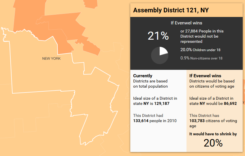
The Supreme Court agreed to hear a case that could alter the way virtually all legislative districts in the United States are drawn. Se t for hearing on December 8, 2015, the case of Evenwel vs. Abbott questions the use of the population equality standard to draw state legislative districts in Texas. The plaintiffs argued for the use of registered voters or potential voters (defined as voting age citizens) instead of the total population in a given district.

On November 5, 2014, the three judge court upheld the population equality standard for use in Texas, but the Supreme Court set the case for argument instead of simply affirming the appellate court opinion. This means that they plan to review the use of the population equality standard to draw districts, and could rule that the appropriate standard counts voters or potential voters instead of total population. 

The question becomes how might that impact legislative districts. Below are what districts in our region might be facing based on analysis from Social Explorer. They provide information on the number of people that would fall out of consideration when districts are drawn. I have grouped them by Congressional Districts, State Senate Districts, and State Assembly Districts.

Congressional Districts 21 and 22


CLICK TO ENLARGE

CLICK TO ENLARGE


State Senate Districts 47, 53, 51 and 49


CLICK TO ENLARGE


CLICK TO ENLARGE


CLICK TO ENLARGE


CLICK TO ENLARGE


Assembly Districts 118, 117, 119, 121 and 101


CLICK TO ENLARGE

CLICK TO ENLARGE


CLICK TO ENLARGE


CLICK TO ENLARGE


CLICK TO ENLARGE


Thursday, December 3, 2015

Mapping Student Debt by Zip Code

According to the Washington Center for Equitable Growth, more than 42 million Americans owe a total of $1.1 trillion in student debt, making it the second-largest liability on the national balance sheet. A generation ago, student debt was a relative rarity, but for today’s students and recent graduates, it’s a central fact of economic life that we don’t know much about.

Mapping Student Debt is changing that. The maps on their page show how borrowing for college affects the nation, your city, and even your neighborhood, giving a new perspective on the way in which student debt relates to income. Below is a map showing student debt for various areas in the region, with Herkimer being highlighted. Click on the map to enlarge the image, or go to the website linked at the beginning of this paragraph to check out your own area's student debt profile.

CLICK TO ENLARGE

2014 ACS FIVE Year Estimates Now Available for ALL Geographies

Each year, the Census Bureau has released three versions of the American Communities Survey (ACS). These have been the 1-Year, the 3-Year, and the 5-Year ACS Estimates. PLEASE NOTE THAT THE 3 YEAR ACS HAS BEEN DISCONTINUED.

The five year estimates are released for EVERY level of census geography (down to the block group level) as well as every municipality (think town, city, and village). FIVE YEAR ESTIMATES ARE NOW AVAILABLE !
 
The most recent Five Year Estimates are a permanent part of this blog in the linked area just below the blog title. A permanent link will take you to the most recent five year estimate post so you can always easily find this important data for both Herkimer and Oneida Counties !

Below are the individual links to the most recent (2014) ACS Five Year Estimate's Demographic, Social, Economic, and Housing Profiles for each county.

Herkimer County ACS Five Year Demographic Profile
Herkimer County ACS Five Year Social Profile
Herkimer County ACS Five Year Economic Profile
Herkimer County ACS Five Year Housing Profile

Oneida County ACS Five Year Demographic Profile
Oneida County ACS Five Year Social Profile
Oneida County ACS Five Year Economic Profile
Oneida County ACS Five Year Housing Profile

Wednesday, December 2, 2015

The Local Growth of "American" as an Ancestral Choice in the ACS

I think this is interesting to see how the regional response to the question of ancestry has changed over time when looking at those that identified as having a single ancestry - "American". While we used to be similar to the rest of the state and country, in the last five years we have seen a huge rise regionally in the percent of people who now say that they are simply "American" when asked about their ancestral past.

Click to enlarge the graph...


CLICK TO ENLARGE

Tuesday, December 1, 2015

Oneida County Teen Assessment Project Survey 2015: Alcohol Use

The 2015 Oneida County Teen Assessment Project (TAP) Survey Report was recently released. The survey, which covers 10 topical areas, includes a variety of questions on alcohol use by teens. Below are several slides highlighting some of the recent finds and trends for teens in Oneida County when it comes to using alcohol. Click on any of the graphics to enlarge them.

Overall alcohol use has significantly declined among teens regardless of their age/grade. It has dropped overall from 54% in 1999 saying that they have ever tried alcohol, to only 36% in 2015.

CLICK TO ENLARGE

 Each of the grade levels have also seen fewer teens ever drinking. The chart below shows the breakdown by grade level over the past 16 years of the survey.

CLICK TO ENLARGE

Among those that use alcohol, fewer are using it "regularly" - a few times a month or more - than at any time in the past. Only one in three teens (33%) that do use alcohol say that they use it at least a few times a month or more.

CLICK TO ENLARGE

 Among all teens, fewer are also going binge drinking - where they drink five or more drinks within a couple hours. So not only are fewer teens drinking, those that are drinking are drinking less often and not as much as teens have in the past.

CLICK TO ENLARGE

To see more about teen drinking trends, you can see the entire report here.