 |
| Click to Enlarge |
Monday, March 31, 2014
Ten for '11: Oneida County's Top 10 Zip Codes For Selected 2011 Income Tax Data
Last week I posted about 2011 County level IRS data. This week I offer the following ten Top 10 Zip Codes tables for various components of that tax data for Oneida County. These include tables on the top zip codes for adjusted gross income, average wages and salary, married couple joint returns, paid tax preparation, itemized deductions, income taxes owed, and refunds. Click on the set of tables below to enlarge them all.
Friday, March 28, 2014
What A Difference A Year (or Two) Makes When it Comes to Population Estimates

Each "vintage" estimate includes revamped estimates for all the prior "vintage" years. With the release of the 2013 estimates, for example, the Census Bureau also releases estimates for each of the years from 2013 back to the most recent census, done in 2010. So there are new estimates for 2013, 2012, and 2011. When the 2014 estimates are released, the Census Bureau will release "readjusted estimates" (my words not theirs) for those previously produced estimates done in 2013, 2012, and 2011. Basically, each time the estimates are released, all the prior years get superseded by a new set of estimates.
This constant revision of the previous released estimates leads me to the statement, "What a difference a year makes!"
Below is a chart of the estimates (in dotted blue) and the Census counts (in red) since 1998 for what the Economic Development offices typically refer to as the "Mohawk Valley" - namely the counties of Oneida, Herkimer, Fulton, Montgomery, Schoharie and Otsego. These estimates are based on the ninth "vintage" year of the intercensal estimates program - in other words, the estimates for 2001, 2002, 2003, etc., through to 2009 are all from the estimates as they were released for vintage year 2009.
In 2010, a new set of estimates were released, adjusted in light of the Census 2010 numbers. These vintage 2010 estimates go all the way back and replace previously released estimates to the year 2001.
I wanted to compare the estimates, as they stood originally for 2009 with what the decennial census counts showed in 2000 and 2010. Note that the 1999 number is from the vintage 1999 estimates, and how it compares to the Census 2000 counts.
 |
| Click to Enlarge |
In the end, if the estimates seem to be habitually lower than what the decennial Census counts show us, how much faith should we have in the estimates we saw recently released? More on this in a future post !
More IRS Tax Data: County Level Information on AGI, Size of Refunds, and Itemization of Deductions
An earlier post provided information about the number of tax returns filed in 2011 for both counties, as well some insight into joint returns, paid preparer returns and the number of dependents and exemptions. Here is some additional information that covers items such as adjusted gross income (AGI), the size of refunds, average amount of taxes owed, itemization, and the number of returns from farms.
Look for a future post showing many of these pieces by zip code.
 |
| Click to Enlarge |
Thursday, March 27, 2014
2013 Population Estimates Released
The 2013 US Census Population Estimates were released today. The Census Bureau's Population Estimates Program (PEP) produces
estimates of the population for the United States, its states, counties,
cities, and towns. Demographic components of population change (births,
deaths, and migration) are produced at the national, state, and county
levels of geography. Additionally, housing unit estimates are produced
for the nation, states, and counties.
These estimates are used in federal funding allocations, as survey controls, as denominators for vital rates and per capita time series, and as indicators of recent demographic changes. With each new release of annual estimates, the entire time series of estimates is revised for all years back to the last census. All previously published estimates are superseded and archived.
The table below shows the population estimates for counties in New York. It comes from the Cornell Program on Applied Demographics, which issues an entire report (viewable through that link) on the estimates.
Wednesday, March 26, 2014
2011 IRS Federal Tax Return Data Summaries for Herkimer and Oneida Counties
The Missouri State Census Data Center has recently released a tool for extracting IRS data from the 2011 IRS Returns. The returns data are aggregated summaries of U.S. federal tax returns (form 1040 et.al) for specific tax years and geographic areas. In this case, they are the 2011 returns and have been disaggregated into State, County and Zip Code geographies. Regional data has been downloaded for further analysis, but I wanted to offer the following sort of first cut look at some of the basics when it comes to those that filed taxes from either Herkimer or Oneida Counties.
Below is a table providing insight into the number of returns, whether they were filed jointly, were filed with a paid preparer, and the number of exemptions and dependents declared by filers. Each of these is broken out by 7 basic adjusted gross income (AGI) categories - those with no income, those between a $1 and $24,999, those from $25,000 to $49,999, those from $50,000 to $74,999, those from $75,000 to $99,999, those from $100,000 to $199,999, and those at $200,000 and above.
As I get other data disaggregated I will post more in the coming days !
Below is a table providing insight into the number of returns, whether they were filed jointly, were filed with a paid preparer, and the number of exemptions and dependents declared by filers. Each of these is broken out by 7 basic adjusted gross income (AGI) categories - those with no income, those between a $1 and $24,999, those from $25,000 to $49,999, those from $50,000 to $74,999, those from $75,000 to $99,999, those from $100,000 to $199,999, and those at $200,000 and above.
 |
| Click to Enlarge |
Tuesday, March 25, 2014
Justice Courts Funds: State, County and Local Shares of Fees and Fines

On the civil side, the Town and Village Courts hear actions seeking monetary awards up to $3,000 and small claims proceedings for awards up to $3,000. These courts also handle landlord/tenant matters that may result in an eviction as well as a money judgment for back rent that is due.
On the criminal side, these courts are authorized to handle matters involving the prosecution of misdemeanors and violations that are committed within the town's or village's geographic boundaries. The Town and Village Courts also conduct arraignments and preliminary hearings in felony matters. In addition, these courts hear Vehicle and Traffic Law misdemeanors and traffic infractions.
As you can imagine, local courts generate a lot of funds from fees and fines. The NYS Comptrollers website provides annual summary reports of these "Justice Court Funds" going back to 2001. If you go to the website, you can select a county and see how much money came through each justice court annually, broken down by the state, county and local shares. Looking over time it is interesting to note that the bulk of local fines and fees end up going to the State after adjudication, followed by the local share then the county share.
Below are several charts showing the total amounts collected by justice courts for Herkimer and Oneida Counties, as well as the percentage that the State takes from these totals, the county receives, and the local jurisdictions get to keep from their justice courts.
|
| ||||
|
|


What seems interesting is the rising share of justice court money that the state of New York continues to take. Whereas in the year 2001 half of the fines and fees collected by justices courts were funneled on through to the state (50% in both Herkimer and Oneida Counties), this percentage has risen considerably. Last year (2013) more than 60% of justice court funds in Oneida County were sent on to the state, while Herkimer County saw 56% of its justice court funds go to the state coffers. Conversely, the local share of these fines and fees dropped off. In Oneida County the local jurisdictions saw their share drop from a high of 42% in 2003 to a low of 33% this past year. Herkimer County justice courts fared somewhat better, although they still saw substantial declines, going from a high of 44% of these revenues in 2008 to 40% last year.
Monday, March 24, 2014
Living Wage Calculator for Herkimer and Oneida Counties

The MIT Living Wage tool is designed to provide a minimum estimate of the cost of living for low wage families. The estimates do not reflect a middle class standard of living. The realism of the estimates depend on the type of community under study. Metropolitan counties are typically locations of high cost. In such cases, the calculator is likely to underestimate costs such as housing and child care. Consider the results a minimum cost threshold that serves as a benchmark, but only that.
Click the appropriate link below to see how either Herkimer or Oneida Counties is doing when it comes to Living Wages in the eyes of MIT. These data are based on information from 2012, however MIT expects to have an updated version of the data available in about a month so check back then as well !
Gallup Poll: Uninsured Rate Continues to Fall

Based on the graph below, the percent of Americans who are uninsured appears to have been declining since even earlier, from around the second quarter of 2011 when it was 17.4%. Since then (other than the spike in the 3rd quarter of 2013) there appears to be a steady decline in those without insurance.
 |
| Click to Enlarge |
According to Gallup, this drop in 2014 could be a result of the Affordable care Act (ACA), which aims to provide healthcare coverage to more Americans through multiple provisions, including federal and state healthcare marketplaces where Americans can purchase health insurance coverage at competitive rates. At the end of February, HHS reported 4 million people have signed up for health insurance coverage through the marketplaces established under the ACA. With the open enrollment period scheduled to close on March 31, the uninsured rate in the U.S. will likely continue to fall.
Regionally, the overall percentage of uninsured residents (the blue line in the chart below) appears to be relatively steady at around 8% of the population. If anything, there appears to be a slight uptick in the numbers since around 2010. What happens to these percentages once post-ACA data becomes available will be interesting to see.
 |
| Click to Enlarge |
 |
| Click to Enlarge |
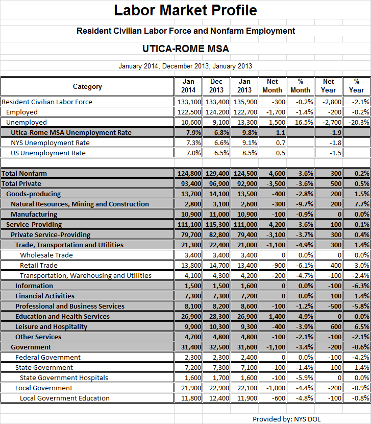
Thursday, March 13, 2014
Labor Market Profile and Unemployment Data for the Mohawk Valley (Jan 2014)
Since it's been six months since I last posted the regional unemployment and labor market profile data, I thought this would be a good time to share these. They came to me through Mark Barbano, our Regional Economist in the
New York State Department of Labor.
You can click each to enlarge them for better reading.
You can click each to enlarge them for better reading.
 |
| Click to Enlarge |
 |
| Click to Enlarge |
Wednesday, March 12, 2014
Historical Food System Data: The Mohawk Valley Food Action Network

Cornell Cooperative Extension of Oneida County received a two-year $100,000 USDA Hunger Free Communities grant which ran from March 2011 through March 2013. This grant supported a broad assessment of the local food system, as well as the formation of a local Food Policy Advisory Council. The results of that food system assessment are summarized in the final grant report from MVFAN.
Among the interesting data provided in the assessment is historical local farm production data going back to 1969. This link gets you to their production graphics and data section of the report, which is filled with breakdowns by various years and by several counties (including Herkimer and Oneida) in central New York. Here's just a couple samples of the types of things you can find there!


Tuesday, March 11, 2014
Regional Characteristics of the Uninsured: 2009 to 2012 ACS Data
 |
| Click to Enlarge |
According to a new Gallup survey, the percentage of Americans without health insurance is on track to reach its lowest quarterly rate since 2008. The results are based on telephone interviews conducted as part of the Gallup-Healthways Well-Being Index survey Jan. 2-Feb. 28, 2014, with a random sample of 28,396 adults, aged 18 and older, living in all 50 U.S. states and the District of Columbia.
Based on this survey, the uninsured rate has fallen to 15.9 percent, Gallup reports. By comparison, the uninsured rate in the fourth quarter of 2013 was 17.1 percent. If accurate, that translates to a difference of about 2.5 million adult Americans. The survey's margin of error was one percent.
 |
| Click to Enlarge |
Local uninsured data appears below. It has been gathered from the 2009, 2010, 2011 and 2012 American Communities Surveys and put together to allow a comparison of the region's uninsured population over the last several years.
 | |
| Click to Enlarge |
Please note that the margins of error, NOT SHOWN HERE, can be rather large in some cases, especially when looking at data broken down into smaller and smaller subgroups. So wild swings in the percent uninsured from year to year for some relatively smaller sub-populations are not necessarily meaningful nor significant !
 |
| Click to Enlarge |
Thursday, March 6, 2014
Changes in Workforce Education: A Historical Review of Education Levels Among People 25 and Older (1960 to 2010)

You can see in the chart below how more than half of all persons age 25 and older didn't even finish high school in 1960 - 61% of residents had a formal education consisting of less than a high school diploma. Only an additional 25% had graduated from high school. So in total 86% of the working age population had a high school education or less. At the same time, only about one in fifteen people had college diplomas, or around 7% of the workforce.
 |
| Click to Enlarge |
By 2010, these numbers change dramatically. Using the 2012 Five Year ACS data, more than one in five people age 25 or older now have at least a bachelor's degree (22%). The proportion of the workforce that has only a high school diploma or less has been cut in almost half, down to 45%.
What's interesting about this change is how "straight lined" it appears to be when you look at it graphically. In the chart below, a regression has been run on the data providing a "best fit" line for both those with high school diplomas or less, and those with bachelors degrees or more. Notice how close each data point is to the regression line. This is an indication of a strong relationship between, quite simply, the passage of time and the increasing number of people getting higher levels of education. Obviously the value of higher education has increased from 1960 to 2010, and the population age 25 and over has pursued this goal.
 |
| Click to Enlarge |
These regression lines generate a statistic called the coefficient of determination, which tells us the percent of the response variable (level of education attained) that is explained by a linear progression of (in this case) time. In the case above, more than 97% of the variation in the decline of people attaining a high school diploma or less, and 99% of the increase in people receiving a bachelor's degree or higher, are explained as reflecting an increase in the value of education over time. This trend line would be an extremely strong predictor of how many of our future workforce will be pursuing higher levels of education.
Wednesday, March 5, 2014
Tracking Poverty By Age Group: 1970 to 2010

But where do we stand today? The government's official measure of poverty shows that poverty has actually increased slightly since the Johnson administration, rising from 14.2 percent in 1967 to 15 percent in 2012.
Interestingly, information from the Columbia Population Research Center shows how national poverty rates have changed over time since the late 1960s, and in particular how these have changed for various age groups as well. They specifically looked at poverty rates among children, working age population, and the elderly over the last 45 years or so. Below is a graph showing the poverty rates for each of those age groups since 1967.
 |
| Click to Enlarge |
Locally, the patterns are a bit different, as seen below.
 |
| Click to Enlarge |
 |
| Click to Enlarge |
Subscribe to:
Posts (Atom)