Showing posts with label migration. Show all posts

Monday, August 10, 2015

A Comparison of AGIs Between Those Migrating Into and Those Migrating Out of Herkimer County (2000-2012)

The chart below shows the difference for each year from 2000 to 2012 of the Adjusted Gross Incomes for those migrating into, and those migrating out of, Herkimer County. These are based on annual IRS returns for the county. The figures below reflect the differences in AGI for those moving in versus those moving out of the county. So, in 2000 for example, the AGI of those coming to the county was about $500 less than those leaving the county. As you can see, in most years those moving into the county appear to have higher AGIs than those leaving.

Click on the graph to enlarge it.

CLICK TO ENLARGE

Friday, August 7, 2015

Herkimer County Migration Based on IRS Returns

One of the key components for estimating migration impacts on population are IRS records. As people move and relocate, IRS records are used to track their entry into, or exit from, communities. The graph below shows the net gains and losses for Herkimer County based on these records.

One thing to note: the 2012 data was tabulated in a manner considerably different than that of previous years.

 In prior years the filer's ID was track and population migration was attributed based on previous household information. In 2012, as an effort to get more accurate data, not only is the filer's ID tracked, but also their dependents, thereby providing a more precise picture of how many people in a household may have relocated from one community to another.

Click the graph below to make it larger.

CLICK TO ENLARGE

Tuesday, February 10, 2015

Percent Of Naturalized Citizens in Herkimer County By Year of Naturalization

Approximately 40% of the naturalized citizenry of Herkimer County were naturalized in the last 15 years. Click to enlarge the graphic.


Click to Enlarge

Tuesday, January 6, 2015

Recent Herkimer County Migration Patterns Compared to Historical In- and Out-Migration for New York State


Recently the New York Times provided an interesting graphic about immigration patterns for each of the states in the US from 1900 through 2012. Below are the two graphs they generated for New York State, the first being for where people born in New York moved to, the second being for where people living in New York were born. Click on either to enlarge them.


Out-Migration for NYS

Click to Enlarge


In-Migration for NYS

Click to Enlarge


In comparison, here are two sets of tables showing the most recent migratory gains and losses for Herkimer County to other counties within New York State, as well as to counties in other states.


Tuesday, September 9, 2014

Visualizing In and Out Migration Within NYS For Herkimer and Oneida Counties

Just a couple graphics that might help you get perspective on the in- and out-migration of NYS residents to (and from) Herkimer and Oneida Counties.

Migration INTO Herkimer County

Click to Enlarge

Migration INTO Oneida County 

Click to Enlarge


Migration OUT OF Herkimer County

Click to Enlarge


Migration OUT OF Oneida County

Click to Enlarge


Monday, September 8, 2014

Geographic Mobility: 2012 Five Year ACS County to County Migration Flows

The American Community Survey (ACS) asks respondents age 1 year and over whether they lived in the same residence 1 year ago. For people who lived in a different residence, the location of their previous residence is collected. The ACS then uses a series of monthly samples to produce estimates. The 5-year ACS data set is used for the county-to-county migration flows since many counties have a population less than 20,000. The first 5-year ACS data set covers the years 2005 through 2009, and the most recent one covers 2009 to 2012.

Below are two maps, focused mainly on New York State, which shows the net migration flow from county to county for both Herkimer and for Oneida Counties.

Herkimer County Net Flow

Click to Enlarge

Oneida County Net Flow

Click to Enlarge

In addition, here are the top five counties FROM WHICH, and TO WHICH, population flows for both Herkimer and Oneida Counties. These are provided for counties within New York as well as for those in other parts of the country as well. 


If you're interested in the full listing of County to County flows for either Herkimer or Oneida County, email me and I will provide them !

Wednesday, August 20, 2014

Interactive Graphic on Where We "New Yorkers" Come From

A little while back the New York Times posted an article on where people in each state came from - how many were native born and how many came from other places. The link above will bring you hopefully to the interactive New York State graphic which allows you to point to a time line within each category and see what percent of New York's population came, for example, from southern states at that time.

Visit this interactive graphic and note the changes we have seen over the last 100 or so years!

Click to Enlarge

Tuesday, May 27, 2014

Global Migration Infographic: 1990-2010

There's a really interesting infographic at Global-Migration that allows you to look at global migration patterns by clicking on a region of the world and hovering over each country displayed to see the out- and in-migration. This is broken into five year periods from 1990 to 2010. Below is a static view of the migration for North America. Go to the website and click on the North American region to see how migration differed between the US and Canada.

Click to Enlarge

Wednesday, April 23, 2014

Single-County IRS Migration Profiles


State and county migration data for 2010–2011 are now available on Tax Stats. Migration data for the United States are based on year-to-year address changes reported on individual income tax returns filed with the IRS. The data present migration patterns by State or by county for the entire United States and are available for inflows (the number of new residents who moved to a county or State and where they migrated from) and outflows (the number of residents leaving a county or State and where they went).

The Missouri Census Data Center, under the leadership of John Blodgett, one of the true treasures of the national state data center program,  has downloaded and converted these files. Their web application for generating IRS Migration Profile reports has been upgraded to recognize the new year of data. Access this application at the IRS Migration Profile menu page (for single counties, anywhere in the U.S.). 

This application will generate a migration profile with data regarding movement into and out of the chosen county based on tracking movement reflected in IRS tax returns in consecutive tax years.  The report will by default show all counties that had a minimum of 10 tax returns indicating a move into the selected county or out of that county.

Below are just partial samples of what the profiles look like.  Visit the website to explore the entire profiles for Herkimer and Oneida counties!

Click to Enlarge
 
Click to Enlarge

Thursday, March 27, 2014

2013 Population Estimates Released

The 2013 US Census Population Estimates were released today. The Census Bureau's Population Estimates Program (PEP) produces estimates of the population for the United States, its states, counties, cities, and towns. Demographic components of population change (births, deaths, and migration) are produced at the national, state, and county levels of geography. Additionally, housing unit estimates are produced for the nation, states, and counties.

These estimates are used in federal funding allocations, as survey controls, as denominators for vital rates and per capita time series, and as indicators of recent demographic changes. With each new release of annual estimates, the entire time series of estimates is revised for all years back to the last census. All previously published estimates are superseded and archived.

The table below shows the population estimates for counties in New York. It comes from the Cornell Program on Applied Demographics, which issues an entire report (viewable through that link) on the estimates.


Wednesday, February 26, 2014

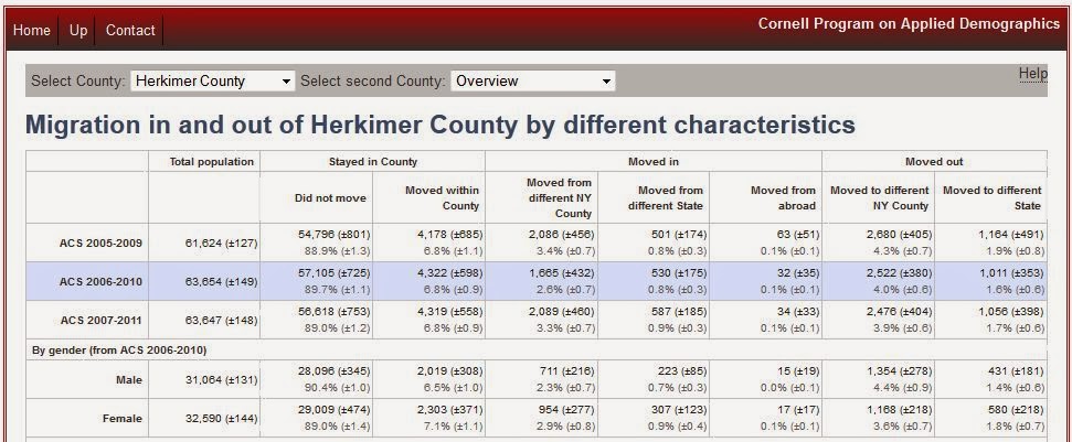
Characterisitics of Those Migrating To and From NYS Counties

In the beginning of February I posted about county to county migration patterns. As I pointed out then, we have seen an overall gain in migration for our region, with a net increase of 2,800 people in this new data release. Unfortunately both counties haven't seen equal good fortune however. As shown in this table, in Oneida County there was a gain of about 3,558 migrants - with other NYS counties providing the bulk of the in-migration. Herkimer County, on the other hand has seen a net migration of minus 758, with those mostly split between other NYS counties and other US states.

Cornell Program on Applied Demographics Screen Sample


The Cornell Program on Applied Demographics now offers and interesting interactive table where you can select a county and see who exactly seems to be coming into, as well as out of, the area. They provide a breakout of the provide information on  the sex, age, race, and several other characteristics of these migratory people. In addition, if you wanted, you could specific a target county to see who from your county is moving there, as well as who from there is moving to your county. If the number of people migrating is small, however, the characteristics of those migrating are suppressed.

Friday, February 7, 2014

County to County Migration Data: Regional Gains and Losses

In a given year, about 6 percent of the U.S. population picks up and changes counties. Young families move from Chicago to the surrounding suburbs. Recent college graduates cross the country for a first job in Boston, or Washington, D.C. Retirees relocate for good down to the Sunbelt.

If you could track all of these moves simultaneously across time, you'd get a picture of the parts of the country that are net population gainers, and those that are losing people instead. That picture would look like this:
 

The Atlantic Cities website does a nice job of explaining the new data flow mapper available at the Census Bureau for tracking these changes in migration. I would encourage you to read their article about this new function.

In the meantime, we have seen an overall gain in migration for our region, with a net increase of 2,800 people in this new data release. Unfortunately both counties haven't seen equal good fortune however. As the table below shows, in Oneida County there was a gain of about 3,558 migrants - with other NYS counties providing the bulk of the in-migration. Herkimer County, on the other hand has seen a net migration of minus 758, with those mostly split between other NYS counties and other US states.

 
Overall, then, where are our new neighbors coming from? And where did our old neighbors go? Here's the top 10 migration patterns for in-, out-, and net-migration for each county. Note that there are separate tables for the top states people came or went to, as well as the top counties in NYS for which they did the same.

Monday, January 6, 2014

Envisioning Migration Between States: Restless America

Chris Walker, of vizynary.com, spends a lot of time trying to help tell stories with visionary looks at "big data". In his article, Restless America, he shows us how migration patterns vary with an interactive graphic that allows you to "mouseover" a state to see the number of people moving between your selected state and other states.

Thicker arc lines mean more people moving. States are linked only if at least 10,000 people moved between them. If a state does not appear in the graphic, it is because it did not exchange at least 10,000 people with any other state in 2012.

To use the actual interactive graphic, visit the Restless America web post.


Friday, May 31, 2013

Origins and Destinations: People Moving Into, and Out of, Upstate NY

When people leave Upstate New York, where do they move to? And where do new migrants to the Upstate region come from? The New York Minute, an oline publication of Cornell University’s Community & Regional Development Institute (CaRDI), produced in collaboration with the Program on Applied Demographics, just released an interesting look at who moves into, and out of, upstate New York. Upstate New York for these purposes is defined as anything in New York north of Rockland and Westchester Counties.

Basically CaRDI looked at the County to County Migration flows in the 2010 American Communities Survey (ACS) Five Year Estimates and identified the top 5 origins and destinations for different age groups within the Upstate New York area. What they found was that “Upstate” receives a significant number of in-migrants from the downstate New York region, from Florida, and from countries in Asia. A significant number of movers out of “Upstate” head to Florida, to downstate New York, and to Pennsylvania, among other locations. And these origins and destinations do seem to vary by the age of mover.

The graphic below, taken from the New York Minute, shows these breakdowns by age groups nicely. 
Click to Enlarge

To see the full data, visit: Cornell's Program for Applied Dempgraphics.                

Monday, April 22, 2013

In-Migration Population and Poverty Estimates for NYS Counties

While the migration of people into Oneida and Herkimer Counties is far from a static process, there is data about the nature of some of those that come to our region based on the American Communities Survey.

Unfortunately not everyone who immigrates to our region arrives with a home, a family, or a job waiting for them. Sometimes those that arrive here are in desperate need of help.

Below is a table which shows the percent of people migrating into New York State counties* who are at or below the poverty line for each of five years (2007, 2008, 2009, 2010, 2011). These include people migrating between NYS counties, people migration into New York from other states, and people coming here from other countries as well. Generally speaking, the average for most counties is about a quarter of all in-migration populations are people in poverty.


* = Only counties that have single year estimates from the ACS were included in this table.

Wednesday, April 3, 2013

Migration Flow Patterns By County Now Available!


Based on data collected during the American Community Survey from 2006 to 2010, county-to-county migration tables are now available from the U.S Census Bureau. These migration tables give added information on the paths of the 17.3 million people who moved to another county. The tables provide the current county of residence, the county of residence one year ago and the estimated number of movers between the counties. Additional tables provide the same information broken down by selected characteristics: age, sex, race or Hispanic origin.

The Census Bureau has developed its first beta version of an online mapping tool called Census Flows Mapper. It is an interactive application that allows users to select a county in the U.S. and view the outbound, inbound and net migration flows for that county. Additionally, users can choose flows based on characteristics such as age, sex, race or Hispanic origin. The application also allows users to download the data for the flow they have selected, zoom in and out on the map to an area of interest, view additional statistics of the selected county and print their map to a PDF file. 

Try out this new feature from the Census Bureau at:


And click on the map below to see a sample of what the maps look like!

Thursday, April 19, 2012

You Can't Get There From Here: In and Out Migration for Herkimer and Oneida Counties Within New York State

Data was released last week  by the Census Bureau through the American Communities Survey (ACS) showing the in-flow and out-flow of people on county level geography. The data, based on the 2005-2009 five year ACS estimates, allows policymakers to get a sense of who is coming to their county, as well as where former residents are relocating.

Below is a table covering both Herkimer and Oneida County migration within the state of New York. It shows the top 5 counties residents are coming from over the period 2005 to 2009, as well as the top 5 places they are going to within New York. It also has data on the top 5 most positive net in-state migration gains.

 
To see the complete in-flow and out-flow of residents for Herkimer and Oneida Counties within New York State, here is a table showing the estimated migration to and from each county (as well as the net impact) for our region.