Monday, November 30, 2015

Oneida County Teen Assessment Project Survey 2015: Tobacco Use

The Oneida County Teen Assessment Project (TAP) Survey Report was recently released and can now be found through the regional planning office website. The survey, which covers 10 topical areas, includes a variety of questions on tobacco use by teens. Below are several slides highlighting some of the recent findings and trends for teens in Oneida County when it comes to using tobacco products. Click on any of the graphics to enlarge them.

Overall tobacco use has significantly declined among teens regardless of their age/grade. It has dropped overall from 44% saying that they have ever tried a cigarette in the 1999 survey, to only 13% in 2015. Each of the grade levels have also seen fewer teens trying smoking.

CLICK TO ENLARGE


Among smokers, there has also been a decline in frequency of use. Respondents who say that they have ever smoked indicated a significant decrease in the percentage that have smoked in the last 30 days.This is true regardless of the grade of the teen smoker.

CLICK TO ENLARGE


The use of e-cigarettes (electronic cigarettes) is a fairly recent phenomena. About 23% of all teens have ever tried "vaping" - using an e-cigarette.

CLICK TO ENLARGE


Among teens that have used e-cigarettes, most have done so in the past month (65%). More than one in five have done so 10 or more days over the past month.

CLICK TO ENLARGE


To see more information on tobacco use, or any of the topics covered in the 2015 TAP survey, visit the regional planning office website.

Tuesday, November 24, 2015

National Refugee Immigration Trends In the Last Decade (2006-2015)

The U.S. Department of State’s Bureau of Population, Refugees, and Migration (PRM), sought the creation of a system to better meet the growing need of refugees throughout the world as their numbers increased and other durable solutions diminished.  Because time is of the essence, the Refugee Processing Center was created to meet this need so that refugees all over the world could be processed more quickly and efficiently. This database system, referred to as the Worldwide Refugee Admissions Processing System (WRAPS), supports the tracking of refugee case status information, processing pipeline and resettlement statistical data for federal, state, and local partners, and, enhanced coordinated mechanisms to ensure program integrity within the context of modern security concerns.  All of these features allow for a faster, more integrated process so that case processing issues can be quickly addressed and resolved.

The following data is for the nation over the last decade (2006 to 2015). Below is a chart showing the flow of immigrants into the country from five regions of the world: Africa, Eastern Asia, Europe (including the republics of the former Soviet Union), Latin American and the Caribbean, and the Near East and Southern Asia.

CLICK TO ENLARGE


In addition, here is a table showing the numbers of refugee immigrants from those five areas for each of the last ten years.

CLICK TO ENLARGE

To see data on the Herkimer Oneida Counties' region for refugees, visit the Mohawk Valley Resource Center for Refugees data page.

Wednesday, November 18, 2015

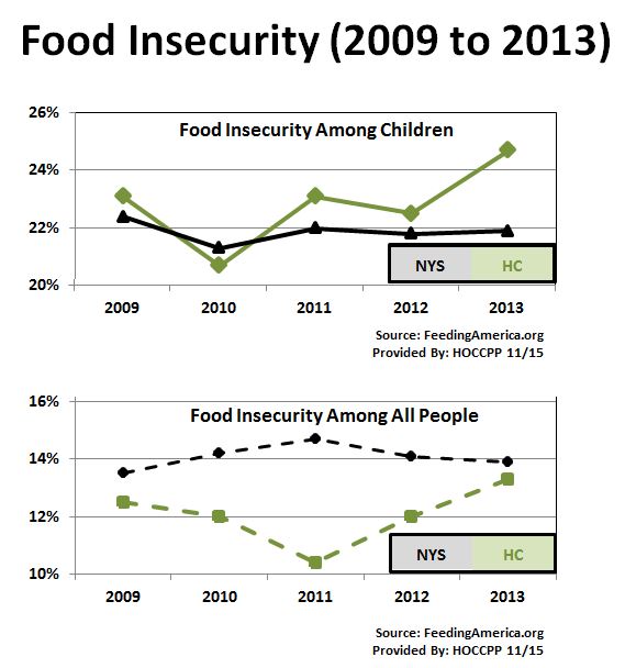
Herkimer County Food Insecurity 2009 to 2013

Back in 2013 I posted information about food insecurity. Food insecurity refers to the USDA's measure of the lack of access, at times, to enough food for an active, healthy life for all household members and limited or uncertain availability of nutritionally adequate foods. Food insecure households are not necessarily food insecure all the time. Food insecurity may reflect a household’s need to make trade-offs between important basic needs, such as housing or medical bills, and purchasing nutritionally adequate foods.

Since that post there is more information available from Feeding America that shows how the counties in the country have changed since 2009 through 2013. The food insecurity data is shown for two groups - the population as a whole, and the population of children for an area.

Below is a chart showing the data for Herkimer County as compared to New York State for that period of time. Note that food insecurity has remained relatively stable for children in NY, but seems to be climbing for children in Herkimer County. In terms of the overall population there is a small increase since 2009 for New York, while food insecurity for the total population of Herkimer County at first plummeted then rose between 2009 and 2013.


To see information for your area, please visit Feeding America and click on your county to get data similar to what is shown below (click to enlarge it).

CLICK TO ENLARGE

Monday, November 16, 2015

Tracking Income Equity: Use of the Gini Index 2006-2014

With the ACS, income inequity can now been seen longitudinally. The main measure of income inequality available through the census is the use of the Gini Index. The Gini Index is a summary measure of income inequality. As an index, it only has a value of between 0 and 1. A value of "0" would mean that every household had the same exact income; a value of "1" would mean that income was concentrated solely in a single household.

The index does NOT speak about the absolute levels of income - in other words, it doesn't measure how much income exists in a household. It measures the relative distribution of income across all households in an area. So when one area has a higher Gini index than another, nothing can be said about the income levels between the areas. Rather, it would tell you about the distribution of incomes within both areas.

That being understood, what are the regional, state and nation Gini levels over the last decade or so? The chart below shows them for the period 2006 to 2014. To enlarge it, click on the graph.

CLICK TO ENLARGE
Note a few things:
  • Each of the three lines show an increase in income disparity - the higher the Gini index number, the less "evenly" that income is spread among households.
  • There is more fluctuation in the Gini index numbers for the regional and state data than the national data - this has to do with the number of households in each area. Fewer households (or a smaller sample size) results in more variability.
  • Despite this variability, the Gini index for all three levels of data (nation, state and region) vary significantly from each other (for example in 2014 the state has the a significantly higher Gini index than the nation, which has a significantly higher Gini index score than the region) and over time within each geography (for the region, the Gini score in 2014 is significantly higher than the score from 2006).
Given a basic look at the trends,  regional income inequity has grown at a rate of more than twice that of the state and one and a half times that of the nation. Don't forget, however, that our overall income inequity score is significantly lower than either the state or nation.

Tuesday, November 10, 2015

Mapping Every Fatality on Every US Road (2004-2013)

Metrocosm has mapped out every fatality of every road in the US over the period 2004 to 2013. Below is a map of the Utica area showing the type of fatality (driver, pedestrian, etc) as well as their relationship to one of three common causes (alcohol, speeding, and distracted driving).

To look at a different area simply type in your address in the upper right corner search bar. Click to enlarge the screen shot.

CLICK TO ENLARGE

Regional Homelessness: Individuals Alone and Persons in Familes (2006-2014)

HUD provides data for homelessness on a somewhat localized level. They use what they refer to as "Continuums of Care" (or CoCs). These tend to be city or urban areas, as well as combined counties, as is the case for the Madison-Oneida County region in upstate NY.

Locally there is a coalition focused on homelessness and on housing related issues. They are part of the data collection process used by HUD. This is the Mohawk Valley Housing and Homelessness Coalition. The mission of the MV Housing and Homelessness Coalition is to prevent and end homelessness in the Mohawk Valley.  Their work includes sustaining an inclusive, community wide, system-level planning, program development and program integration process that targets public and private, local, state, and federal resources to the areas of greatest need.

Below is several years worth of data from HUD on regional homelessness. Please note how drastically the data drops between 2010 and 2011. It is in that time frame that HUD redefined who was to be included in the homeless survey, excluding those that might have taken refuge in a residential program that also offers treatment services. For better or worse, this definitional change certainly impacted what the local homeless numbers look like.  

If you'd like additional information about housing or homelessness in our area, please check out the MV Housing and Homelessness Coalition website.

You can click the graph below to enlarge it for better viewing.


CLICK TO ENLARGE

You can also go to Homeless Analytics and view maps showing a variety of data on homelessness for your region. They include maps like the one below as well as reports (note the circled red area). Here's screenshot of the map for our area. Click to enlarge it.

CLICK TO ENLARGE

Friday, November 6, 2015

Possible Census Bureau Workshop Locally

Members of the Census Bureau's regional office covering the northeast are looking at possibly offering a free public workshop on the use of the decennial census, the American Communities Survey, and the use of American Fact Finder. Ideally they would like to use a local library as a setting and have 20 or so people attend to learn more about these important census products.

As the local census affiliate we would probably help coordinate some of this and so I am wondering how many people in the region might be interested in attending such a session. There are NO specifics at the moment so it is an open ended issue.

However, i would appreciate it if YOU'RE possibly interested in attending such a workshop if you might drop me an email and express your level of interest !

Our Aging Workforce: Increases in Older Worker Participation by 2020


A couple charts showing where we are, and where we may be headed regionally with an aging workforce.

Looking at the workforce age 65 and over, there has been an increasing trend in the size of our elderly workforce over the last 10 years. As a general statement, we have gained roughly 200 more workers in this age group each year.

The chart below shows this trend and breaks the age groupings down further: from 65 to 69; 70 to 74; and 75 and over. In each case, the region has seen increases in workers in these subgroups over the last ten years.

CLICK TO ENLARGE

Based on this trend, a simple projection would suggest that as many as 1,000 MORE workers age 65 or older will be joining these ranks by the year 2020. Here's a look at how that thousand additional older workers will be distributed by age groupings by the end of this decade.


CLICK TO ENLARGE

Tuesday, November 3, 2015

Regional Elderly Population In or Near Poverty (2006-2014)

The graph below shows changes in the percentage of older regional residents (age 65 or older) who were either in poverty, or near poverty (within 150% of the poverty level). Click the graphic to enlarge it.

CLICK TO ENLARGE

Monday, November 2, 2015

Changes in Median Age For White and Minority Populations

Over the last decade our median age in the region has risen, having gone from 39.7 years of age 10 years ago to 42.1 in 2014. Much of this is driven by an aging white, non-Hispanic population. Among whites, the median age over the period from 2005 to 2014 rose from 40.7 to 44.8 years of age. Conversely, the minority population (meaning anyone who is not white, Non-Hispanic) has actually gotten younger over the past 10 years. Among minorities, the median age has dropped from 28.7 years of age to 26.2. As this portion of our population grows (minorities now make up about 15% of our population compared to 10% a decade ago) this younger influence will probably begin to influence our median age statistics.

The graph below shows you how these two populations' median ages have changed in our area between 2005 to 2014. Click to enlarge the graphic.

CLICK TO ENLARGE