Most people are familiar with the traditional decennial census counts. Those are the numbers that come out, once every 10 years, as a result of the Constitutionally mandated census efforts. These have taken place since 1790, and will next occur in the year 2020. People, policymakers and businesses all look forward to the census counts as a way to see where we are, and how we've changed over the last decade. They also use these numbers for reapportionment of our legislative districts.
However, the decennial census counts aren't the only population numbers that get bandied about. In the non-decennial census years people often pay close attention to the population estimates, which get released annually. Each year, the Census Bureau's Population Estimates Program (PEP)
utilizes current data on births, deaths, and migration to calculate
population change since the most recent decennial census. Over the course of the years between decennial censuses, they produce a
time series of estimates of population. The annual time series of estimates begins
with the last decennial census year and extends to the vintage (i.e. most recent)
year. These numbers are generally seen as indications of where we are and where we're headed.
A third sort of population number that draws attention are population projections. While anyone can put together a population projection, many in New York turns to the projections done by
Cornell University's Program of Applied Demographics (PAD). The projections done by PAD are in 5 year intervals and currently
project to 2040. The projections are based upon rates of change
estimated from historic data. This means that the projections reflect
what would happen if the rates of population growth and decline stay as
they were. The projections are not meant to be forecasts; forecasts are
predictions of future conditions while these projections are meant to
gain insight into what might happen if the future looks like the past.
For our region, these three versions of our past, and our future, are a sort of mixed bag - they are much like the Good, the Bad, and the Ugly.
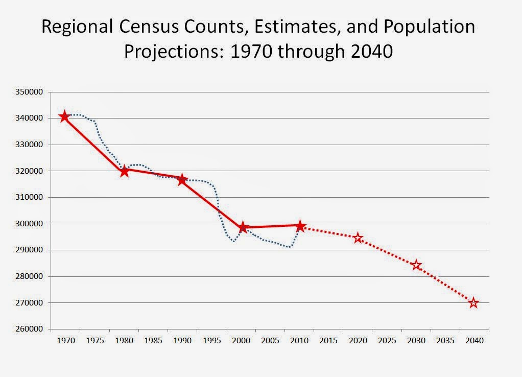
The Good may be the decennial census counts. These can be considered "good" in that they are very accurate, generally speaking. The tremendous effort needed to identify housing units, and count the people in those units, provides very accurate numbers when it comes to our population counts. The chart below shows you the census counts for the Herkimer-Oneida Counties region from 1970 to the most recent census done in 2010.
 |
| Click to Enlarge |
The Bad are the Population Estimates. They are bad, and that is a relative term, in that they appear to be consistently underestimating our population. Looking at the blue dotted line on the chart below, you can see that in about 1994, right through the Census in 2010, the estimates (based on the ninth vintage year in each cycle - 1999 and 2009 estimates) have consistently underestimated our population by around two percent. Some would maintain that two percent is negligible from a statistical standpoint; of course to the degree that these estimates impact federal or state formulas for funding, or business location decisions, that statistical distinction is anything but negligible.
 |
| Click to Enlarge |
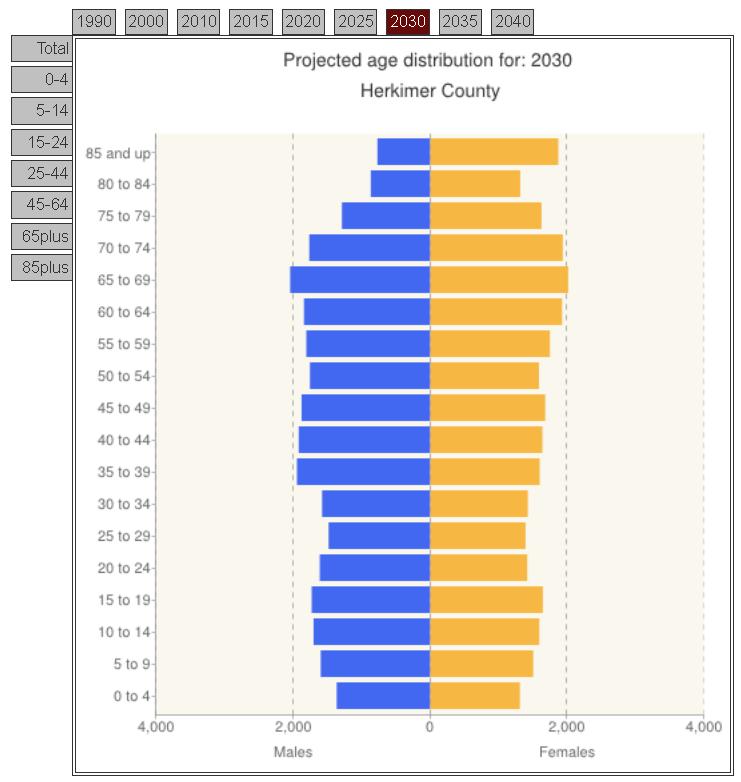
The Ugly comes down to the population projections, in this case those offered by PAD. While not arguing the methodology, the projections, as they note, are not forecasts - they assume that nothing in the future is different from anything in the past. And in the case of the past, they may or may not take into account special issues or circumstances for our region, such as the impact of the Mohawk Valley Resource Center for Refugees. Regardless, the projections see the last decade's population stabilization as fleeting and would suggest a continuing (and even accelerating) decline of population for the region in the future.
 |
| Click to Enlarge |
In reality these are very different measures, with very different assumptions. But they are the numbers that are often used to define our region.

 The Atlantic Magazine recently reviewed a new report by PEW Research which provides a portrait of some very significant demographic and cultural shifts in the United States. The report is
filled with fascinating details about who we are as Americans, what we
believe, and how both of those things have changed over the last several
decades.
The Atlantic Magazine recently reviewed a new report by PEW Research which provides a portrait of some very significant demographic and cultural shifts in the United States. The report is
filled with fascinating details about who we are as Americans, what we
believe, and how both of those things have changed over the last several
decades.