Friday, September 27, 2013

The Value of Volunteering: New York and National Data

September 11th has become recognized as our National "Day of Service". In 2009, Congress designated September 11th as a National Day of Service and Remembrance under bipartisan federal law, and charged the Corporation for National and Community Service with helping to support this effort across the country. Similarly, April is National Volunteer Month, which grew out of National Volunteer Week. National Volunteer Week began in 1974 when President Richard Nixon signed an executive order establishing the week as an annual celebration of volunteering. Every president since has signed a proclamation promoting National Volunteer Week.

Obviously volunteering is a large part of our culture. But how large ? And at what cost?

New York, according to the Corporation for National and Community Service (CNCS), ranks only ahead of Louisiana when it comes to our volunteer rate. What is the volunteer rate? It's defined as the percentage of individuals who responded on the Census Bureau's Current Population Survey's Volunteer Supplement that they had performed unpaid volunteer activities for or through an organization at any point during the 12 preceding months. While the national volunteer rate was 26.8% in 2011, only 20.7% of New Yorkers volunteered during that same time period. In Louisiana, 19.4% had volunteered services in comparison.  Here's a couple other graphics that they have about New York volunteer services. Click any of the graphics below to see larger versions.

New York versus National Volunteerism 2002-2011
Urban, Suburban, Rural Volunteers in New York
Types of Volunteerism Among New Yorkers

 Among the things the CNCS highlights are the following when it comes to New York volunteerism:
  • More than 3 million people volunteered during 2011
  • They provided more than 410 million hours of service
  • This averages to 26.6 volunteer hours per resident of New York State
  • Almost 60% of residents said that they do favors for their neighbors

Of course non-profit organizations rely heavily on volunteers to provide their needed services. According to the independentsector.org, New York has more than 100,000 nonprofit organizations. They are broken out by the type of agency below.
Click to Enlarge

Independent Sector goes on to point out that:
  • New York nonprofits employ 1.25 million people–15%of the state’s workforce
  • New York nonprofits pay wages of $55.6 billion
  • New York nonprofits hold assets of $372 billion and generate annual revenues of $194.7 billion
  • New York City nonprofits employ 500,000 people –15% of NYC’s workforce and are the city’s largest private employer
  • New York foundations annually give over $6.9 billion and rank first in the USA in total giving
But the question that many organizations wish they could put their finger on is the value of their volunteers. It is very difficult to put a dollar value on volunteer time. Volunteers provide many intangibles that can not be easily quantified. For example, volunteers demonstrate the amount of support an organization has within a community, provide work for short periods of time, and provide support on a wide range of projects.

That being said, the Independent Sector has worked with Bureau of Labor Statistics data to determine the average value of volunteer time based on the hourly earnings of all production and non-supervisory workers on private non-farm payrolls. The Independent Sector indexed this figure to determine state values and then increased it by 12 percent to estimate for fringe benefits. In essence the value of volunteer time presented here is the average wage of non-management, non-agricultural workers plus a fringe of 12%.

Below, then, is their table which suggests that the the value of a volunteer hour of service in New York is more than $28. Perhaps this can help put all those volunteer hours out there in our region in perspective!

Click to Enlarge


  • 26.6 volunteer hours per resident.
  • 59.3% do favors for their neighbors.
  • 87.4% eat dinner with their family a few times a week or more.
  • 52.3% discuss politics a few times a month or more.
  • 3.22 million volunteers.
  • 413.2 million hours of service.
  • $9.0 billion of service contributed.
  • - See more at: http://www.volunteeringinamerica.gov/NY#sthash.J6ow54bC.dpuf
    The percentage of individuals who responded on the Current Population Survey's Volunteer Supplement that they had performed unpaid volunteer activities for or through an organization at any point during the 12-month period that preceded the survey.
    The percentage of individuals who responded on the Current Population Survey's Volunteer Supplement that they had performed unpaid volunteer activities for or through an organization at any point during the 12-month period that preceded the survey. - See more at: http://www.volunteeringinamerica.gov/about/glossary.cfm#volunteer_rate
    The percentage of individuals who responded on the Current Population Survey's Volunteer Supplement that they had performed unpaid volunteer activities for or through an organization at any point during the 12-month period that preceded the survey. - See more at: http://www.volunteeringinamerica.gov/about/glossary.cfm#volunteer_rate

    Thursday, September 26, 2013

    The Economics of Leaf-Peeping

    According to observers for Empire State Development’s I LOVE NEW YORK and their most recent Fall Foliage Report for New York State, beautiful peak fall colors are expected to make their first appearance of the season this weekend in the Adirondacks region of New York State. Foliage approaching midpoint of change is starting to appear in the Catskills, as well as other areas of the state.

    In Central New York, spotters in southern Herkimer County expect midpoint to near peak foliage with 40 percent leaf change and bright red leaves with some yellow mixed in. Oneida County also expects up to 40 percent color change with assorted shades of orange, gold, bronze and amber, along with splashes of fiery red. Northern Oneida County is showing more rapid change, with orange, golds and reds predominating. In Chenango County, expect 35 percent change with yellow, red and orange fall colors of average brilliance. Otsego County predicts 30 percent change with yellow, green, red and orange leaves of average brilliance. Both Broome and Madison counties are predicting 25 percent change by the weekend with average to bright leaves of yellow, orange and red. Schoharie County expects 20 percent change.

    Why is this important ? Well according to Bostonmagazine.com the average leaf-peeper spends between $85 to $110 per day when taking in the view!


    BONUS POST: Don't forget that this is the last weekend that the Trenton Falls Trails are open !


    Regional HIV and AIDs cases

    The U.S. Census Bureau recently released a new interactive database on the prevalence of international HIV infections and AIDs cases and deaths. The data represents a compilation of information from 219 countries and areas, and has data for more than 100 countries not included in past releases. Major updates include new data for China, Ghana, Ethiopia, India and Cameroon. The database focuses on HIV/AIDS surveillance data for countries and areas with at least 5,000 population, but does not have information on Northern America (including the United States) and U.S. territories. Public health surveillance involves the collection, analysis and use of data to provide public health prevention resources where needed.

    In terms of New York State, the State Department of Health released county related data last August in a report on HIV/AIDs. It provides a variety of information for the year 2010, including the number of HIV and AIDs cases among the general public (including prisoners), and the number of cases without prisoners included. I've pulled out the Herkimer and Oneida County data from the DOH report below.

    Wednesday, September 25, 2013

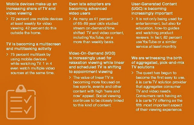
    Changing Television and Video Viewing Habits of Consumers Worldwide

    According to a study released from Ericsson ConsumerLab, the times, they are a'changing. The explosion of connected mobile devices in the home has opened a whole new world of possibilities when it comes to viewing TV and video content. Consumer viewing habits now involve so much more than just the living room TV and traditional broadcast services. Today people take their entertainment with them around the house – and beyond. Viewing TV and video is now something that happens throughout the day, and as our exposure to content increases, so does our attitude and behavior towards it.

    The modern consumer has a wealth of choice over their device and content sources, allowing them to adapt their viewing experience to suit their needs and putting them in charge of their TV and video consumption. However, this abundance of choice creates greater complexity for users. There is now an opportunity for service providers to forge new aggregate services that will help consumers simplify the management and selection of their content, enabling them to enjoy the TV and video experience of tomorrow.

    Click on the table below to see some of their major findings about more modern viewing habits. These findings are based on more than 15,000 interviews in 15 different countries. Although that may skew the results somewhat in regard to American consumers experiences, it clearly shows a more involved, and at the same time more selective, viewing process is taking hold.

    Click to Enlarge

    August 2013 Labor Profile for the Mohawk Valley

    The New York State Department of Labor recently released its August 2013 Labor Profile for the Mohawk Valley. It provides a comparison between August and July of this year, as well as a comparison with August of 2013 and 2012 for the Utica-Rome MSA (Herkimer and Oneida Counties combined). It includes data on the number of people employed and unemployed, as well as some analysis by employment sector. 
    For more information on employment you might consider contacting Mark Barbano, our Regional Economist for the Mohawk Valley with the State Department of Labor !
     

    Click to Enlarge
     

    Monday, September 23, 2013

    ACS Community Profile: Town of Camden

    The American Communities Survey (ACS) provides snap shots of municipalities each and every year. For many of our communities, this represents the only source of data for things such as education, poverty, and transportation issues. As part of an effort to bring this data to the public's eye, I like to occasionally post the profiles for some of our smaller towns and villages.

    Below are links to the demographic, social, economic and housing profiles for the Town of Camden, NY, which can be found through the ACS. To learn more about this prominent town in Oneida County, visit the New York Genweb site and look at the history of the town.

    In the meantime, here are links to the ACS profile data for the Town of Camden!


    2011 ACS Five Year Estimate Town of Camden Demographics

    2011 ACS Five Year Estimate Town of Camden Social Data

    2011 ACS Five Year Estimate Town of Camden Economic Data

    2011 ACS Five Year Estimate Town of Camden Housing Data
     

    ADDITIONAL NOTE: To see how the Town compares to the County, check the County 5 Year Estimates link found just below the center of this page's banner !

    Friday, September 20, 2013

    Food Stamp Recipients In Herkimer and Oneida Counties (2012)

    The House approved Thursday a three-year nutrition bill (H.R. 3102), with a 217-210 vote, that would result in cuts of about $40 billion over 10 years for the Supplemental Nutrition Assistance Program (SNAP) and provide various reforms to the program. The SNAP Program, which is better known by the name Food Stamps, served nearly 48 million people in June of this past year according to U.S. Department of Agriculture.

    Locally, the region had about twenty thousand households enrolled in the SNAP program during 2012. About a third of those were elderly, and nearly half of those households had children under the age of 18 present. Two out of every three families (67%) receiving SNAP support had at least one person working. For a more complete look at the region's SNAP recipients, see the table below.

    Click to Enlarge

    Miles and Miles of Transportation Data

    The Bureau of Transportation Statistics (BTS), a part of the U.S. Department of Transportation’s (USDOT) Research and Innovative Technology Administration (RITA), presents State Transportation Statistics 2012, a statistical profile of transportation in the 50 states and the District of Columbia. This is the tenth annual edition of the State Transportation Statistics, and a companion document to the National Transportation Statistics (NTS), which is updated quarterly on the BTS website.

    Like the previous editions, this document presents transportation information from RITA/BTS, other federal government agencies, and other national sources. A picture of the states’ transportation infrastructure, freight movement and passenger travel, system safety, vehicles, transportation related economy and finance, energy usage and the environment is presented in tables covering the 50 states and the District of Columbia.


    Thursday, September 19, 2013

    2012 One Year ACS Estimates Released

    Each year, the Census Bureau releases three versions of the American Communities Survey (ACS). These are the One Year, the Three Year, and the Five Year ACS Estimates. These are released based on the population size of the municipality.   
    • Five year estimates are released for EVERY level of census geography (down to the block group level) as well as every municipal  civil division (think town, city, and village).  
    • Three year estimates are only released for geographies or municipalities with a MINIMUM population of 20,000 persons. So many smaller villages and towns are excluded.  
    • One year estimates are released for municipalities with a MINIMUM population of 65,000. This means they are mostly available for counties and larger cities.

    What this means for municipalities is that in some cases (Oneida County for example), each year there are 3 levels of ACS released - the One Year, the Three Year, and the Five Year ACS Estimates ALL include Oneida County data. Other communities, like Herkimer County, only have two versions of the ACS that cover them - the Three Year, and the Five Year ACS Estimates. And even still smaller areas, say the tiny villages such as Newport, can only find annual updates of data in the Five Year estimates.

    The most recent One Year Estimates for 2012 were released today, so new information is now available for Oneida County (and larger geographies like New York State). A permanent link, located just above the banner of this blog will take you to the most recent ACS data for each county, including this new release of One Year ACS data for Oneida County.

    Below are the individual links to the most recent (2012) ACS One Year Estimate's Demographic, Social, Economic, and Housing Profiles for Oneida County as well as the Utica-Rome Municipal Statistical Area (Oneida County and Herkimer County combined).

    Oneida County ACS One Year Demographic Profile
    Oneida County ACS One Year Social Profile
    Oneida County ACS One Year Economic Profile
    Oneida County ACS One Year Housing Profile

    Utica-Rome MSA ACS One Year Demographic Profile
    Utica-Rome MSA ACS One Year Social Profile
    Utica-Rome MSA ACS One Year Economic Profile
    Utica-Rome MSA ACS One Year Housing Profile

     The Three Year ACS data, which will include Herkimer County data, are scheduled to be released October 24, 2013.

    Monday, September 16, 2013

    Fifty is the New Thirty?

    According to an article on Today.com, America's most popular age to be is now fifty ! According to the website, "The online poll surveyed a total of 2,252 American adults which included men and women of all ages, all geographical regions, and all political bents. Some had children; some did not. All were picked from a pool of folks who’d agreed to participate in a Harris Interactive survey."

    "The question: If you could live forever in good health at a particular age, what age would you like to be?The answer, based on the average: five-oh. Half a century. Not surprisingly, younger people chose younger ages. Echo boomers, ages 18 to 36, thought the perfect age was 38. Gen Xers, ages 37 to 48, wanted to stay put at 49. Baby boomers, ages 49 to 67, thought 55 was pretty awesome. While mature adults, ages 68 and older, were happy to hold steady at 67. On average, men wanted to be younger than women, choosing 47 over the average perfect age for females of 53. Those with kids in the household thought staying 45 forever would rock; those without children around opted for 53.

    "There are plenty of reasons people might call 50 the perfect age, psychologists say. “You have almost every opportunity,” says Barbara Becker Holstein, a psychologist with a private practice in Long Branch, N.J. “You’re young enough to be famous or start an organic farm and still have the muscle tone to work eight hours a day. You’re old enough to have wisdom but young enough that your parents are still alive so you have a generational experience. If you’re tired, you can ask the young man on the bus to get out of his seat for you. Or you can date the young man. The more I think about it, the more appealing it is.” Holstein says all of the recent medical – and cosmetic -- developments have also helped to give 50 a facelift.
    “I really think 50 is the new 30 to 35,” she says."

    According to the Census 2010, which provides data on the population based on a single year age, more than a thousand (1,029) people in Herkimer County would have been this ideal age when the census was taken, and 3,713 were age fifty in Oneida County during the Census 2010.

    Thursday, September 12, 2013

    2013 Herkimer County Teen Assessment Project Report to be Released Soon !

    The 2013 version of the Herkimer County Teen Assessment Project (TAP)  should be released within a short time. The TAP report, which represents the fifth time data has been collected from Herkimer County teens over 16 years, will contain a variety of information from local youth about their experiences in school, in their homes, and within their the communities. Topics covered include alcohol and drug use, bullying, sexuality issues, depression and suicide, and internet use, as well as many others.

    Until the report is released your best bet for Herkimer County TAP data is the 2009 survey results. The 2013 Herkimer County TAP data has been analyzed and a report of its findings, along with all of the TAP survey reports, will be found on the Human Service Planning page of HOCCPP as well as on here.

    In the meantime, here's a look back at some of the 2009 results in Herkimer County. Click any of them to enlarge that graphic.
    2009 TAP Smoking Data
    2009 TAP Drinking Data
    2009 TAP Marijuana Data

    2009 TAP Sexuality Data
    2009 TAP Harassment Data
    2009 TAP Suicide Ideation Data

    2009 TAP Web Presence Data
    2009 TAP Web Behavior Data
    2009 TAP Sexting Data

    Wednesday, September 11, 2013

    FEMA Flood Zone Maps and Questions About Flood Zone Designations

    The Federal Emergency Management Agency is the federal agency responsible for flood mapping. With all of the local flooding that has occurred in New York State in recent years, including this spring in the Mohawk Valley, some people have wondered where they might find the FEMA Flood Zone maps.

    Flood Zone maps are available from the FEMA website. The site can be a little tricky to navigate through and all interpretation of the maps is the responsibility of the federal government. But here are a few tips to seeing a map of your neighborhood.

    First, go to the website and put in your address as shown below:

    Click to Enlarge


    Second, click the link on the map that shows up for your neighborhood to retrieve the appropriate "panel":
    Click to Enlarge


    Third, choose to see the actual imagery by clicking on the symbol circled below:


    Finally, when the map loads, zoom in or out, and move around the map, by using the tools at the left hand side of the page:


    This link at FEMA answers many of the questions people have about the flood zone maps and also suggest that if you want more information you may e-mail or call a Map Specialist in the FEMA Map Information eXchange toll free, at 1-877-FEMA MAP (1-877-336-2627).


    Tuesday, September 10, 2013

    The Relationship Between Food Insecurity and Obesity Rates

    A recent release by Child Trends on food insecurity and obesity shows a link between a lack of food and increases in body mass index, especially among children. As they observe, "Ironically, child food-insecurity is also associated with a greater risk for being overweight. While the processes underlying this association are not completely understood, food insecurity can result in lower diet quality and less variety, both of which can contribute to being overweight, and unpredictable availability of food can lead to overeating."

    They go on to point out that in 2011, 22 percent of children under 18 lived in food-insecure households, and one percent in households with very low food security among children specifically. To learn more about food insecurity in our region visit this previous post about food insecurity in Herkimer and Oneida Counties.

    Below are the most recent statistics from the New York State Health Department on obesity rates for New York State as a whole, for the upstate (non-New York City) region, for Herkimer County, and for Oneida County. Click on any of them to enlarge them.


    Ironically, child food-insecurity is also associated with a greater risk for being overweight. - See more at: http://www.childtrends.org/?indicators=food-insecurity&utm_source=E-News%3AObesity+Month+and+Kids+without+Food&utm_campaign=E-News+9+5+13&utm_medium=email#sthash.g2ll0CmT.dpuf
    Ironically, child food-insecurity is also associated with a greater risk for being overweight. - See more at: http://www.childtrends.org/?indicators=food-insecurity&utm_source=E-News%3AObesity+Month+and+Kids+without+Food&utm_campaign=E-News+9+5+13&utm_medium=email#sthash.g2ll0CmT.dpuf
    Ironically, child food-insecurity is also associated with a greater risk for being overweight. - See more at: http://www.childtrends.org/?indicators=food-insecurity&utm_source=E-News%3AObesity+Month+and+Kids+without+Food&utm_campaign=E-News+9+5+13&utm_medium=email#sthash.g2ll0CmT.dpuf
    Click to Enlarge NYS Data
    Click to Enlarge Upstate Data
    Click to Enlarge HC Data
    Click to Enlarge OC Data

    How Employers View Online Versus Traditional Degrees

    With recent data suggesting there has been a decline in college enrollments, perhaps some students, as well as employers, will find themselves looking at the value of online degrees more seriously. many of the local colleges offer online course work, which can be used of course to attain a degree. The question becomes how employers view those online programs when hiring employees.

    This info-graphic from Drexel.com suggests that there are three vital criteria employers are looking for when an application comes across their desk from a potential worker who has an online degree: whether the program has accreditation; whether it has a bricks and mortar campus, and whether it has an established brand.


    Monday, September 9, 2013

    STEM Employment: Who Works in the Science, Technology, Engineering and Mathematics Fields?

    Growth in women’s share of science, technology, engineering and mathematics occupations – commonly referred to as STEM jobs – has slowed since the 1990s, according to a U.S. Census Bureau report released today. Women’s employment in STEM has slowed because their share in computer occupations declined to 27 percent in 2011 after reaching a high of 34 percent in 1990.Blacks and Hispanics also remain underrepresented in STEM jobs.

    These statistics come from two reports released today: Disparities in STEM Employment by Sex, Race, and Hispanic Origin and The Relationship Between Science and Engineering Education and Employment in STEM Occupations. STEM workers include those who work in computer and mathematical occupations, engineers, engineering technicians, life scientists, physical scientists, social scientists and science technicians. It also includes managers, teachers, practitioners, researchers and technicians. The reports are an example of the important education and occupation statistics that the American Community Survey produces annually, allowing businesses, communities and civic leaders to make informed decisions on workforce development

    In 2011, there were 7.2 million STEM workers accounting for 6 percent of the U.S. workforce compared with 4 percent in 1970. Half of STEM workers were employed in computer occupations, followed by engineers (32 percent), life and physical scientists (12 percent), social scientists (4 percent), and mathematicians and statisticians (3 percent). While women make up nearly half of the total workforce, they comprised only 26 percent of the STEM workforce in 2011.
     
    “We have seen an increase in women employed in STEM occupations, but they are still underrepresented in engineering and computer occupations that make up more than 80 percent of STEM employment,” said Liana Christin Landivar, a sociologist in the Census Bureau’s Industry and Occupation Statistics Branch and the reports’ author.


    To see the local breakdown of degree fields for Herkimer and Oneida County graduates programs, and to see how females and males compared in terms of their degrees, see this prior post about regional STEM college degrees.

    Streams and Rivers Data: The National Atlas Mapping of Water Features

    Streamer, a water features website operated by the National Atlas, allows you to trace the flow of most streams and rivers in the U.S., including those in New York State. If you zoom in to New York and then click on a stream it will provide you with a variety of information on the water feature. Below is one I did for the West Canada Creek in Herkimer County. I selected it to trace upstream (note the downstream versus upstream tabs at the top of the picture). The dialog box pops up if you hover your selection arrow over selection point on the map.

    Click to Enlarge


    Friday, September 6, 2013

    Living Conditions in the U.S: Hardships in Fulfilling Basic Needs

    Roger Green, who runs the New York State Data Center Affiliates Blog notes that a recent report from the Census Bureau finds that 22 percent of households experienced one or more possible “hardships” in fulfilling their basic needs in the previous 12 months. These hardships included difficulty meeting essential expenses such as not paying rent or mortgage; getting evicted; not paying utilities; having utilities or phone service cut off; not seeing a doctor or dentist when needed; or not always having enough food. Among all households, 9 percent experienced exactly one of them, 7 percent experienced two of the hardships and 6 percent endured three or more of these problems.

    These statistics come from Extended Measures of Well-Being: Living Conditions in the United States: 2011, a report based on the Survey of Income and Program Participation. The report measures well-being based on housing conditions, neighborhood conditions, community services, possession of specific types of appliances and electronic goods, the ability to meet basic needs and the expectation of help in meeting these needs ─ if necessary ─ from friends, family and the community. These measures are compared both across demographic groups and over time.

    For example, the chart below shows the different hardships being faced by different age groups.

    Click to Enlarge
    What is interesting is how each group appears to place varying importance on different aspects of their lives. For example, among the youngest population (those 15 to 29 year old) the most common hardship they faced was unpaid utility bills. This was followed by not seeing a dentist when needed, and failing to pay their rent or mortgage. this is considerably different than the hardships facing the middle aged population (those 45 to 49 years old). Among middle aged Americans, the most common hardships faced were not seeing a dentist, not paying utilities, and not seeing a doctor when needed.

    The report has many other insightful pieces and is well worth looking at. Unfortunately there is no locally comparative data.

    Thursday, September 5, 2013

    The Value of a Two Year Degree

    An article at CNN.com about two year degrees suggests that, at least in some cases, a two year associates degree can result in a better pay off than a four year degree. The study, by CollegeMeasure.org, is largely based on a data collected in Texas concerning graduates of technical programs and with certificates in technical fields.
     
    The results of the study suggest that the degree a student earns matters, but that there are important variations in returns by program and by institution. This report documents some of the differences in first-year earnings ranging from certificate programs through master’s programs.
     
    Among the findings are:
     
    • Technical-oriented associate’s degree programs are helping many students successfully enter the labor market by equipping them with skills that are in demand. On average, a year after graduation, students with two-year technical degrees have first-year median earnings of more than $50,000, just over $11,000 more than graduates of bachelor’s degree programs across the state.
     
    • Graduates with these two-year technical degrees earn, on average, about $30,000 more than students who completed academically oriented two-year degrees and are now in the labor force.
     
    • Certificates are one of the fastest-growing credentials offered by community colleges. The median first-year earnings of certificate holders often exceed those of graduates from academic and technical associate’s programs.

    Locally, here's some numbers, broken down by the gender of the graduate, that shows the numbers of Associate Degrees among those age 25 or older in Herkimer and Oneida Counties.

    Click to Enlarge

    The New Health Care Law: Where States Stand on the ACA

    This is an interesting set of maps from the Advisory Board Company concerning where states stand in regard to the Affordable Care Act (ACA). A Supreme Court ruling on the ACA allowed states to opt of the law's Medicaid expansion, leaving each state's decision to participate in the hands of the nation's governors and state leaders. The first map shows each state's position based on legislative or executive actions to expand coverage to low-income residents using ACA funding.

    Click to Enlarge


    Then a second map shows the number of persons per one thousand that are uninsured in each state.

    Click to Enlarge

    To learn more about the ACA and the uninsured in Herkimer and Oneida Counties, revisit this earlier blog post.