Monday, June 30, 2014

Our Changing Population: West Utica - 1980 Versus 2010

Recently I did data comparisons for 1980 versus 2010 for Utica's Center City neighborhood, as well as the Cornhill section of Utica. Both areas lent themselves to a relatively easy comparison given the stability of the census tracts used to define them over the years. West Utica, which this post is about, is a bit more difficult to look at with the present geography, but still lends itself to a pretty good match.

The outline on the 1980 census map below provides you with a better idea of where the West Utica neighborhood basically is. It largely lies south of the NY Penn railroad, is bordered on the west by the city line which encompasses Utica College, its south edge is defined by Burrstone Road and finally to the east it is bordered by Genesee St. until it snakes its way back toward the Arterial around Cornelia St. heading west then north along routes 5, 8 and 12.

Click to Enlarge

This area has gone from about 40% owner occupied housing in 1980 to only around 30% as of 2010. More than half of the housing (52%) are renter occupied units which is virtually identical to what existed 30 years ago when 51% were renter occupied. The biggest difference is really in the number of vacant structures - in 1980 roughly 6% of the housing was vacant; now 9% remains unoccupied.

Below is an infographic that compares the age, sex, race, nativity, employment, education, income and poverty levels of those who have found the West Utica neighborhood to be their home, in 1980 and in 2010. There are substantial changes in who lives there now as opposed to 30 years ago. Click to enlarge the graphic for easier viewing !
Click to Enlarge

Wednesday, June 25, 2014

Our Changing Population: Utica's Cornhill - 1980 Versus 2010

Recently I did a comparative of Utica's Center City neighborhhood, 1980 versus 2010. The area lent itself to a relatively easy comparison given the stability of the census tracts used to define it over the years. Utica's Cornhill neighborhood is similar in that the tracts that largely comprise it are similar now to what they were back 30 years ago. It's not perfect, but certainly it's close enough to make some general observations about the nature of any changes that have occurred over that time period in Cornhill.

So where is Cornhill in Utica? The tract map below shows you the outline (in red) of this neighborhood, with the Parkway serving as its southern border, Genesee Street to the west, South Street to the north, and the eastern boundary running mainly along St. Vincent and Mohawk Streets.


This area is more than 50% apartments, with the remainder of housing being split roughly with 20% abandoned properties and 30% owner occupied homes. Between 1980 and 2010, the area saw a substantial drop in population - it lost about 30% of its population. It dropped from more than 16,500 to around 11,700. These people were part of about 4,100 households in 2010, as compared to in 1980 when the 16,500 residents were spread across about 6,600 households.

Below is an infographic that compares the age, sex, race, nativity, employment, education, income and poverty levels of those who have found Utica's Cornhill neighborhood to be their home, in 1980 and in 2010. There are substantial changes in who lives there now as opposed to 30 years ago. Click to enlarge the graphic for easier viewing !

Click to Enlarge

Monday, June 23, 2014

2012 SAT Scores by School District

Wondering how your district does in preparing your child for the SATs? Bizjournal.com has a great site where you can select your region, and your county to see all of the local schools scores on the SAT for the 2012 year (which is the most recent released by the Department of Education).

Simply click the link above then pick your region, and the county you live in and search to see all of the districts.


Below are the ranks for Herkimer and Oneida Counties.

Click to Enlarge

Wednesday, June 18, 2014

Our Changing Population: Center City Utica - 1980 Versus 2010

Utica's Center City is an area that lends itself fairly easily to some simple neighborhood data comparisons. In terms of census geography it has stayed relatively stable, at one time comprising mostly two tracts - Census Tracts 203 and 204. In the Census 2000, these two tracts were combined and renamed as Tract 203. I wanted to take a look at how this high poverty area in the center of downtown Utica has changed in the last 30 years. To do this I took a look at some of the archived 1980 Census data and the 2012 American Communities Survey 5 Year Estimates.

Center City Utica, as I noted before, has remained relatively unchanged in terms of its geographical definition for at least the last 50 years. Below is a simple map showing the area, outlined in red. with a few familiar roads labeled. Genesee Street basically bisects the neighborhood from northeast to southwest.


This area is a heavy mix of businesses and apartments, along with a small number of owner occupied homes as well. Between 1980 and 2010, the area saw a substantial drop in population - it lost about 40% of its population dropping from more than 1,800 to around 1,100. These people were part of about 600 households in 2010, as compared to in 1980 when the 1,800 residents were spread across about 1,000 households.

Most of the residents live in apartments now, as they did in 1980. In both censuses, about 90% of residents were apartment dwellers.

Below is an infographic that compares the age, sex, race, nativity, employment, education, income and poverty levels of those who have found Center City Utica to be their home, in 1980 and in 2010. There are substantial changes in who lives there now as opposed to 30 years ago. Click to enlarge the graphic for easier viewing !

Click to Enlarge

Friday, June 13, 2014

More Census Maps from the Program on Applied Demographics

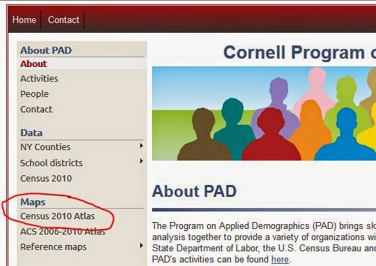
Cornell's Program on Applied Demographics has a great resource for maps (in some cases down to the tract level) in the Census 2010 Atlas application. If you go to the link above you can find the Atlas on the left side of the page:


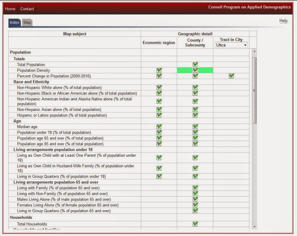
When you click that link you end up here:

Click to Enlarge

Note several things...first, each check box is a map. You can see them by either the economic region, the county/subdivisions, or by a specified city.


To see a map, simple click on the box under the geographic level you'd like to see mapped out. You end up with a map like the following, which shows population density.

Click to Enlarge

To get back to the index page either use your back button or click the index tab at the top left. 


 There are a ton of maps here so take a look around and check the ones for the city of Utica as well!

Tuesday, June 10, 2014

Census of Agriculture: Twenty Years of Tracking Changes in Farm Commodity Sales in Oneida County

With the recent release of the 2012 Census of Agriculture I wanted to look at some of the longer term trends in farming. One of the things that looked interesting was examining the changes in the overall commodities that local agribusinesses have produced over the last, let's say, 20 years. I did this both in terms of their annual sales (in inflation adjusted dollars), and as a percent of the total annual commodities market.

If nothing else is clear, this much should be: milk and dairy products are kings in Oneida County! Far and away the single largest piece of the market belongs to cows ! As the chart below shows, dairy production has made up more than half of the total agricultural business market in the county in each census since 1992. Interestingly, though, it appears to have taken a bit of a slide downward in the last few years, slipping from 64% to about 54% of the total market.

Click to Enlarge

Of course what comprises the remainder of the farm commodities is also of interest. In the next chart, you can see what percent of the total market seven other groups of commodities made up annually in each census year.

Click to Enlarge

To get a better view of how each commodity has fared since 1992, below are sets of graphs showing the inflation adjusted sales value for each of these agribusinesses in Oneida County from 1992 through 2012. By examining each on it's own merit, you can see whether they appear to have grown in market share, declined in market share, or remained relatively stable over the past 20 years.


Click to Enlarge

Click to Enlarge

Click to Enlarge

Click to Enlarge

Friday, June 6, 2014

Second Most Common Religious Following By State and County

This is an interesting infographic, via the Washington Post, on the second most popular religious following by state.  While Christianity is first across the country, there is some definite patterns to which religion is second around the nation. The WP also  published an even more detailed breakdown by county.

Christianity is the largest religion in the US, by a wide margin: more than three-quarters of Americans identify as Christians. Buddhism is second. The data comes from a 2010 census sponsored by the Association of Statisticians of American Religious Bodies.

 National

Click to Enlarge


Counties

Click to Enlarge


 New York Counties


To see ALL of the religion traditions of our region, visit this previous post on relgious adherents

Thursday, June 5, 2014

Census Struggles to Gather Data on Same Sex Marriages

Same-sex marriage is now legal in Washington, D.C., and 17 states. Now the federal government’s task is to produce an accurate count of same-sex married couples. Acknowledging a “very serious problem” of flawed same-sex marriage data, the U.S. Census Bureau is testing new marriage and relationship questions on its pre-Census 2020 surveys in hopes of producing more accurate numbers in the next few years.

The PEW Research Center has a very good article exploring the hurdles facing the Census Bureau in this task.


The bureau also is testing an expanded question about marital status. Now, people can choose “now married,” “widowed,” “divorced,” “separated,” or “never married.” The agency is considering adding questions about whether someone is “living with a boyfriend/girlfriend or partner,” or is “currently in a registered domestic partnership or civil union.”

Wednesday, June 4, 2014

Top 5 Annual Wage Earning Jobs By Occupational Category in the Mohawk Valley

One more piece from the New York State Department of Labor wage data link - the top 5 wage earning jobs by occupational category. The table below lists 22 occupational groupings and the top 5 wage earning job titles based on their mean annual income. In a couple cases less than 5 job titles exists so only those that were provided are listed, in order of earnings. And don't forget - the "Mohawk Valley" consists of 6 counties: Herkimer, Oneida, Fulton, Montgomery, Otsego and Schoharie.


Part 1: Management; Business and Financial; Computer and Mathematical;

and Life, Physical and Social Science Occupations

Click to Enlarge

Part 2: Community and Social Services; Legal; Education, Training and Library;

Arts, Design, Entertainment, Sports and Media; Healthcare Practitioners and Technical Assistants; and Healthcare Support Occupations

Click to Enlarge

Part 3: Protective Services; Food Preparation and Serving; 

Building and Grounds Cleaning and Maintenance; Personal Care and Service;

and Sales and Related Occupations

Click to Enlarge

Part 4: Office and Administrative Support; Farming, Fishing and Forestry; 

Construction and Extraction; Installation, Maintenance and Repair; Production;

and Transportation and Material Moving Occupations

Click to Enlarge

Tuesday, June 3, 2014

The Value of Experience: Top 25 Occupations Where Experience Counts in the Mohawk Valley and New York State

The New York State Department of Labor provides occupational wage data for the state as a whole, as well as each of the labor market regions, like the Mohawk Valley. Employment and wage data by occupation are based on the Occupational Employment Statistics (OES) survey. The OES is a semiannual mail survey of employers that measures occupational employment and occupational wage rates for wage and salary workers in nonfarm establishments, by industry.  OES estimates are constructed from a sample of about 52,000 establishments.  Each year, forms are mailed to two semiannual panels of approximately 8,500 sampled establishments, one panel in May and the other in November.  Estimates are based on responses from six semiannual panels collected over a 3-year period.

Below, I have constructed tables for New York State as well as for the Mohawk Valley (which include Fulton, Herkimer, Montgomery, Oneida, Otsego, and Schoharie Counties). These tables show the top 25 occupations where experience seems to have the greatest relative impact on annual income. This was done by dividing the mean annual salary of entry level positions by the mean annual salary of experienced positions for each occupation. These 25 have the highest ratio of experienced salary to entry level salary.

In essence then, these are the top 25 occupations where experience has the greatest relative impact for the employee.

 New York State Top 25

Click to Enlarge


Mohawk Valley Top 25

Click to Enlarge

Monday, June 2, 2014

2012 Census of Agriculture County Profiles Available

The County profiles for the Census of Agriculture are now available from the USDA! Click on this link to select the county in NY you are interested in seeing !

In the meantime here are two simple pie charts about farm land in Herkimer and Oneida Counties that come from the profiles.

Herkimer County


Oneida County