Wednesday, February 26, 2014

Characterisitics of Those Migrating To and From NYS Counties

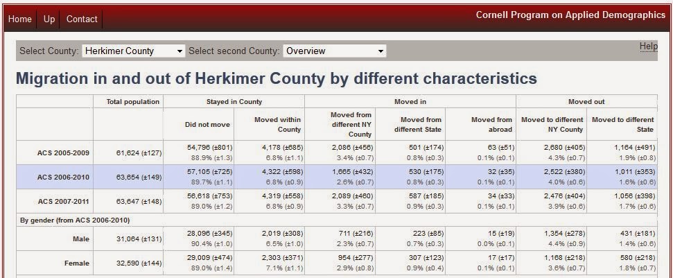
In the beginning of February I posted about county to county migration patterns. As I pointed out then, we have seen an overall gain in migration for our region, with a net increase of 2,800 people in this new data release. Unfortunately both counties haven't seen equal good fortune however. As shown in this table, in Oneida County there was a gain of about 3,558 migrants - with other NYS counties providing the bulk of the in-migration. Herkimer County, on the other hand has seen a net migration of minus 758, with those mostly split between other NYS counties and other US states.

Cornell Program on Applied Demographics Screen Sample


The Cornell Program on Applied Demographics now offers and interesting interactive table where you can select a county and see who exactly seems to be coming into, as well as out of, the area. They provide a breakout of the provide information on  the sex, age, race, and several other characteristics of these migratory people. In addition, if you wanted, you could specific a target county to see who from your county is moving there, as well as who from there is moving to your county. If the number of people migrating is small, however, the characteristics of those migrating are suppressed.

The State(s) of Being Happy: How the 50 US States Rank in Terms of Happiness


Gallup-Healthways recently released a report on the happiest states in the country based on six index domains: life evaluation; emotional health; work environment; physical health; healthy behaviors; and basic access. As they explain in the report...


So based on these six domain evaluations, which are the happiest states in the union? Well here's a map so you can geographically see how happiness seems to be arranged across the country, as well as a graphic from the report showing last year's and this year's rankings.

Click to Enlarge


Click to Enlarge

What's also interesting is to see how each state scored for each domain area...

Click to Enlarge

Tuesday, February 18, 2014

Licensed for Adventure: New Hunting, Fishing, and Camping Driver's License Options in NYS

Last week Governor Andrew M. Cuomo introduced the New York State Adventure License Series, providing New Yorkers and visitors the opportunity to purchase lifetime licenses to fish, hunt and visit New York State Parks, as part of his efforts to enhance sporting and recreational opportunities, support outdoor enthusiasts and boost tourism throughout the state. As part of this promotional effort, the Governor unveiled New York’s Outdoor Adventure License Plates, which features nine new plate designs – including the I [love] NY HUNTING, I [love] NY FISHING, and I [love] NY PARKS license plates – available for free exclusively to those buying new lifetime hunting, fishing, or parks licenses in 2014. Click here to view the new plates.

In addition, New York residents who secure lifetime licenses will have the opportunity to receive an Adventure License, which allows them the option of consolidating all their recreation licenses and benefits onto their New York State Driver’s License, an initiative first introduced by the Governor during his State of the State address last month. The Adventure License and plates are available on the state’s revamped online licensing portal: www.licensecenter.ny.gov


New York’s Lifetime Adventure License Series will provide many benefits including:
  • Lifetime Hunting License: $535 for small/big game
    A lifetime hunting license allows holders to hunt across millions of acres of majestic wild lands in New York while saving on the costs of an annual license.
  • Lifetime Fishing License: $460
    A lifetime fishing license provides a lifetime of fishing on more than 70,000 miles of rivers and streams and more than 7,000 lakes and ponds while saving on the cost of an annual license.
  • Lifetime Empire Passport: $750 with special offer
    The Lifetime Empire Passport allows holders to enjoy the forests, the seashore, and the lakefronts in New York’s state parks for years and years to come while saving on the cost of an annual license. In addition, as a free one-time special bonus, purchasers will be able to select from any one of the following: a free week of camping, a free round of golf for four, or a $100 State Parks gift card.

Friday, February 14, 2014

New York State's Energy Profile

The U.S. Energy Information Administration provides a pretty interesting assessment of New York State's Energy Profile. Among the main findings:

  • In 2010, New York was the eighth largest energy consumer in the United States, but it had the second lowest energy consumption per capita after Rhode Island, due in part to NY's widely used mass transportation systems.
  • The Marcellus shale, which underlies southwestern New York, is estimated to hold at least 141 trillion cubic feet in technically recoverable natural gas.
  • The 2,353-megawatt Robert Moses Niagara hydroelectric power plant was the fourth largest hydroelectric power plant in the United States in 2010 and, in 2011, New York produced more hydroelectric power than any other State east of the Rocky Mountains.
  • New York's Renewable Portfolio Standard requires that 30 percent of electricity come from renewable energy resources by 2015; in 2011, 24 percent of electricity came from renewable energy resources.
  • In 2011, New York had the fourth highest average electricity prices in the United States.
  • More than half of New York households (53 percent) use individual window or wall air conditioning units, while only 20 percent have a central air conditioning system, according to EIA's Residential Energy Consumption Survey.  

Click to Enlarge

Wednesday, February 12, 2014

The Best Counties For Finding the "Marrying Kind"


Ok, one more Valentine's themed post here. According to the US Census Bureau the median age for first time marriage in the United States is approximately 27 years old for women, and 29 years of age for men.


Here, then, are the top 10 counties in New York for finding a single-never-married-mate in the 26 to 30 year old age range.


Rank Counties with Highest Ratio of
Males to Females (ages 26 to 30)
Counties with Highest Ratio of
Females to Males (ages 26 to 30)
1 Wyoming County New York County
2 Franklin County Hamilton County
3 Essex County Bronx County
4 Green County Schenectady County
5 Seneca County Kings County
6 Washington County Monroe County
7 Clinton County Fulton County
8 Putnam County Albany County
9 Schuyler County Columbia County
10 Jefferson County Montgomery County

Just for comparison purposes, Herkimer County has the 11th highest ratio of females to males in the age range 26 to 30, while Oneida County has the 22nd highest ratio of males to females.

Another Pleasant Valley Sunday: Most Pleasant Places to Live

Kelly Norton is a designer and software engineer living in Atlanta, Georgia. He holds degrees from Georgia Tech's School of Electrical and Computer Engineering and from the MIT Media Lab. He has put together an interesting map showing where the most "pleasant" places to live are in the US. “Pleasant” for his purposes means the average temperature was between (55° F and 75° F), the minimum temperature was above 45° F, the maximum temperature was below 85° F and there was no significant precipitation or snow depth.

As he points out, "It has been a winter of dreadful weather so far. I spent January flying back and forth from New York expecting to find a different set of conditions at the end of each leg. Whichever way I went, bitter cold greeted me at the end of the jet way and often with a coating of slick ice. It’s hard not to dwell on anomalous and unpleasant weather. It got me wondering, though, where in the U.S. do you go if you want the most “pleasant” days in a year?"

To see his interactive map visit here! You can put in your zip code to get a look at your area's "pleasantness".

In the meantime, here's what he has for the Utica area.

Click to Enlarge


Tuesday, February 11, 2014

One in Ten Winter Olympians Comes From One College in Utah

Forbes magazine points out that college students across the U.S. gathered around their TVs Friday night to watch the opening ceremonies of the Sochi Winter Olympics, which got tepid reviews from most. The scene was a little different at Westminster College. The school organized a big Olympic viewing party with prizes of clothing and accessories from the U.S. ski team. Westminster students could also pick out 23 of their classmates in the U.S. procession entering Fisht Olympic Stadium. The Westminster contingent represents 10% of the 230 athletes on the U.S. Olympic team and more than any other school.

But one Olympian, one with a bronze medal around her neck, doesn't come from Utah. She comes from Remsen, New York !

Congratulations to Erin Hamlin !


Love, By The Numbers...Census Numbers, That Is...

Expressing one's love to another is a celebrated custom on Valentine's Day. Sweethearts and family members present gifts to one another, such as cards, candy, flowers and other symbols of affection. Opinions differ as to who was the original Valentine, but the most popular theory is that he was a clergyman who was executed for secretly marrying couples in ancient Rome. In A.D. 496, Pope Gelasius I declared Feb. 14 as Valentine Day. Esther Howland, a native of Massachusetts, is given credit for selling the first mass-produced valentine cards in the 1840s. The spirit continues today with even young children exchanging valentine's cards with their fellow classmates. Here's just a few of the Valentine's relevant numbers, as found through various Census resources.

Candy

1,148

Number of U.S. manufacturing establishments that produced chocolate and cocoa products in 2011, employing 35,538 people. California led the nation with 122 of these establishments, followed by Pennsylvania, with 109.
Source: U.S. Census Bureau, County Business Patterns: 2011

440

Number of U.S. establishments that manufactured nonchocolate confectionary products in 2011. These establishments employed 19,198 people. California led the nation in this category with 56 establishments.
Source: U.S. Census Bureau, County Business Patterns: 2011

$13.5 billion

The estimated value of shipments in 2011 for firms producing chocolate and cocoa products.
Source: U.S. Census Bureau, 2011 Annual Survey of Manufactures, Products and Services
Non-chocolate confectionery product manufacturing, meanwhile, was an estimated $8.4 billion industry.
Source: U.S. Census Bureau, 2011 Annual Survey of Manufactures, Products and Services

3,320

Number of confectionery and nut stores in the United States in 2011.
Source: U.S. Census Bureau, County Business Patterns

Government and Private Employees In New York State

Unfortunately I do not have a lot of information about Andy Arthur, who made the maps below, but they are an interesting look at the state, local and private workforce as percentages of those employed across New York State. The maps appear to use the block group level of census geography and I think they are made with 2012 Five Year ACS estimates. Regardless, they represent a unique look at employment patterns across the state.

State Government Employees

Click to Enlarge


Local Government Employees 

Click to Enlarge


 Private Sector Employees 

Click to Enlarge

Friday, February 7, 2014

County to County Migration Data: Regional Gains and Losses

In a given year, about 6 percent of the U.S. population picks up and changes counties. Young families move from Chicago to the surrounding suburbs. Recent college graduates cross the country for a first job in Boston, or Washington, D.C. Retirees relocate for good down to the Sunbelt.

If you could track all of these moves simultaneously across time, you'd get a picture of the parts of the country that are net population gainers, and those that are losing people instead. That picture would look like this:
 

The Atlantic Cities website does a nice job of explaining the new data flow mapper available at the Census Bureau for tracking these changes in migration. I would encourage you to read their article about this new function.

In the meantime, we have seen an overall gain in migration for our region, with a net increase of 2,800 people in this new data release. Unfortunately both counties haven't seen equal good fortune however. As the table below shows, in Oneida County there was a gain of about 3,558 migrants - with other NYS counties providing the bulk of the in-migration. Herkimer County, on the other hand has seen a net migration of minus 758, with those mostly split between other NYS counties and other US states.

 
Overall, then, where are our new neighbors coming from? And where did our old neighbors go? Here's the top 10 migration patterns for in-, out-, and net-migration for each county. Note that there are separate tables for the top states people came or went to, as well as the top counties in NYS for which they did the same.

Thursday, February 6, 2014

Who Still Smokes In America ?

With the announcement yesterday that CVS will no longer sell tobacco products at its stores, the question of who this potentially impacts might be of interest. The CNN Money page recently released an infographic depicting the characteristics of American smokers, and I've attached it below.

Click to Enlarge