Transfer payments are non-compensatory government payment to individuals, such as for welfare or social security benefits. It also includes things like veterans benefits, Medicare and Medicaid, disability payments and earned income credits.
To see the interactive page, CLICK HERE
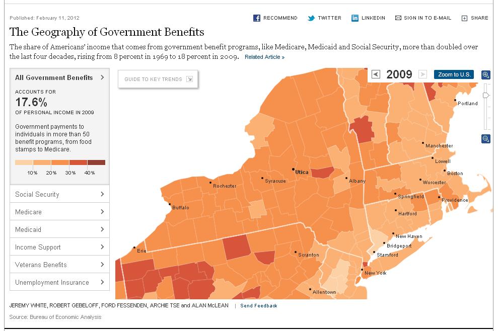
The interactive map lets you point to a county and see what the present per capita payment is as well as look at the historical trends over the last several decades. The source data is the BEA (Bureau of Economic Analysis).