Showing posts with label PAD. Show all posts

Wednesday, March 4, 2015

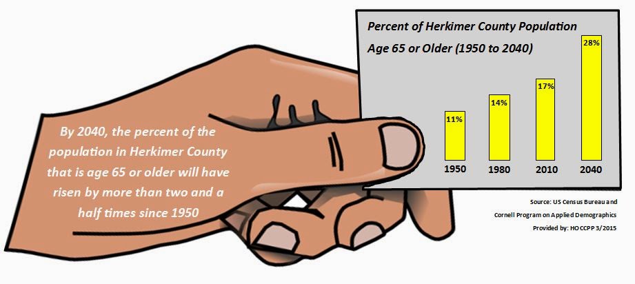
Boomergedden: Senior Citizens as a Percent of Population in Herkimer County

This graphic shows the projected rise of senior citizens (people age 65 and older) in Herkimer County. The projections are from the Cornell University Program on Applied Demographics. The historical data comes from the US Census decennial counts. Some have referred to this movement of Baby Boomers into the ranks of senior citizenry as "Boomergedden".

Click on the graphic to enlarge it.

CLICK TO ENLARGE

Friday, June 13, 2014

More Census Maps from the Program on Applied Demographics

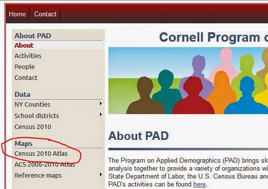
Cornell's Program on Applied Demographics has a great resource for maps (in some cases down to the tract level) in the Census 2010 Atlas application. If you go to the link above you can find the Atlas on the left side of the page:


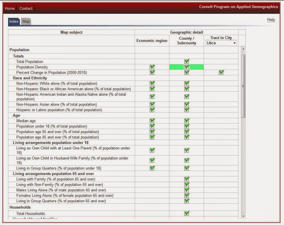
When you click that link you end up here:

Click to Enlarge

Note several things...first, each check box is a map. You can see them by either the economic region, the county/subdivisions, or by a specified city.


To see a map, simple click on the box under the geographic level you'd like to see mapped out. You end up with a map like the following, which shows population density.

Click to Enlarge

To get back to the index page either use your back button or click the index tab at the top left. 


 There are a ton of maps here so take a look around and check the ones for the city of Utica as well!

Thursday, April 24, 2014

Cornell PAD Trend Data: Building Upon the Release of IRS Records


The Cornell Program of Applied Demographics (PAD) has recently folded in the IRS records cited in my last post on their Trends page.


The PAD Trends page presents recent demographic and economic county trends. The data presented is collected from a variety of sources. The trends (variables) are organized in chapters and sub-chapters. Each trend has a little sparkline that quickly gives a glance at the recent trend. More detail, including the numbers are also available.


To use their page:
  • Select a county (or the state as a whole) using the drop down menu.
  • The bottom grey bar has some additional menu items:
    • Trends that have to do with dollar amounts can be displayed unadjusted for inflation (Current $) or adjusted for inflation (Constant 2000 $)
    • "Export to Excel" will create a Microsoft Excel file with the data from selected variables.
    • "Analyze" will open a new window with larger graphs. This page allows for some basic computations between variables. Trends for multiple variables are combined when possible (based on the dimension of the variable)
    • "Map" will open a new window with a coloured county map that shows differences beween counties for selected variables. There will be a drop down box with the variables selected.
  • The chapters are listed on the left and assist in scrolling through the available trends.
  • The chapters and sub-chapters can be collapsed and expanded by clicking on the little double arrows or on the chapter title.
  • If you move your mouse over a sparkline, an enlarged chart with axes information will pop-up.
  • Click on the details button to see an enlarged chart and a table. There will also be a reference to the data source.
  • You can select/unselect variables for further analyses by clicking on the little box in front of the variable name.
Further explanation of a variable can be found by clicking on the name of the variable (not available for all variables).

Friday, August 30, 2013

Sub-County Profiles Now Available From Cornell PAD

Previously I have posted about Cornell's Program on Applied Demographics (PAD) County Profiles. These profiles provide a rather in-depth look at each county in New York, covering wide ranging topics from age and sex of the population, to the languages spoken at home, poverty levels, education, agricultural characteristics, and local climate.  Each county profile contains data, as well as thematic maps to help in understanding some of the nuances of the information.

PAD has now released similar profiles on the sub-county level - meaning similar types of data and written profiles are now out there on the town and city levels across the state. All you have to do is go to the PAD Profile page and select the Sub-County tab as shown below. Then simply click on a county to get the sub-county profiles.


For ease of access you can see the Oneida County Sub Profiles by clicking this link, and the Herkimer County Sub Profiles by following this one.

Tuesday, July 2, 2013

Thematic Maps Available Through Cornell's Program on Applied Demographics

The Program on Applied Demographics at Cornell University has a great maps page if you're looking for some thematic mapping of the whole state by county. By visiting their maps page you can select a theme (or metric as they prefer to say) to see mapped out by county for the entire state of New York  So for example if you were looking for a feel for what the median age of the population living in each county was, you could select the "metric" on median age and then get the map to show that particular characteristic on a state wide map. It would look like this:

Click to Enlarge
Mappable metrics include:

Feel free to explore the PAD site. They do some great things with Census data there !

Wednesday, June 26, 2013

Population Projections: The Program on Applied Demographics at Cornell

I get a fair number of requests from people for population projections. Unfortunately, while we do occasionally dabble in these, the efforts we make remain unofficial. The State of New York, which has provided such things in the past, also doesn't have any "official" population projections. At present, the best place to probably look for this type of data is through the Program on Applied Demographics (PAD) at Cornell University.

PAD offers a variety of excellent data services and analysis, and works closely with both the Census Bureau and the NYS Census Data Affiliate Network. One of the things that they offer are population projections for every county in New York. The most recent version of their projections run through the year 2040, and offer breakdowns by age groupings, by sex, and by sex by age groupings.

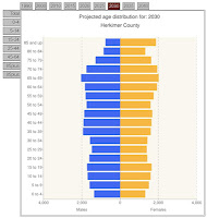
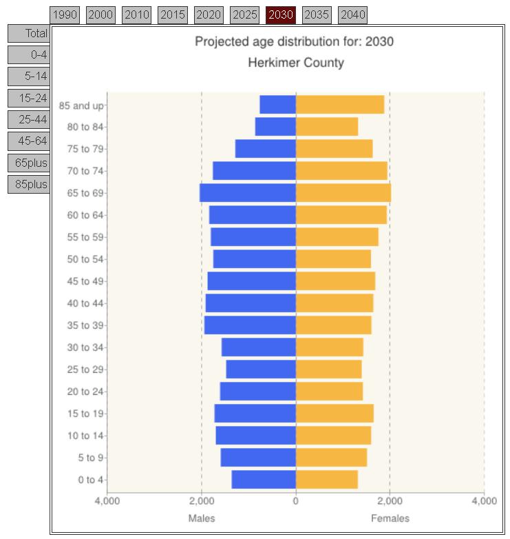
Below are the two counties' population pyramids - basically a graphic representation of their population age distributions broken out by sex. The initial one in each series reflects the most recent census data from 2010. The successive pyramids are from PAD's projections for the years 2020, 2030 and 2040. Clicking on each will enlarge it to make it easier to see.

Herkimer and Oneida County Population Pyramids (click each to enlarge)

Herkimer County 2010 Census
Herkimer County 2020 Projection
Herkimer County 2030 Projection
Herkimer County Projection
Oneida County 2010 Census
Oneida County 2020 Projection
Oneida County 2030 Projection
Oneida County 2040 Projection

To see the actual data associated with each of these pyramids, be sure to visit the PAD population projection page.
Friday, May 31, 2013

Origins and Destinations: People Moving Into, and Out of, Upstate NY

When people leave Upstate New York, where do they move to? And where do new migrants to the Upstate region come from? The New York Minute, an oline publication of Cornell University’s Community & Regional Development Institute (CaRDI), produced in collaboration with the Program on Applied Demographics, just released an interesting look at who moves into, and out of, upstate New York. Upstate New York for these purposes is defined as anything in New York north of Rockland and Westchester Counties.

Basically CaRDI looked at the County to County Migration flows in the 2010 American Communities Survey (ACS) Five Year Estimates and identified the top 5 origins and destinations for different age groups within the Upstate New York area. What they found was that “Upstate” receives a significant number of in-migrants from the downstate New York region, from Florida, and from countries in Asia. A significant number of movers out of “Upstate” head to Florida, to downstate New York, and to Pennsylvania, among other locations. And these origins and destinations do seem to vary by the age of mover.

The graphic below, taken from the New York Minute, shows these breakdowns by age groups nicely. 
Click to Enlarge

To see the full data, visit: Cornell's Program for Applied Dempgraphics.                

Wednesday, April 10, 2013

NYS County Profiles from Cornell Now Available

The Cornell Program on Applied Demographics (PAD), in coordination with the Community and Regional Development Institute, has released statewide County Profiles.. These profiles provide a rather in-depth look at each county in New York, covering wide ranging topics from age and sex of the population, to the languages spoken at home, poverty levels, education, agricultural characteristics, and local climate.  Each county profile contains data, as well as thematic maps to help in understanding some of the nuances of the information. Below are two samples of the types of data presentation contained through the profiles.
Click to Enlarge

Click to Enlarge


To see the entire profile for either Herkimer or Oneida Counties, click the appropriate link below to view the pdf file.


Monday, June 11, 2012

Urbanized Areas and Density in New York State

The Program on Applied Demographics (PAD) brings skills in demographics, economics, statistics, data gathering and data analysis together to provide a variety of organizations with data, information and advice. PAD works closely with the New York State Department of Economic Development, the U.S. Census Bureau and other organizations to assist them in their activities.


In an effort to help policy makers see their present (and past) urbanized area, and get a feel for the density of the population in those areas, PAD created a series of maps that do just that ! They are located in a pdf file on the Applied Demographics website.