Each year, the Census Bureau releases three versions of the American
Communities Survey (ACS). These are the 1-Year, the 3-Year, and the
5-Year ACS Estimates. These are released based on the population size of
the municipality. Five year estimates are released for EVERY level of
census geography (down to the block group level) as well as every
municipality (think town, city, and village). Three year estimates are
only released for geographies or municipalities with a MINIMUM
population of 20,000 persons. As a result, many smaller villages and towns are
excluded. One year estimates are released for municipalities with a
MINIMUM population of 65,000. This means they are mostly for counties
and larger cities. For our region, only Oneida County and the Utica Rome MSA have single year estimates available.
The newest Herkimer County ACS data comes through the Three Year ACS Estimates which are NOW AVAILABLE! The most recent 3-Year Estimates are a permanent part of this blog
in the linked area just below the title above. A permanent link will
take you to the most recent 3 year estimates post so you can always
easily find this important data for both counties !
Below are the individual links to the Demographic, Social, Economic and
Housing Profiles for the 2013 Three Year ACS Estimates for Herkimer and Oneida Counties.
2013 OC ACS 3 Year Estimate Demographic Profile
2013 OC ACS 3 Year Estimate Social Profile
2013 OC ACS 3 Year Estimate Economic Profile
2013 OC ACS 3 Year Estimate Housing Profile
2013 HC ACS 3 Year Estimate Demographic Profile
2013 HC ACS 3 Year Estimate Social Profile
2013 HC ACS 3 Year Estimate Economic Profile
2013 HC ACS 3 Year Estimate Housing Profile
Thursday, October 23, 2014
Friday, October 17, 2014
Weekly Hours Worked and Weeks Worked Per Year By "For Profit", "Non-Profit", "Government" and "Self Employed" Workers

Below are several graphs which show the distribution of each of these classifications in terms of the hours and weeks worked in the past year. To start with, as you can see below, most of the workforce is working between 31 to 40 hours weekly - the majority of those working at for profit businesses (56%), those in non-profits (55%), and those working in the public sector/government (62%) all work in the 31 to 40 hour range.
 |
| Click to Add |
The lone exception are workers who are self employed. While more of them work 31 to 40 hours per week (26%) than any other ten hour span, it is not a number approaching the 50% mark as with the other three workforce groups. If we look a bit deep at these numbers the reason why is obvious.
Below are four pie charts showing the percent of workforce for each group that work more than 40 hours per week. In the case of for profits, non-profits, and government workers, somewhere between 38% and 45% worked in excess of 40 hours each week in the past year. However, note the percent of self employed workers who put in more than 40 hours of work each week - nearly 3 in 4 (74%) worked in excess of 40 hours per week. And from the PUMS data, it shows that as many as 15% worked in excess of 50 hours each week!
 |
| Click to Enlarge |
 |
| Add caption |
Not surprisingly, most of the workforce works 50 or more weeks per year - regardless of the sector, between 70% and 75% worked 50 to 52 weeks in the last year.
 |
| Click to Enlarge |
Here is the distribution of each group's workforce in regard to the number of weeks less than 50 that they worked in the prior year.
 |
| Click to Enlarge |
How The Census Bureau Measures Poverty
The US Census Bureau offers two measures of poverty. The official measure of poverty is the more traditional piece based on a 1963 definition of poverty living based largely on cash resource availability. The second measure is the Supplemental Poverty Measure (SPM) which accounts for non-cash benefits from government programs aimed at low income families as well as cash resources of the household.
Below is an infographic comparing the two measures which helps explain their differences more fully. A publication by the Census Bureau, located here, provides some comparisons between the official and SPM data by state. To see local information for your community on poverty, visit this previous post of poverty and income by municipality.
 [Source: U.S. Census Bureau]
Below is an infographic comparing the two measures which helps explain their differences more fully. A publication by the Census Bureau, located here, provides some comparisons between the official and SPM data by state. To see local information for your community on poverty, visit this previous post of poverty and income by municipality.
[Source: U.S. Census Bureau]
Tuesday, October 14, 2014
A Look at Seniors in Herkimer County From the 2012 ACS Five Year Estimates
Below are two tables showing characteristics of the current population age 65 and over in Herkimer County. New data for Herkimer County will be available at the end of this month in the form of the 2013 ACS Three Year Estimates!
Herkimer County Elderly Profile (Part 1)
 |
| Click to Enlarge Part 1 |
Herkimer County Elderly Profile (Part 2)
 |
| Click to Enlarge Part 2 |
Monday, October 13, 2014
New Zip Code Data from the IRS
The IRS recently released ZIP
Code data showing selected income and tax items classified by State, ZIP
Code, and size of adjusted gross income. These data are based on individual
income tax returns filed with the IRS and are available for Tax Years
1998, 2001, 2004 through 2012.
The map on the IRS page allows you to select a set of state ZIP Codes and peruse their data.

The data include items such as:
- Number of returns, which approximates the number of households
- Number of personal exemptions, which approximates the population
- Adjusted gross income
- Wages and salaries
- Dividends before exclusion
- Interest received
So pick a year below and take a look at your local ZIP code !
ZIP Code Data
ZIP Code Data 1998–2010
Tuesday, October 7, 2014
An Example of Using ACS Estimates Over Time: Poverty and Family Types 2005 to 2013

As an example, below are the historical estimates of poverty by family type, in this case single mom families versus two parent families in Oneida County. Not surprisingly, poverty rates for single parents are quite a bit higher than they are for dual parent families - the average over the nine years is about 30% for single moms and around 5.5% for dual parent families.
 |
| Click to Enlarge |
What's important to note is the trends depicted by the shaded areas in the chart, which represent the margins of error for each year. As can been seen, they are rather large for single moms and fairly small for dual parents. This is mainly because of the small number of single mom's sampled (due to their fairly small number within the community). Just be sure to take a look at those margins of error as you explore the ACS data as there are times that they are exceedingly large, and should then be viewed with a some caution.
Thursday, October 2, 2014
Does Buying Local REALLY Matter?

What they found was that this question is addressed in a Federal Reserve Bank of Atlanta analysis of county level economic data for the 2000 to 2009 time period. Economist Anil Rupasingha examines the local share of employment by county and compares those numbers to real per capita income growth, employment growth, and poverty.
In most counties, employment in locally-owned businesses surpasses employment in "nonresident-owned" businesses. But the local share varies greatly by county, which you can see at a glance in the county-level maps included in the analysis. The share of employment in locally-owned businesses varies by county from 11 to 87 percent. The share of employment in nonresident-owned businesses varies by county from zero to 85 percent.
Percent of Residents Working in Locally Owned Businesses (2007)
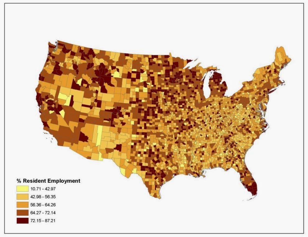 |
| Click to Enlarge |
"Historically, the most popular local economic development approach was to attract businesses outside a particular municipality, state, or region," says Rupasingha. But theories about local economic development are changing, he says, and "economic development based on local entrepreneurship is increasingly gaining traction." Which approach is better?
Local is better. According to the study's results, the greater the local entrepreneurship, the greater the per capita income and employment growth and the lower the poverty. Also and interestingly, smaller local businesses have a greater effect on local economic performance than larger local businesses. "My results suggest that fostering smaller local businesses may be good local economic development policy," Rupasingha concludes.
Locally, businesses with less than 50 employees make up about 98% of companies in Herkimer county and 95% of those in Oneida County. There are more than 10,000 people who consider themselves "self employed" in the region ! So obviously small businesses play a big part of our local economy.
Subscribe to:
Posts (Atom)