Showing posts with label jobs. Show all posts

Thursday, February 18, 2016

Projected Openings in Occupations Within the Mohawk Valley: 2012 to 2022

A while ago I posted on job openings in the Mohawk Valley by occupation through 2020. Note that the "Mohawk Valley" includes Fulton, Herkimer, Montgomery, Oneida, Otsego, and Schoharie Counties combined. The information has been updated an is now available for the period 2012 to 2022.

There are several ways to look at this data. First, and similar to what I did the last time, you might take a look at the actual numbers of jobs being created. Job creation takes into account brand new jobs, as well as hirees selected to replace workers that have left or retired. The chart below shows the top 10 jobs with projected growth from 2012 to 2022 for the Mohawk Valley Region.

CLICK TO ENLARGE
As the data shows, the top growth is in Office and Administrative Support jobs. The vast majority of that projected growth involves openings created mostly by current job holders leaving those positions - 770 out of a projected 900 openings.  On the other hand nearly half of the growth in Personal Care and Service jobs come from new job creation (200 out of 410 job openings).

Another way to look at these job openings is by the percentage growth they are projected to have. It's one thing to see a projected increase of 900 jobs, but another if those 900 jobs represent only a small percentage of that particular market sector. So as an alternative way to view these projections, here are the top ten projected openings by their percentages of job sector.

CLICK TO ENLARGE
In this case you can now see how the sectors with the largest percentage projected growth is Personal Care and Service (17.6% projected growth), and Healthcare Practitioners and Technical Support (15.6% projected growth).

Lastly, here is a summation of all of the sectors, their job creation projections, and current salary data.

CLICK TO ENLARGE

Wednesday, February 17, 2016

Occupational Attractions: Who Marries Whom By Occupation


When it comes to falling in love, it’s not just fate that brings people together—sometimes it’s their jobs. Bloomberg.com scanned data from the U.S. Census Bureau’s 2014 American Community Survey—which covers 3.5 million households—to find out how people are pairing up by occupation.

Interestingly, here's how Urban Planners seem to match up. Click to Enlarge the graphic. Type your occupation into the space on the page to see how you might match up to your mate, job-wise. 


CLICK TO ENLARGE

Tuesday, February 16, 2016

Projected National Job Growth By Occupation (2024)

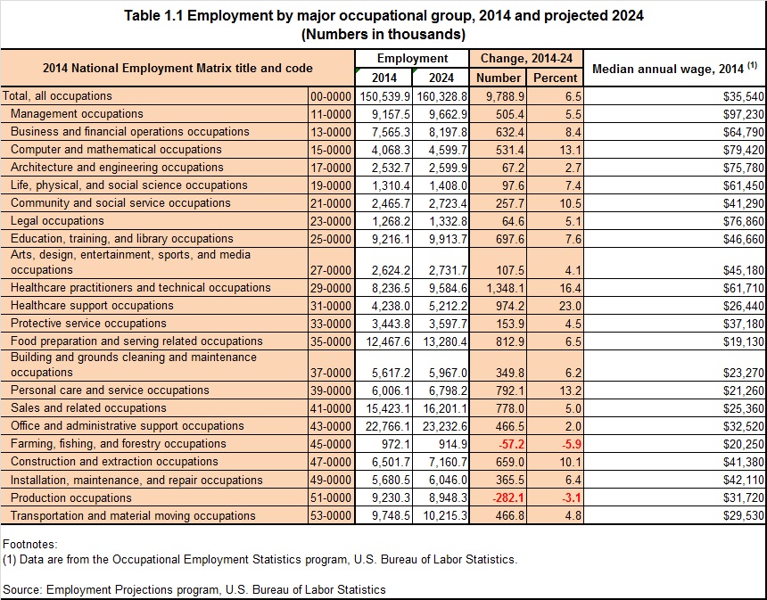
From the Bureau of Labor Statistics comes projected job growth within various occupations through 2024. The data provides a comparison of 2014 occupational data with the projected changes by the year 2024.

Here are three basic tables found in the Excel spreadsheet download: overall employment by major occupational group; the fastest growing occupations; and the fastest declining occupations. Click each to see them enlarged.

CLICK TO ENLARGE


CLICK TO ENLARGE


CLICK TO ENLARGE

Monday, August 31, 2015

How THIS Map Might Change With Development of High Tech Jobs

Robert Manduca, a graduate student at Harvard, recently create this map based on 2010 Census data. This visualization plots one dot for every job in the United States, according to the Census Bureau's Longitudinal Employer-Household Dynamics data. The LEHD data is based on state unemployment insurance records, and tabulates the count of jobs by census block.

In this map, jobs are colored by type, allowing us to see how different industries and sectors exhibit different spatial patterns--some clustering in downtowns, others spreading across city and suburbs alike.

What I was wondering was how the map I posted below, which centers on Utica and Marcy, might change in the coming years, and by the Census 2020, if the region sees the influx of high tech jobs on the Quad C Campus and surrounding area? Click on it to enlarge the graphic and pay attention to coloration guide at the bottom of the map ! And be sure to look at the job distribution in other areas by visiting the website !

CLICK TO ENLARGE

Thursday, May 14, 2015

Mapping the Concentration of Job Sectors

The Census Bureau's On The Map feature allows the comparison of job sector concentration through mapping. Below are just four sectors I looked at within Herkimer County to see how their concentration varies: Health Care and Social Assistance, Retail Trade, Manufacturing, and Accommodations and Food Service.

Health Care and Social Assistance

CLICK TO ENLARGE


Retail Trade

CLICK TO ENLARGE


Manufacturing

CLICK TO ENLARGE

Accommodations and Food Service

CLICK TO ENLARGE

Wednesday, May 13, 2015

Workforce Sector Distribution by Age Of Workers (2011)

I thought this was sort of an interesting use of "On the Map", located on the Census Bureau's webpage. It shows the number of employees found in selected work sectors within the Herkimer-Oneida Counties region. Note how some age groups (under 30, 30 to 54, or 55 and above) seem to dominate certain sectors of employment. Click on the graph to enlarge it.

CLICK TO ENLARGE

Thursday, May 29, 2014

Projected Openings in the Mohawk Valley by Job Type (2010-2020)

The following data comes through the NYS Department of Labor. The graphic is all mine ! Basically it is the projected job openings (not to be confused with job growth) for this decade. These are broken into two categories: replacement jobs (in other words filling a job that has become vacant) and new jobs.


Personal care and health care appear to be where the most new jobs will be opening up, while office administration and sales support will have the most openings of replacement jobs.

Click to Enlarge

Friday, May 3, 2013

Dirty Jobs: Skilled Trades and Their Growth in Herkimer and Oneida Counties


As high school graduation season is looming just around the corner, of course not every graduating senior is necessarily anticipating heading off to college in the fall. While the vast majority may have their eyes on continuing their formal education at a school of higher education (upwards of 80% of 11th graders have said they plan to go to a 2-year or 4-year college after graduation, according to local survey data), college is admittedly not for everyone. Trade and vocational schools offer great alternatives to college for some young people.  

This has become a considerable focus of a rather famous TV personality – Mike Rowe of “Dirty Jobs”, “The Most”, and “Deadliest Catch” fame has become an outspoken advocate for getting kids interested in skilled trade jobs. He has even testified before Congress about the dangers of declining interest in this type of work. The notion of depicting hard work as noble and fun is central to his personal mission. On Labor Day of 2008, Mike launched a website called www.mikeroweWORKS.com where skilled labor and hard work are celebrated in the hope of calling attention to the steady decline in the trades and bolster enrollments in trade schools and technical colleges. Later that same year, he started the mikeroweWORKS Foundation which provides tool stipends and scholarships to those looking to learn a skill or master a trade. His financial aid page even has financial aid specific to New York State colleges and trade schools .

Locally we have seen an increase in the last decade when it comes to some of the skilled trades Mike Rowe promotes as options to more traditional college pursuits. Below is data from the 2000 Census and the 2011 Three Year Estimates of the American Communities Survey showing changes in several construction and trade jobs between those years. Note that both Herkimer County (38%) and Oneida County (25%) have seen greater growth in demand for these skilled workers than the state (17%) has as a whole.

Click to Enlarge


Wednesday, April 24, 2013

Office and Administrative Support Occupations in Herkimer and Oneida County

According to Wikipedia, Administrative Professionals' Day is an unofficial holiday observed in several countries to recognize the work of secretaries, administrative assistants, receptionists, and other administrative support professionals.The idea began with Mary Barrett and C. King Woodbridge. They served on a council addressing a national shortage of skilled office workers and originated the idea for a National Secretaries Week.

The official period of celebration was first proclaimed as "National Secretaries Week," which was held June 1–7 in 1952, with Wednesday, June 4, 1952 designated National Secretaries Day. In 1955, the observance date of National Secretaries Week was moved to the last full week of April. The name was changed to Professional Secretaries Week in 1981, and became Administrative Professionals Week in 2000 to encompass the expanding responsibilities and wide-ranging job titles of administrative support staff. The basic object was originally to recognize "the secretary, upon whose skills, loyalty, and efficiency the functions of business and government offices depend," and to call attention "through favorable publicity, to the tremendous potential of the secretarial career."

Nearly 20,000 people are employed in Office and Administrative Support positions in our region. The vast majority of these positions are filled by women (72%). The positions held are quite wide ranging. Click on the table below to see the the breakdown of these jobs, as well as the numbers of males and females in each type of position in Herkimer and Oneida Counties.

Click to Enlarge


Tuesday, May 8, 2012

Business Dynamics Statistics in Herkimer and Oneida Counties: Establishment Births and Deaths

The Business Dymanics Statistics Program  (BDS) is a product of the U.S. Census Bureau and includes measures of establishment openings and closings, firm startups, job creation and destruction by firm size, age, and industrial sector, as well as several other statistics on business dynamics. The U.S. economy is comprised of over 6 million establishments with paid employees. The population of these businesses is constantly changing –– some businesses grow, others decline and yet others close altogether. New businesses arise to replenishing this pool. The BDS series provide annual statistics on gross job gains and losses for the entire economy and by industrial sector and state. Currently the BDS covers the years 1976 through 2010 These data track changes in employment at the establishment level, and thus provide a picture of the dynamics underlying aggregate net employment growth.

The Herkimer and Oneida Counties region (or what is known as the Utica-Rome Metropolitan Statistical Area, or U-R MSA) has faced incredibly difficult hurdles over the last 20 years. With the closing of several major businesses, as well as the realignment of Griffiss Air Force Base (GAFB), the economic impacts on the region have been unprecedented. Below are several pieces of data from the BDS data base, as well as the Small Business Administration’s (SBA) Office of Advocacy . The SBA Office of Advocacy offers data through its Statistics of U.S. Businesses (SUSB) program to track establishment births and deaths, as well as the associated job creation and loss with each of those respectively.

For example, looking at the chart below, you can see how establishment loss spiked in the early and mid-1990s in our region. At the same time, new businesses moving into the area also dropped precipitously just prior to the decision to close GAFB, and then for the remainder of the decade following its closure.
Since the start of the new millennium, business births and deaths appear to both be increasing slightly, but in fits and starts.
 
So how do establishment births and deaths impact job growth in the region ? Well below is a chart showing establishment births and deaths just for the last 5 years worth of SUSB data (2003-2007). As you can see, in all but one of the years the number of business deaths outnumbered the business births regionally.
 
However, in three of the last 5 years there have been more jobs created by newly created establishments than lost by those that have closed. This is especially true in 2007. So it’s not just about the number of establishments created or lost, but the size of those establishments. 

In the U-R MSA, about 22.5% of all newly formed establishments are among companies of 20 or more employees; establishments of this size (20 or more employees) only make up about 19.7% of all business “deaths”. So the region is seeing slightly more midsize to large companies creating jobs in new establishments than they are losing.