Monday, September 14, 2015

Living Wage Gaps By Counties

MIT’s Living Wage Calculator estimates the cost of living (“living wage”) in each of the nation's counties and major metropolitan areas, and compares it to the minimum wage for a variety of household types. Mapped here are three types: parent with spouse and two children, single parent with one child, and single adult.

Variations in the gap between living wage and minimum wage occur for a variety of reasons. A city with a relatively high minimum wage, for instance, may still show a large gap due to a high cost of living. Conversely, living expenses tend to be lower in rural areas, making even a relatively low minimum wage come closer to meeting basic household needs.

You can get Living Wage data for any county in the country from the link above. Below is the Herkimer County Data. Click to enlarge the table.

CLICK TO ENLARGE

 The MIT site also has a living wage map which includes similar data but allows you to see the data spatially. Below is the Herkimer County data and map. Go to their Living Wage Map to see the country, as well as New York State counties.

CLICK TO ENLARGE

Wednesday, September 9, 2015

Mapping Local Immigration By Region of Origin

Kyle Walker, from Texas Christian University, has been working on a mapping project where the US immigrant population is represented with dots colored in accordnace to the immigrants’ general region of origin. 


The regions include:
  • Mexico (red);
  • Latin America and the Caribbean, other than Mexico (blue);
  • East and Southeast Asia (green);
  • South Asia (aqua);
  • Sub-Saharan Africa (purple);
  • North Africa & Southwest Asia (pink);
  • Europe (orange);
  • Oceania (yellow);
  • Canada (brown)
Demographic data are from the 2009-2013 American Community Survey at the Census tract level; both geographic and demographic Census data come from the National Historical Geographic Information System.Walker used the ACS table B05006, “Place of Birth for the Foreign-Born Population in the United States.” Each dot represents approximately 20 immigrants in that Census tract from a given region, and the dots are placed randomly within Census tracts.

Below is a  screenshot of the greater Utica area from the link above. Click the map to enlarge it.

CLICK TO ENLARGE

Tuesday, September 8, 2015

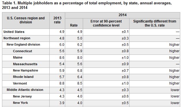
UPDATE: Moonlighting in the 21st Century - Multiple Job Holders By State

In January of last year I posted a piece about workers who held multiple jobs. This has since been update from 2012 data to 2014 data. While not a lot has changed in terms of BLS data for NYS, it is still interesting to look at the country as a whole.

Below is an updated map as well as some information on New York for 2013 and 2014. Click to enlarge either.

CLICK TO ENLARGE

CLICK TO ENLARGE

Ranking the Ability to Secure Mortgages in NYS Counties

SmartAsset provides an interactive map of the county (and New York State) that highlights the best counties for securing a mortgage. If you go to the link provided above and hover over each county you can see the data points for each one. You can also use the tabs at the top of the map to view the factors that drive the analysis used by SmartAsset to make their determinations.

Below is a sample of what you can see when I hovered over Herkimer County. Click to enlarge it.

CLICK TO ENLARGE

Tuesday, September 1, 2015

Highway Performance Monitoring System: Seeing Traffic Density in Your Neighborhood

Mapbox has created a map visualizing the latest Highway Performance Monitoring System national highway dataset. The Open Highway Data Set Map shows all the HPMS traffic density measurements for US roads.

Roads on the map with traffic density data are colored yellow. The thickness of the yellow lines on the map relate to the amount of traffic. Thick lines indicate more traffic and thinner lines less traffic. Zoom in on the map and you can view the average number of vehicles per day for different sections of roads.

Visit the site and zoom in to your neighborhood to see how many vehicles travel daily on some of the local roads where you live. Below happens to be a screen shot of the Village of Herkimer, with some rudimentary roads labeled by me. Click on the map to enlarge it.

CLICK TO ENLARGE THE MAP