Wednesday, February 26, 2014

Characterisitics of Those Migrating To and From NYS Counties

In the beginning of February I posted about county to county migration patterns. As I pointed out then, we have seen an overall gain in migration for our region, with a net increase of 2,800 people in this new data release. Unfortunately both counties haven't seen equal good fortune however. As shown in this table, in Oneida County there was a gain of about 3,558 migrants - with other NYS counties providing the bulk of the in-migration. Herkimer County, on the other hand has seen a net migration of minus 758, with those mostly split between other NYS counties and other US states.

Cornell Program on Applied Demographics Screen Sample


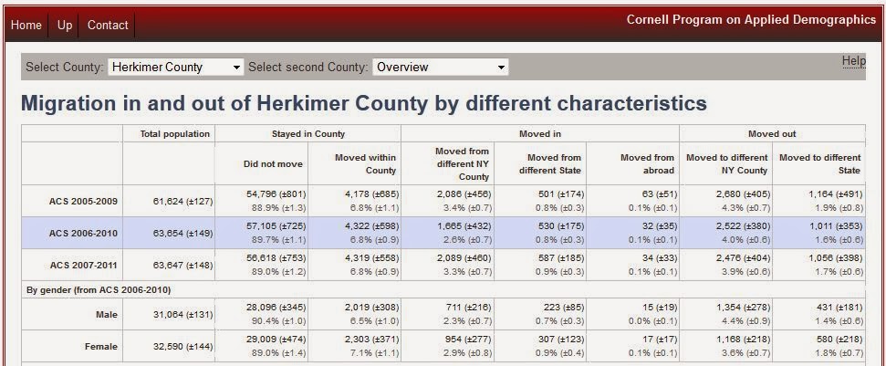
The Cornell Program on Applied Demographics now offers and interesting interactive table where you can select a county and see who exactly seems to be coming into, as well as out of, the area. They provide a breakout of the provide information on  the sex, age, race, and several other characteristics of these migratory people. In addition, if you wanted, you could specific a target county to see who from your county is moving there, as well as who from there is moving to your county. If the number of people migrating is small, however, the characteristics of those migrating are suppressed.