CensusScope.org offers some interesting analysis of the levels of segregation various "neighborhoods" experience based on their racial composition. Note that the term "neighborhoods" generally means whole cities or even metropolitan statistical areas, which for us would be the combined counties of Herkimer and Oneida. So rather looking at sections of cities, or what we might think of traditionally as "neighborhoods", these measures of integration/segregation go, at best, down to the city level. In addition, while they are working on using American Communities Survey data, they haven't done this yet for our area.
The graphs and tables shown here are based on Census 2000 data sets. They may not be based on the newest available data out there, but they still provide some interesting insight into our region.
The charts and tables below
come from the segregation analysis page at CensusScope. The first set are the the "Exposure Indices". As they explain, "Unless there is complete integration, the average racial composition of
neighborhoods where whites live differs from the average racial
composition of neighborhoods lived in by blacks, by Hispanics, or by
other groups. To examine this, we calculate the average racial
composition of neighborhoods experienced by members of each racial
group. These are sometimes referred to as 'exposure indices'. This is
because they show the exposure a given race group experiences with
members of their own and each other race (percentaged to 100) in an
average neighborhood of the city (or metropolitan area) being examined.
In the chart below, the first five columns represent the average racial
composition of the neighborhood of a person of a given race. The
rightmost column shows the racial composition of the metro area or city
as a whole." The data corresponding to these tables is included at the bottom of the clickable charts below.
 |
| Click to Enlarge Utica Indices |
|
 |
| Click to Enlarge Rome Indices |
|
 |
| Click to Enlarge MSA Indices |
|
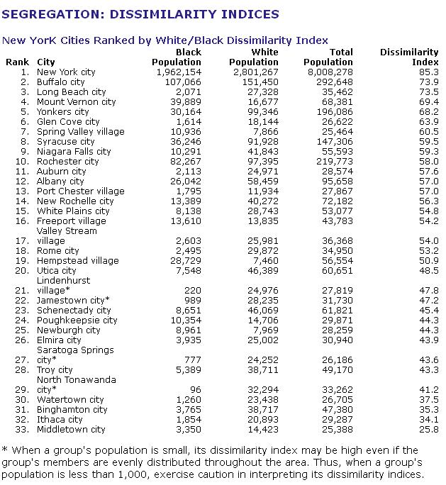
The Dissimilarity Index is the most commonly used
measure of segregation between two groups, reflecting their relative
distributions across neighborhoods within a city or metropolitan area. It
can range in value from 0, indicating complete integration, to 100,
indicating complete segregation. In most cities and metro areas,
however, the values are somewhere between those extremes. The Dissimilarity Index below is for thirty three (33) New York cities, including Utica and Rome. Remember that complete integration is closer to 0 (zero) while complete segregation is closer to 100.

As you can see, Utica and Rome pretty much lay in the middle of the chart, and show a substantial level of integration when it comes to their white and black populations. To see how they fair with other races in terms of integration, make sure to visit the CensusScope.org web site. Besides the segregation/integration data, I especially like their maps web page. It has a lot of great visualizations of some unusual data there. |